Best graphic design software in 2026: 12 tools for every designer
Discover the best graphic design software for every workflow. Compare Photoshop, Illustrator, Figma, Blender, Canva, Affinity, and more to find your ideal tool.
Envato: Get every type of asset for any type of project, and access to AI tools. Start now
Tennis aesthetic explained with design ideas, color palettes, and modern preppy style inspiration.
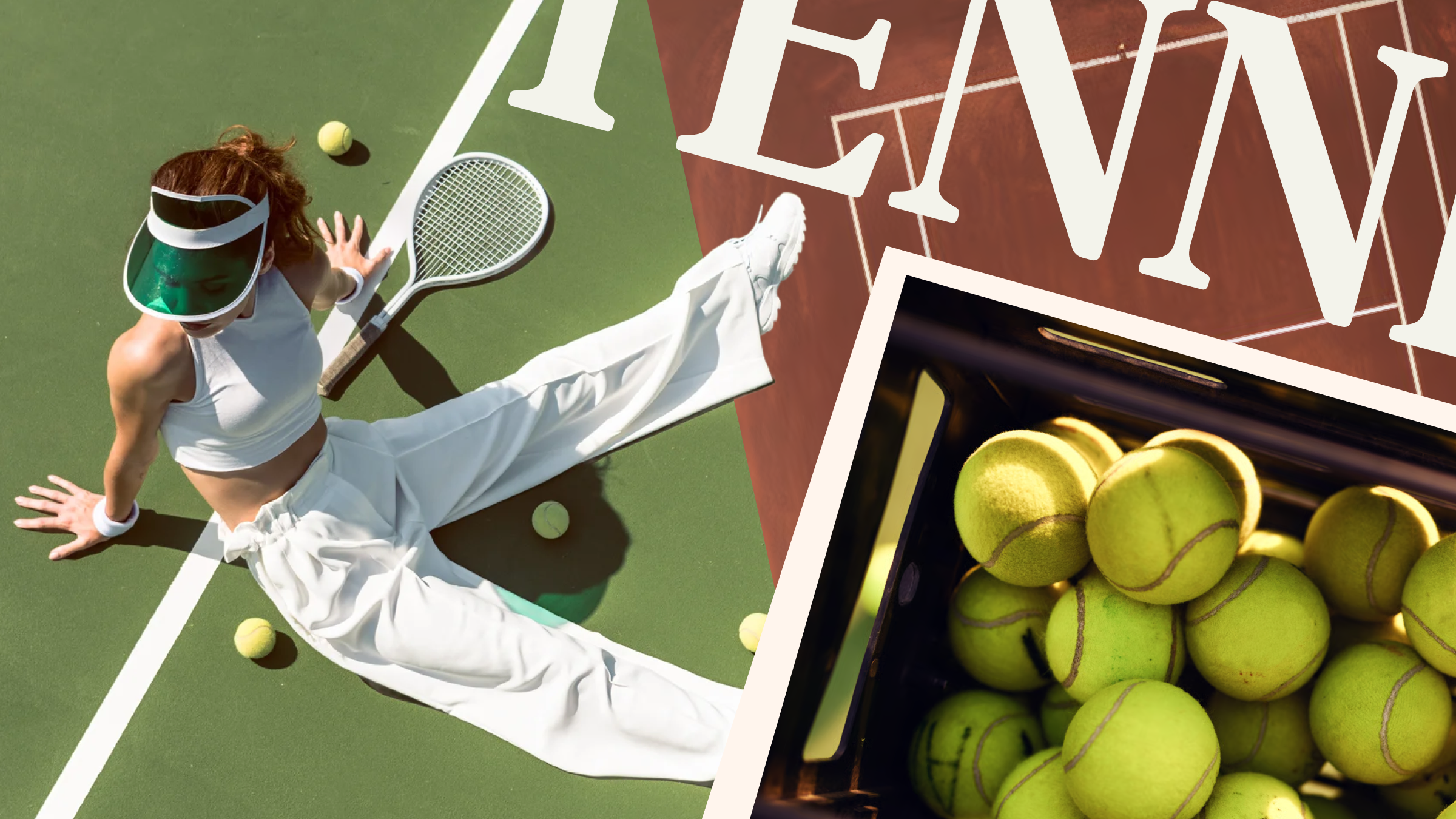
From branding to summer marketing campaigns, the tennis aesthetic is shaping how creatives approach design in 2026. So grab your strawberries and cream and explore how to apply this preppy, sport-inspired style to your projects.
The tennis aesthetic is a visual style inspired by tennis culture, combining preppy tennis style, heritage sports design, and clean, minimal layouts. Often referred to as tenniscore by the TikTok crowd, it typically features:
From tennis aesthetic outfits to branding and digital design, the style blends tradition with modern visual trends.
Tennis has always been a widely popular sport to play and spectate, but in 2026, tenniscore and preppy tennis style hit different. A renewed interest in preppy fashion, 90s minimalism (think the stealth wealth aesthetic of Love Story), and old-money aesthetics is powering the tenniscore trend to new heights, making it a trend to watch for brand designers and marketers.
And the stats back it up. It’s clear that audience interest in the sport is on the rise. Recently, tennis has attracted a soaring number of hobbyist players, with worldwide growth of 25.6% over the past five years. With championships like Wimbledon attracting the glamorous Hollywood crowd, and players including Jannik Sinner, Novak Djokovic, and Serena Williams attracting multimillion-dollar sponsorships and big-brand collaborations, even post-retirement, it seems that tennis has finally shed its once-fusty reputation.
Perhaps this is why tennis continues to captivate audiences: its unique position at the intersection of sport and design aesthetics. Rooted in old money but more youth-driven than golf, and attracting both male and female fans in equal measure, being a tennis fan is as much about tapping into a wider lifestyle as it is about the sport itself.
Design and culture underpin tennis’ allure, with movies like The Royal Tenenbaums and Challengers playing up the sport’s unique preppy style and bringing it, along with ‘yuppie’ aesthetics, to younger demographics.
And the trend extends to other design fields, like interior design, furniture design, and fashion. From tennis-inspired interiors for 2026 that champion green and white stripes and racket-adorned walls, to heritage sports brands like Lacoste and Fred Perry experiencing a social media-driven revival, tenniscore’s connections to luxury, heritage, and fine living make it an enduringly popular style with consumers.
Nailing a tennis aesthetic is far easier than winning Wimbledon with these tips for tennis color palettes, preppy aesthetics, and heritage design. We’ll also look at how to adapt your tennis designs for Gen Z audiences, boosting the engagement power of social media designs and summer campaigns.
A tenniscore color palette is rooted in crisp, modernist shades of lawn green, crisp white, and clay orange. You can also experiment with neon yellow, as a tribute to the bright flashes of tennis balls, and royal purple—the brand color of Wimbledon.
When using color in tennis-inspired designs, maintain plenty of white space and stick to a minimal palette to channel a clean preppy aesthetic. Blurs and gradients in pastel shades can also give your designs a sense of sporty movement.
Preppy style goes hand in hand with tennis aesthetics. The old-money Ivy League set of the 1980s and 1990s was, after all, the original proponents of “Anyone for tennis?” On social media, we’ve seen the trend resurrected as prepcore, defined by traditional patterns like stripes and gingham, polo shirts, quarter-zips (yes, really!), and a trust fund (desirable, not essential).
Translate the prep aesthetic to a design project by using 90s references throughout. Think clean sans-serif fonts, plenty of white space, and Calvin Klein-inspired black and white photography.
Tennis is built on tradition. First formalized as a lawn racquet sport in England in 1874, the first tennis tournament, Wimbledon, was established in 1877. Since then, the sport has migrated globally, but it retains its heritage spirit.
Wearing tennis whites at most tournaments is still obligatory (colored trims at Wimbledon are strictly limited to a maximum width of 1 centimeter), and extensive formal rules still govern audience behavior, player conduct, and pre-match rituals.
Some tournaments observe less formal rules, but tennis is generally considered one of the most polite spectator sports.
In your designs, classic and heritage elements like serif typography, metallic touches, or luxury paper textures can help to anchor a layout and lend even the newest of brands a sense of establishment.
Gen Z is perhaps an unexpected target for tenniscore designs, but since Zendaya’s role in Challengers and an injection of young blood into the professional sport, this younger demographic is starting to interact with tennis content more actively. Brand collaborations, like that between rising star Coco Gauff and fashion house Miu Miu, have built deeper connections between the sport and designer fashion, bringing tenniscore to the forefront of social media feeds.
To update a Tenniscore aesthetic for Gen Z, incorporate unexpected twists into a design. Dial up the color for reels and posts with neon accents, and turn to high fashion styling, such as bold logos and fashion photography, to blend style with sport.
Tennis aesthetics are big news in design right now, with a preppy tennis style proving popular across branding and logo design, packaging design trends, websites, and social media campaigns. Browse these inspirational ideas to bring summery sport style to your own projects.
From player of the moment Sinner’s high-fashion collaboration with Gucci to the ‘quiet luxury’ brand identity for tennis cafe Ball and Bean by Dayenah Studio, tenniscore branding channels an aspirational mood in 2026. Ornate logo designs set within crests and borders give branding an older, heritage feel, while 3D elements help branded social media designs pop from the screen.
A stroke in the opposite direction? Designer Fanny Raffenot created a modernist brand identity for The Grid, an elite tennis training club. Shots of neon yellow, a court-inspired grid, and sans serif typography give the print and web designs a sleek, contemporary style.
If you thought tennis styling was all about tradition, think again! When it comes to packaging design, bright colorways and quirky concepts capture attention both on and off the court. We love the fun pastel identity for Cob popcorn, with color pop packaging design that screams of a courtside summer.
Meanwhile, Esthet Design reimagines dietary supplements as colorful tennis ball-inspired boxes, showing that tennis aesthetics don’t have to be limited to tennis branding alone.
For the Tenniscore website designs, look to animation, energetic video templates, and interactive UX elements to take users into the action. Geometric animation transports visitors to the Champions For Good Club site into a dynamic sporting universe, created by Double Play. A palette of neon pastels and rich, high-contrast brown and purple tones creates a perfect, accessible blend, while condensed display fonts look fantastic set at full-width across landing pages.
We also like the modernist styling of agency dots and lines’ design for ski service Sport Fleiss. With its pastel palette, chunky display typography, and clean minimalism, numerous tenniscore traits are at play here.
In your own projects, tennis aesthetics can be applied to a wide range of designs, with the style not limited to sports branding. Why not try using the style for summer marketing campaigns, luxury branding, or fashion marketing? These tips and resources will help you serve an ace for the first time.
Channel a stealth wealth vibe with design elements that evoke old-money and Ivy League vibes. Look for crest logo designs, italic serif fonts, and plenty of material texture. Leather, wood, and paper backgrounds will give digital designs a lived-in luxury look.
A clean, dynamic font set in crisp white over boldly colored photography will really help you to channel that tenniscore mood. Within the tennis aesthetic, chunky sans-serif fonts lend designs a more minimal, sporty look, but you could also use serif fonts for a more traditional look.
Conjure up heady summer days with light filters for photos and video. Bright filters with pastel tones evoke midday hours when the sun is at its height over the court, while sunset-hued LUTs evoke a hard-fought match drawing to a tense conclusion.
Sporty video templates that move with players’ action, offer close-up focus on sweat-drenched faces, or feature jaunty camerawork will help give video content dynamism. You can also create AI-generated videos for sports and lifestyle branding in Envato’s AI video generator — try a Tracking Shot or Whip Pan from the Preset menu to add tenniscore energy to your video before you hit generate.
The tennis aesthetic remains popular because it balances:
This flexibility makes it highly adaptable across industries and formats.
Let’s compare the tennis and preppy aesthetics to help you decide which mood you might want to channel in your projects. These two aspirational styles overlap, feeding into each other to create two super-stylish aesthetics, but there are also key differences between them.
| Tennis aesthetic | Preppy aesthetic |
| Court-inspired colors such as lawn green, clay orange, and crisp white. | Classic colors and autumnal colors, such as berry red, rich brown, bottle green, and navy blue. |
| Sport photography and video, with an emphasis on movement and action. | Sedate, high-fashion photography, often in black and white. |
| Logos and icons that blend sport and heritage, with clean sans serifs and white contrast. | Logos and icons that feel luxurious and academic, with ornate crests and metallic details. |
| Sport styling, such as raw video footage of gameplay and audience reactions, plus integration of major sports brands into websites and social media content. | Collegiate styling, such as traditional plaid and gingham patterns, bookish aesthetics, and East Coast-inspired motifs and borders. |
| Emphasis on the summer season, with bright-light filters, vibrant color contrast, and references to hot weather. | Emphasis on the fall season, creating a back-to-school atmosphere with rich colors, moody filters, and cozy, outdoorsy references. |
The tennis aesthetic, or tenniscore, is characterized by visual references to the sport, summertime, and the culture of tournaments like Wimbledon and the US Open. Blending tennis-inspired fashion and preppy aesthetics, crisp whites and polo shirts make up the wardrobe, while a court-inspired color palette and minimal, quiet luxury layouts define the aesthetic style.
No, although they are related. Tenniscore focuses on the influence of the sport on design, with more references to tournament and match culture, while prepcore is rooted in Ivy League, old money culture.
Prepcore and 90s minimalism are definitely trending for 2026, with fashion brands like Gigi Hadid’s Guest in Residence bringing preppy style to young audiences. Meanwhile, 90s brands like Calvin Klein and Ralph Lauren are also experiencing a revival.
Crisp, classic colors like racing green, clay orange, clean white, and royal purple make up the tennis aesthetic color palette.
Due to a growing interest in the sport (hobbyist players have increased by a quarter globally over the past five years), tennis aesthetics appeal to a growing audience and have reached more Gen Z consumers due to the popularity of Zendaya’s Challengers movie.
You can use tennis aesthetics for a wide range of projects, beyond sports branding. Try the style out for summer marketing campaigns, lifestyle branding, luxury packaging, or health and wellness.
Tennis is a sport of tradition and contradiction. Always wrestling between the conservatism of its heritage and the fresh Gen Z blood bringing ever-changing energy into the sport, it’s one of the most idiosyncratic of sports.
This push-and-pull effect ensures that tennis aesthetics are never boring. Neon colors enliven an otherwise classic color palette, while raw video breaks down the sport’s elegant reputation, bringing the blood, sweat, and tears of the tournament directly to viewers at home. The future of tennis aesthetics is always in flux, created in action by emerging star players and highly competitive big brands.
For more sport branding inspiration, read Alex Pillow’s breakdown of how he designed a run club brand, and discover which font Nike uses in its iconic marketing campaigns. Or why not generate your own tennis-inspired videos with generative AI using this starter guide to Envato’s AI video generator?
Discover the best graphic design software for every workflow. Compare Photoshop, Illustrator, Figma, Blender, Canva, Affinity, and more to find your ideal tool.

Learn how to edit with AI on Envato stock photos, customizing images instantly by removing objects, changing backgrounds, and creating polished visuals without leaving the platform.

Fourteen World Cup shirts that still matter, from Brazil 1954 to Cameroon's banned vest. The design thinking behind the kits that lasted, and what they all have in common.

Canary yellow explained: meaning, hex code, color psychology and design ideas. Learn how to use this bold yellow in branding, UI and 2026 creative projects.