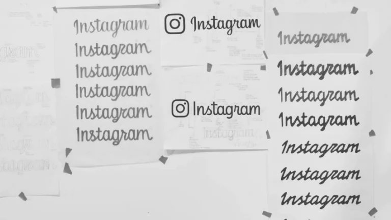
Will the Instagram rebrand win back the social media sceptics?
Users are abandoning Meta’s platform in their millions, so can a timely 2026 rebrand place Instagram back in the social media spotlight?
Envato: Get every type of asset for any type of project, and access to AI tools. Start now
Canary yellow meaning, hex code and design ideas for modern branding, UI and creative projects.
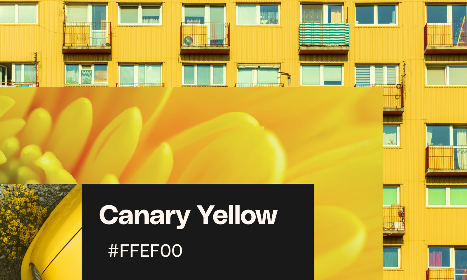
A key color trend for summer 2026, canary yellow is the brighter, zestier successor to 2025’s butter yellow obsession. With catwalks lit up in shades of sunshine yellow, this guide explores how to use canary yellow in branding, UI, packaging, and social media design.
Canary yellow is a bright, vibrant shade of yellow used in design for high-impact visuals, contrast, and attention-grabbing accents.
Canary yellow is a bright, vibrant shade inspired by the feathers of the Atlantic canary. It sits between lemon yellow and golden yellow on the color spectrum and is known for its high visibility and energetic tone.
Named after the sunshine-hued bird native to the Canary Islands, Madeira, and the Azores, the color reflects that same bold, unmistakable presence.
In design, canary yellow conveys:
That makes it a strong choice for summer campaigns, high-impact branding, and UI elements designed to stand out.
Canary yellow is an ultra-vivid and vibrant shade of bright yellow. The canary yellow HEX code (for web and app designs), canary yellow RGB swatch (for screen-based designs), and canary yellow CMYK swatch (for print) are:
These values make canary yellow especially effective for both digital and print applications, where brightness and clarity matter.
Canary yellow is closely associated with sunlight, warmth, and positivity. It’s one of the most emotionally expressive colors in the spectrum.
In design, it can:
However, because it’s so intense, overuse can feel overwhelming. Balanced correctly, it becomes a powerful accent color that improves both mood and usability.
Riding on the tide of last year’s butter yellow success, it seems that the worlds of fashion and design are not yet ready to turn their backs on the yellow end of the color spectrum. The 2026 color trends are all about dialing up the intensity of the pastel colors that have dominated over the last few years. Canary yellow, crayola orange, and aubergine purple are just three 2026 color trends to make a note of for the year ahead.
The 2026 catwalks were lit up with an array of canary yellow creations, often paired with unexpected color combinations, like scout-style brown and moody lavender purple. At Ferragamo, pops of canary yellow contrasted against mink brown and rich black in a tribute to 1920s aesthetics, while Balenciaga took the canary yellow trend literally with vibrant yellow feather adornments that transformed models into spectacular birds of paradise. Big Bird chic? We’re here for it.
While pale yellow devotees like Sabrina Carpenter are still flying the flag for softer butter yellow at events, the design crowd is seeing the benefits of canary yellow’s brighter, more eye-catching tone, which helps website and app designs pop on the screen.
Beyond the catwalks, the yellow color trend points to something deeper in the cultural zeitgeist.
Interestingly, the Pantone Color of the Year 2026, a white shade named Cloud Dancer, has failed to capture the imagination of wider audiences. Perhaps felt to be too sterile and purist, by comparison we’re seeing yellow continue to dominate designs well into summer 2026.
Color psychology indicates that yellow is a purely joyful color, helping viewers to feel more optimistic and mimicking the healing effects of bright sunshine. In a year dominated by doomscrolling headlines, it’s no surprise that the spectrum’s happiest color offers much-needed relief and escapism.
For designers, canary yellow also serves as a useful accent color, providing excellent contrast against black typography and helping highlight CTAs and buttons. Boasting both positive psychological effects and high design function, canary yellow is a great way to boost the mood and accessibility of your designs.
While both colors sit in the same spectrum, they serve very different purposes.
Use canary yellow when you want:
Use butter yellow when you want:
Canary yellow isn’t a shy shade. One of the most stimulating summer color trends for 2026, you can afford to be experimental with color pairings, enhancing or balancing out its high energy.
Did you know that too much yellow in a design has been proven to promote feelings of anxiety in viewers, with people more likely to lose their temper in yellow rooms? Avoid overstimulation with a balanced color palette that teams bold yellow with more soothing shades, bringing out canary yellow’s sophisticated side. These color-pairing suggestions demonstrate how Canary yellow can be combined with unexpected colors to build contrast and psychological balance in projects.
Sea-inspired hues of indigo, seafoam, and cerulean are a leading 2026 color trend, with oceanic blues also making a mellow partner to canary yellow. We’re seeing this color combination play out in interior design this year, but we think it would make a great pairing for website designs and brand identities, striking a balance between cool and warm tones.
Tap into an outdoorsy energy with this Scout-inspired color pairing. Try a milky chocolate brown with canary yellow for unexpectedly beautiful results. This color palette gives canary yellow a retro, 1970s feel that fits perfectly with nostalgia marketing.
Another muted hue, slate gray or dove gray, comes to life when paired with bold yellow. This color combination feels more urban in mood—try with app designs or sports branding.
Combined with canary yellow, saccharine shades of dusky purple and powder pink take on a fresh personality, transporting these traditionally spring colors into the summer months.
Yellow contrasts best against inky black, a color pairing commonly seen in nature as an attention-grabbing warning sign (think the high-contrast stripes of bees and wasps). A permanent fixture on the fashion catwalks, black has been given a twist by designers like Prada for 2026, paired with yellow.
In graphic design, pair bold black typography with a canary yellow background, or vice versa, for a head-turning aesthetic and accessibility-boosting properties.
Canary yellow is a versatile hue that can create eye-popping graphics or surprisingly sophisticated designs for packaging, websites, and social media. It’s all in the way you use it! These inspirational canary yellow examples show how designers can take canary yellow’s optimistic energy and channel it into a wide variety of projects for the summer season and beyond.
For brand identities and logos, use canary yellow as an attention-grabbing accent color, or team with equally bold hues to really make your identity pop from the page.
For Zukae Instant Noodles, brand designer Good Spark pairs canary yellow with equally bright shades of cobalt blue and ketchup red to put across a fun fast food feel, while logistics goes high fashion with DHL’s twist on their red and yellow logo for an event in Qatar, combining pattern and high-contrast black as part of the day’s branding.
Canary yellow packaging will attract distracted eyes browsing crowded shelves, and its positive association makes it a great match for summer products, beverages, or lifestyle packaging. And while yellow is often used to denote budget or lower-cost items, with the right application, it can be transported to luxury territory.
For example, designer Khoi (Khoi Nguyen) reinterprets Lipton Tea, an iconic yellow brand, with all-yellow packaging in a mature, matte finish and a subtle serif typeface.
Because canary yellow is such a bright hue, it’s important to balance website designs with contrasting colors. Try teaming canary yellow with deep black, crisp white, or slate gray to build accessibility into an online layout, to avoid burning your visitors’ retinas!
A case in point — Spanish creative agency We Are Yellow embraces the energy and optimism of canary yellow with their friendly website design, incorporating UX elements like a cute yellow cursor and highlighter pen that playfully strike through text as the user scrolls. The simple, effective design is anchored by chunky black-and-white type.
For social media designs, you can boost the summery mood of canary yellow by using the shade as part of lazy, hazy gradients. Use airbrushed shapes in popping yellow to draw attention to important information or links, or cast a sunset-hued filter over imagery and videos to transport viewers to a vacation destination.
Whether you’re shooting real footage or experimenting with AI-generated photos and video, a canary yellow filter or LUT has the ability to produce a wide range of effects. On the more positive side of effects, canary yellow can mimic the effect of bright midday light or high summer, giving visuals a high-season atmosphere. Or even try a stronger yellow filter with some teal mixed in to create a mood of dystopia or illness for sci-fi AI videos.
Use canary yellow strategically to get the best results:
In practice, canary yellow works best when it enhances a design — not dominates it.
Web templates, buttons, and banners attract eyes and clicks when set in vivid canary yellow. Just make sure to add contrasting type in darker shades of black, gray, or blue to keep text legible and the user experience flowing. You can improve website navigation by using canary yellow sparingly to highlight headings, menus, or buttons.
For impactful headlines, contrast canary yellow typography against sharp black (for an urban, sporty look) or dusky blue (for an ethereal summer effect). For canary yellow font styles, look for typefaces with chunky, condensed lettering or quirky display characteristics like swirls and ornate ligatures—these will ensure logos and headlines really pop.
Brighten photos and videos with a wash of summery yellow color. Keep your yellow filters subtle for a sunkissed effect, or create a bolder, more urban look by increasing the saturation of yellow LUTs and yellow Photoshop add-ons.
An instant way to enliven landing pages, poster designs, or social media posts, canary yellow backgrounds take the effort out of a design. Look for Mediterranean-inspired citrus patterns or floral backgrounds with painterly elements for an arty touch, or take an edgier approach with graffiti-inspired yellow backgrounds.
Yellow is a complex, somewhat contradictory color that produces different psychological effects depending on the viewer and the context. In some cases, excessive yellow can promote feelings of anxiety and frustration, with babies shown to be more likely to cry in a yellow room.
Some viewers can find too much yellow overly stimulating, so it’s important to address the balance with color pairings that offset these characteristics.
On the other hand, many people adore yellow, noting its comparability to life-giving sunlight and its innately optimistic, extroverted nature.
Canary yellow is an exceptionally vibrant shade of yellow, which means that yellow’s color psychology will be exaggerated, compared to, say, a more muted shade such as mustard yellow or butter yellow. With this in mind, try teaming canary yellow with colors that are more somber in mood, such as brown, which has a lethargic psychology that can be balanced out nicely with brighter yellows. Alternatively, use canary yellow sparingly as an accent tone against otherwise neutral backdrops, helping to draw attention to elements on a design without creating an overwhelming all-yellow effect.
Canary yellow is one of the most impactful color trends for 2026. It offers a bold, versatile option for creatives working across branding, UI, and digital design.
Used well, it brings energy, contrast, and clarity to a project. Paired carefully, it becomes both expressive and refined.
If you’re looking to push your color palette further this year, canary yellow is a strong place to start.
For more color inspiration, look no further. Explore our curated canary yellow workspace, discover the fascinating world of color psychology with these 9 emotional color palettes, and take a deep dive into the oceanic blue 2026 color trend.
The canary yellow HEX code is #FFFF8F, the canary yellow RGB swatch is 255, 255, 143, and the canary yellow CMYK swatch is0%, 0%, 44%, 0%.
Canary yellow is a warm color, though not as warm as orange and red. The yellow is relatively cool-toned with a slightly green undertone, making it a clean, neutral yellow to design with.
Yes! Canary yellow is a great choice for brand identities, logo design, and packaging. Eye-catching, optimistic, and dynamic, it is best suited to branding that requires go-getting energy. Think sports brands, summer marketing campaigns, and vacation branding.
Build a contemporary, versatile canary yellow color palette by pairing it with neutral shades like black, white, and gray, or team it with unexpected pastel hues like lavender, baby pink, and dusky blue.
Lemon yellow is a slightly greener variation of canary yellow, given its citrus nature.
Users are abandoning Meta’s platform in their millions, so can a timely 2026 rebrand place Instagram back in the social media spotlight?

Slick and polished, sports luxe is the new aesthetic take on athleisure style, with the 2026 trend powered by major tournaments like the FIFA World Cup and Tour de France, and translating to branding, marketing and design this summer.
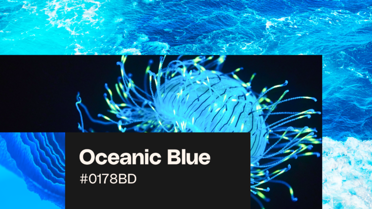
Oceanic blue is the calming color trend of 2026. Discover palettes, inspiration, and practical ways to use oceanic blue across branding, digital design, and creative projects.
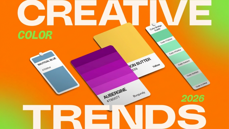
Dive into the 2026 color trends, from molten teal to eclectic purple, and discover the perfect palette for your next project.