Best graphic design software in 2026: 12 tools for every designer
Discover the best graphic design software for every workflow. Compare Photoshop, Illustrator, Figma, Blender, Canva, Affinity, and more to find your ideal tool.
Envato: Get every type of asset for any type of project, and access to AI tools. Start now
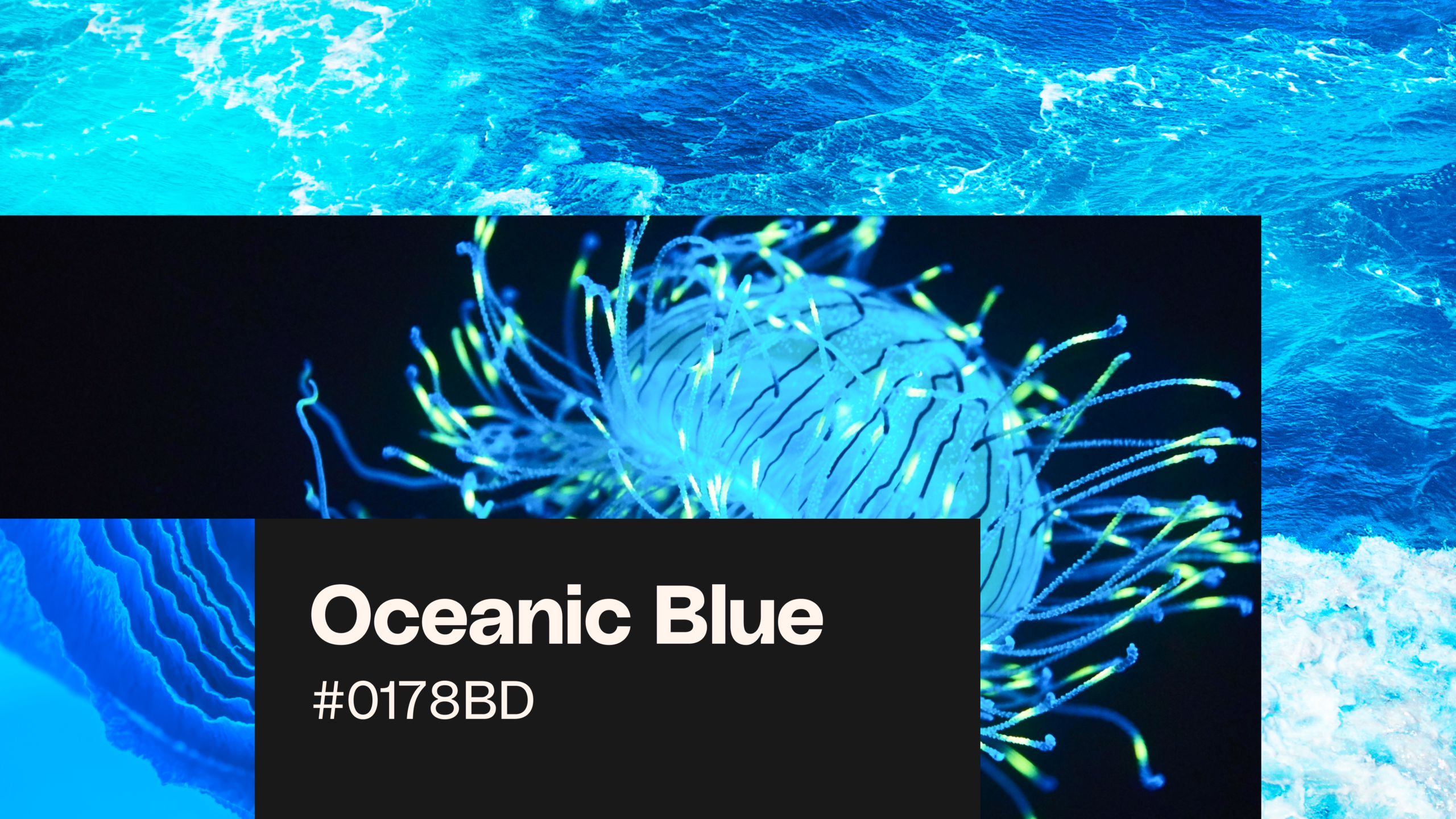
Oceanic blue defines 2026 with calming palettes and versatile applications across modern design.
Consumer trend forecaster WGSN, as well as Pinterest and Etsy, have all named oceanic blue and related tones as Color of the Year 2026. From rich ultramarine blue to airy cerulean blue and deep, pigment-heavy phthalo blue, these shades are rising fast. Rooted in sustainability, biophilic design, and calm tech, they’re quickly becoming essential across branding and visual design.
In this guide to oceanic blue, we’ll take a deep dive into this evolving palette, highlighting must-use shades and real-world inspiration. You’ll also find practical tips for working with blue across your own projects, from social media campaigns to packaging design. There’s never been a better time to have a Blue Monday…
Oceanic blue is a range of calming blue tones inspired by the sea, sky, and natural water environments, including shades like cerulean, ultramarine, teal, and phthalo blue.
There’s something innately calming about oceanic blue, and it goes more than skin deep. According to color psychology, blue can lower cortisol levels, making it one of the most effective choices for calming color design in digital and brand environments. Connected with open spaces, like the ocean and sky, the color has long been associated with spirituality and tranquility.
Perhaps this explains why blue is having a moment in design. It responds to digital overstimulation and doomsday news cycles with cleanliness and calm. The color also intersects with other major 2026 design trends such as sustainability, the new wave of mindful ‘calm tech’, and Organic flow, which emphasizes soft, naturalistic design over harsh geometry. Beyond this, it has a uniquely escapist mood that makes it the perfect fit for lifestyle products, vacation fashion, and wellness branding.
Buying patterns are already reflecting a shift towards the cooler end of the color spectrum, with marketplace Etsy tapping Patina Blue as their Color of the Year 2026, a mesmerizing molten blue inspired by copper’s natural ageing process. But perhaps the fashion world got there first, with Valentino, Gucci, Tom Ford, and Chloe all championing bold blue looks on the Spring/Summer 2026 catwalks.
The general design message for 2026 is calm and reset, which is no surprise given the saturated state of our media intake and its impact on mental health. The antidote to digital fatigue? It could lie in something as simple as color, with consumers drawn to products and brands that represent a contrast to the intensity of modern life. This year, serene oceanic blues will dominate branding, web, and product design, spanning a spectrum of cool blue hues, from ice blue and seafoam to teal and cobalt.
Design is a fickle beast, but blue’s versatility caters to a wide range of moods and media, making it a popular choice for designers seeking adaptable color for branding, packaging, digital UI, and social visuals. Moody and mysterious? Check. Nostalgic and escapist? You got it.
If you want to create designs that feel like a welcome contrast to the neon Brat era of last year or the saccharine sweetness of fashion-favorite Butter Yellow, blue is the soothing and sophisticated shade to try right now.
Oceanic blues are blue hues reminiscent of the sea, sky, and nature, ranging from water-inspired, green-tinted blues to icier, pale blues that incorporate white and gray tones. Somewhere in the middle sits purer blues that have an elemental, ultramarine aesthetic. Think strong cobalt blue or the perennially chic International Klein Blue, an ultra-intense shade which was patented by the artist Yves Klein in 1960.
“Blue has no dimensions; it is beyond dimensions.”
Yves Klein
In 2026, look for natural, mineral blues that feel livelier than their corporate counterparts, like navy or royal blue. These vivid blues also pair beautifully with texture and pattern, which lend them a naturalistic look. Team with washed linen backgrounds (as announced by Etsy as their first-ever Texture of the Year 2026) or swirling patterns for a coastal, oceanic feel.
Oceanic blues can be used across a wide range of designs, with cool tones providing calming contrast on loud social feeds and offering website visitors a moment of serenity between browsing sessions. They also work beautifully for packaging design (especially for organic and natural products) and fashion-forward brand design.
Try teal or green-infused blues to give designs a natural or sustainable association. Environmentally conscious projects, or brands with sustainable credentials, will be a natural home for these types of blue hues. Sea tones also work well with soft tech, such as wellness and health apps and lifestyle sites. There’s a good reason that corporate blues like navy are so enduringly popular; they communicate a sense of authority and establishment, so by lifting this idea and dialing up the intensity of your blue tone slightly, you can build trust with new consumers.
For product and retail brands, opt for stronger blue tones like cobalt, denim blue, or azure, which mirror the blue trends forecast for 2026 in high fashion. And for branding aimed at younger Gen Z and Gen Alpha, experiment with paler, softer blues like turquoise, baby blue, and ice blue. You can pair these softer hues with nostalgic marketing strategies, tapping into 90s nostalgia or mid-century Atomic Age style.
Blue is a tried-and-tested color choice, particularly within the tech and financial sectors, but in 2026, the new wave of Oceanic blues is poised to liven up branding, websites, social media, and interior design for start-ups, fashion brands, and more. Peruse these inspirational examples of blue branding in 2026, from cornflower-colored packaging to baby blue social media campaigns.
Across branding and graphic design, blue is a calm yet impactful color choice that reassures consumers of a brand’s authority and lends a playful Mediterranean mood to food and drink branding, beauty packaging, and fashion brands.
Blue is an enduringly popular choice for luxury branding, particularly in campaigns and packaging design, with Tiffany, La Prairie, and Harry Winston all opting for authoritative shades of blue. Some long-established brands even look to the versatility of blue to transition a heritage label to digital platforms. For example, in 2023, designer Daniel Lee launched an electric blue shade for fashion house Burberry, designed to contrast effectively with the brand’s all-beige palette and pop on phone screens.
Oceanic blues work particularly well for brands associated with summer vacations and leisure time. We’ve seen more brands in the restaurant, drinks, and travel sectors turn to shades of teal, turquoise, and seaglass to build a fun-loving association with seaside pursuits.
Beauty branding is also on the lookout for color alternatives to the Glossier-era pinks and reds, with blue a clear favorite. Building on the growth of the Blue Beauty movement, in which brands seek to use reef-safe ingredients and adopt zero-waste packaging, we’ve seen blue brand palettes adopted by emerging beauty brands Kinship, Bubble, and Exa.
For websites and apps, we’re seeing blue as a consistent favorite amongst AI start-ups, as well as across a range of soft tech sites focused on health, pharmaceuticals, and wellness.
As a firm favorite of corporations and tech, blue can risk feeling too formal. But by experimenting with interactivity and visual effects, it’s possible to give even the most corporate of websites a fresh look. Take a leaf out of Justified Studio’s book, who have given Indicium AI’s branding a 2026 lift with dynamic blue glass effects that respond dynamically on web and app interfaces.
By taking oceanic blues into the more vibrant end of the spectrum, you’ll benefit from the vastness of blue that can make websites feel more immersive. Electric blue and cobalt blue make great alternatives to black for website backgrounds and look fantastic contrasted with either sharp acid neons or tonal neutrals for type and graphics.
For social media, blue is a calming antidote to crowded feeds. We’re even seeing some brands completely pivot from their favored brand colors to embrace a blue identity on Instagram and TikTok. Rhode Skin, for one, has set aside the brand’s signature pink and neutral palette in favor of an icy baby blue. For campaign content, see how this brand uses blue to anchor event photography, with packaging, signage, and even a pop-up bakery decked out in all-blue for a nostalgic, mid-century look.
For social media posts, look for photography that integrates blue backgrounds (an ocean backdrop is on-point) or use blue graphics and frames to draw the eye to key information.
You can also use color contrast to balance blue’s serenity with a clickable pop of color. Use bright yellow, orange, or coral to make a CTA stand out on reels and stories.
Trends favored or set by interior design often cross over into graphic design and branding, and it seems that blue is also having a 2026 moment in our homes.
Paint brand Dulux has tipped three blue hues, a trio named Rhythm of Blues, for their paint colors of the year. Ranging from a deep blue-black to a soft blue-gray, these are calming colors that the brand states are about ‘embracing a slower, more natural rhythm, more in tune with nature and each other’.
High-end paint brand Farrow and Ball is also in favor of blue for the year ahead, with Parma Gray, Light Blue, and Kittiwake representing a soft, coastal-inspired aesthetic for calming interior decor. And way back in the middle of 2025, BEHR Paint also announced its 2026 Color of the Year, Hidden Gem, a smoky teal that adds complexity and moodiness to interiors.
Meanwhile, IKEA is championing indigo blue hues for their collections, combining this chilled-out yet rich color with natural textures, rustic block prints, and contrasting earthy ochre.
Oceanic blue shades are cool and collected, making them the perfect partner to warmer, earthier shades. Brown, rust red, and ochre orange make grounded counterparts to steely blues, and will give your designs a naturalistic, vacation-friendly look. Perfect for sustainable brands or eco-minded projects.
For a fresher, more youthful mood, try teaming paler blue shades with pastel hues like lemon yellow, baby pink, or mint green. We’ve seen these ocean-inspired color palettes become really popular across social media imagery aimed at Gen Z audiences, and they also tap into a retro mid-century aesthetic.
If you want more edge to your blue palettes, stick to a stripped-back palette of vibrant blue as an accent, teamed with crisp white or vivid neon colors. This is a tech-forward approach to using blue hues that will suit AI brands, health tech, or corporate websites.
In your own projects, oceanic blues are versatile and beautiful to work with, producing subtly varied results depending on the type of project or platform. Here are some top tips for incorporating this tranquil color trend into your own designs.
Heighten the naturalism of oceanic blues like teal and seafoam with organic textures, overlays, and backgrounds like linen, canvas, wood, and water. You can also overlay organic patterns, such as swirling waves or botanical-inspired designs, to enhance the environmental effect.
Consider also the impact of light on a design. Overlaying light effects like soft diffusions, glows, or gradients can lend a layout an oceanic look.
Blue is one of the most diverse colors on the spectrum, ranging from near-white ice blues to almost-black midnight blues. Choose your blue depending on the type of project you’re working on for a perfect brand fit:
By teaming surrealist design traits with blue, you can create mesmerizing scenes for website and social media projects that play up to blue’s mysterious, meditative mood.
When creating an AI prompt for a generator like ImageGen or VideoGen, make sure to specify the type of blue you want to include in your image for greater accuracy, such as ‘electric blue’, ‘azure blue’, or ‘teal blue’.
You can also use AI tools to swap blue color palettes across existing brand designs, allowing you to try out different blue hues without the time investment.
Sensory branding uses sound, motion, and interaction to build a holistic experience for websites and other digital designs. Tactile 3D materials can be animated to create ocean waves and ripples, or ocean-inspired LUTs can be used for a blue wash across the video.
Sonic branding, which uses unique, ambient sounds to build brand association, can also create calm, ocean-inspired soundscapes for blue brands.
Despite its versatility, blue can be a surprisingly difficult color to design with. For one thing, any printer will tell you that blues (particularly dark blues) are notoriously fickle and can look very different in print from a screen design. Aside from avoiding tricky dark blues, here are some other common mistakes to look out for when designing with oceanic blues:
When the world is loud, the savviest brands will dial down the noise with calm and collected blue. Oceanic blues reflect a wider cultural mood of an urgent need to slow down, in the face of a mounting mental health crisis and pressing environmental emergency. A calm balance to readdress the chaos.
These soothing, nature-sourced colors balance sustainability, nature, and futurism, making blue the most essential choice for designers seeking mindful color palettes for the year ahead. With tones like cobalt set to go stratospheric by 2027, there’s no better time than now to start experimenting with blue hues and find your color niche for campaigns, websites, and other creative projects.
Oceanic blue isn’t just a trend — it reflects a wider cultural shift toward calm, clarity, and connection with nature. For designers in 2026, it’s one of the most versatile and impactful color choices to explore.
Ready to delve into even more color? Discover these 9 color palettes designed to evoke emotion, backed by color psychology, as well as 8 mobile app color trends for 2026.
Blue colors are definitely trending in 2026 and beyond into 2027 because they represent a welcome shift from ‘loud’ design, maximalism, and oversaturated social media feeds. Blues, by contrast, are calm and serene, and have been proven to lower cortisol levels and heart rate.
Transformative Teal is the 2026 Color of the Year from consumer forecasters WGSN and leading color development company Coloro. It’s a rich blue-green color inspired by ecological awareness. WGSN has also backed another blue hue, Luminous Blue, as its Color of the Year for 2027.
Yes! Ice blue is a great choice for branding projects, combining elegance and coolness with nostalgic design. Ice blue is a good fit for tech branding, youthful beauty brands, and nostalgia marketing campaigns.
To make blue feel contemporary rather than stuffy, steer clear of traditional blues like navy and royal blue. Instead, opt for sophisticated yet interesting blues, such as indigo, midnight blue, or ultramarine.
You can bring more energy to brand identities by combining oceanic blues with warm shades like hot orange or coral, or for even more dynamism, team with acid shades like neon green or neon yellow.
Moody, tranquil or effortlessly cool, blue in all its forms is a major color trend for 2026. Across graphic design, branding, fashion and interiors, you may have noticed the tide turning towards oceanic hues of teal, baby blue, midnight and cobalt on your social media feeds.
Discover the best graphic design software for every workflow. Compare Photoshop, Illustrator, Figma, Blender, Canva, Affinity, and more to find your ideal tool.

Learn how to edit with AI on Envato stock photos, customizing images instantly by removing objects, changing backgrounds, and creating polished visuals without leaving the platform.

Explore the tennis aesthetic trend for 2026, from preppy style and color palettes to branding and design ideas inspired by tennis culture, fashion, and modern creative projects.

Fourteen World Cup shirts that still matter, from Brazil 1954 to Cameroon's banned vest. The design thinking behind the kits that lasted, and what they all have in common.