

Movie typography in 2026: why does it suddenly look so good?
Explore movie typography trends shaping 2026, from bold film fonts to cinematic branding, with inspiring examples and practical tips for creating impactful, screen-ready typography.
Envato: Get every type of asset for any type of project, and access to AI tools. Start now
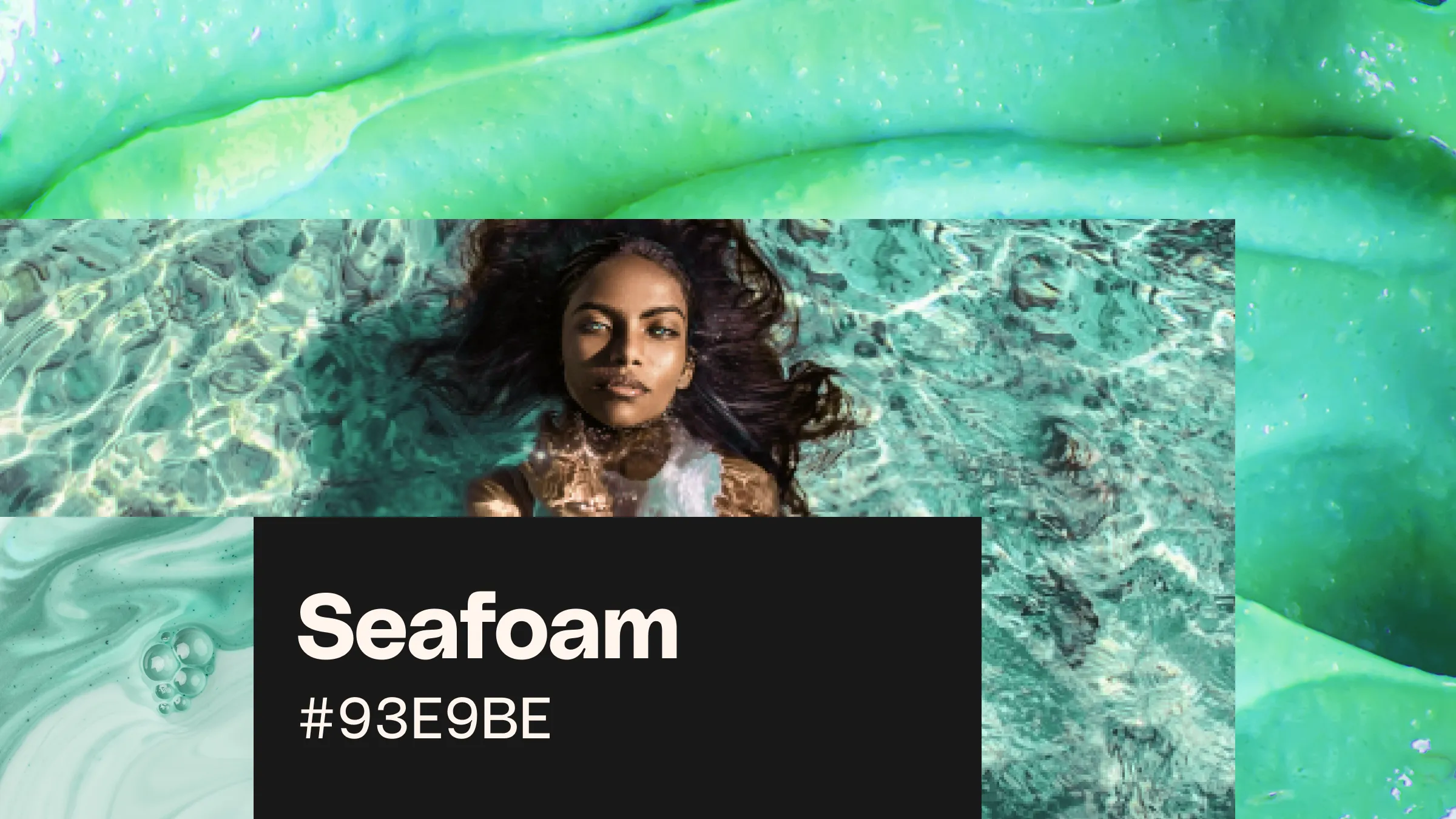
Learn everything that you want to know about the seafoam green color. Find some great seafoam green color palettes, and discover the colors that go with seafoam green the best. Get inspired!
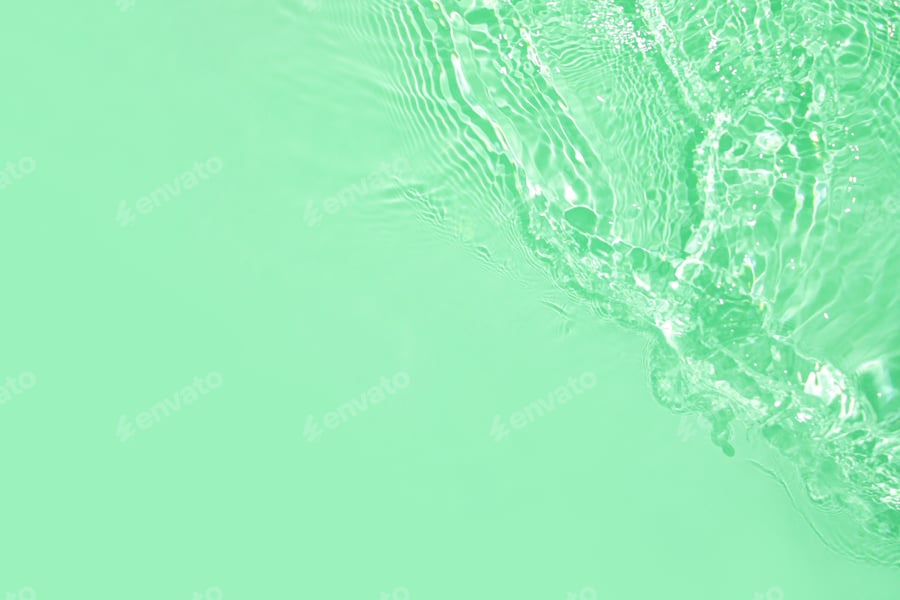
Have you heard? Seafoam green is one of the trendiest colors of 2025. However, awesome as it is, you may be wondering what color it is. Is seafoam blue or green? Well, to tell you the truth… it’s a mixture of both, with a small tint of grey too.
The overall mood of the color is affected by the dominant green notes, making it look refreshingly bright green but soft at the same time.
With a hex code of #93E9BE, this soft color associated with the ocean is often confused with mint green. But don’t get it twisted. While many people see these two colors as the same, mint green has its own hex code (#98FF98) and is considered a different color.
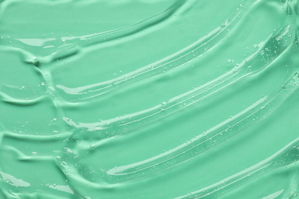
#93E9BE.#93E9BE has a hue of 150°, 37% saturation, and a brightness value of 91%.Now that you know what values make up the seafoam green color code, you can be sure that you’ll get the right swatch every time. Isn’t that cool?
If you truly want to make an impact on your audience, you may be looking for some seafoam color palette inspiration. We’re influenced by the things we see, and color combinations have a major impact on how we perceive and react to things. With a killer combo, you can draw attention, generate emotion, and leave a lasting impression. Want some ideas? Here are the best colors that go with seafoam green.
There’ll be no shortage of color inspiration for your next projects with the following seafoam color palettes. Let’s dive in!
Another amazing thing about this color is that it explodes into a full range of shades. If you’re looking for the specific color values of seafoam green, we’ve got you covered. These values can help you match the specific shade you’re looking for in your designs and even help you find the colors that complement seafoam green.
By adding black to a hue, we will obtain darker shades. In the left image, you can see a palette of darker shades of this color.
| Seafoam green | Eton blue | Polished pine | Feldgrau | |
| Palette |  |  |  |  |
| Hex code | #93E9BE | #80C7A4 | #6EA689 | #466354 |
| CMYK | 39 0 35 0 | 51 1 45 0 | 60 18 54 1 | 72 43 66 27 |
| RGB | 147 233 190 | 128 199 164 | 110 166 137 | 70 99 84 |

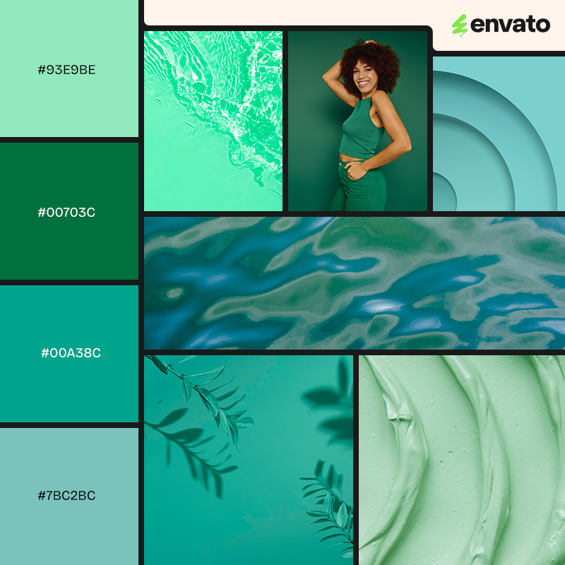
An analogous color palette is a group of colors that sit next to each other on the color wheel. These colors typically share a common hue and feel harmonious when used together, because they have similar undertones. Tones will be naturally cohesive, and low contrast.
| Seafoam green | Mint green | Light turquoise | Pale teal | |
| Palette | |  |  |  |
| Hex code | #93E9BE | #00703C | #00A38C | #7BC2BC |
| CMYK | 39 0 35 0 | 89 31 97 21 | 80 12 56 1 | 51 5 29 0 |
| RGB | 147 233 190 | 0 112 60 | 0 163 140 | 123 194 188 |
Complementary color palettes consist of colors that are opposite each other on the color wheel, creating high contrast and visual energy when used together.
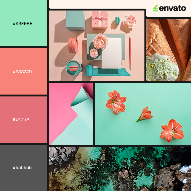
For seafoam green (which is a soft, pale green with blue undertones), the complementary color is typically a muted reddish or pinkish tone — because red is opposite green on the color wheel. This looks like the perfect summer color inspiration palette—it makes you think of delicious sorbet, fruit, and all things good. The pink and coral shades will create a real pop of color, while the seafoam shades will act as neutrals.
| Seafoam green | Soft coral | Warm rose pink | Charcoal gray | |
| Palette | |  |  |  |
| Hex code | #93E9BE | #F88379 | #E4717A | #555555 |
| CMYK | 39 0 35 0 | 0 61 45 0 | 7 69 40 0 | 64 56 55 31 |
| RGB | 147 233 190 | 248 131 121 | 228 113 122 | 85 85 85 |
A triadic color palette uses three colors that are evenly spaced around the color wheel, forming a triangle. This gives you balanced contrast: more vibrant than analogous, but less stark than complementary.
Since seafoam green is a mix of green and blue, let’s place it near the green-cyan area of the wheel.
| Seafoam green | Soft coral | Lavender | Light beige | |
| Palette | | |  |  |
| Hex code | #93E9BE | #F88379 | #C3B1E1 | #F5F5DC |
| CMYK | 39 0 35 0 | 0 61 45 0 | 22 30 0 0 | 4 1 15 0 |
| RGB | 147 233 190 | 248 131 121 | 195 177 225 | 245 245 220 |
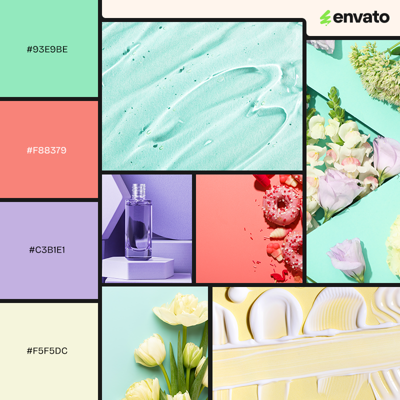
We can’t get enough of this lilac color combination, reminiscent of the color lavender, which is as energizing as it is calming. This is a gorgeous ensemble of soft, approachable colors. The palette feels clean and is perfect for the beauty and fashion industries, as well as designs crying out for a captivating splash of color.
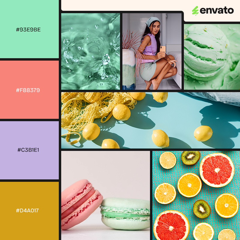
A tetradic color palette, also called double-complementary, uses four colors arranged as two complementary pairs on the color wheel, forming a rectangle. This gives you high color variety and contrast, but it requires careful balancing to avoid overwhelming the eye.
Since seafoam green sits between green and cyan, here’s a classic tetradic setup based on that:
Seafoam green and soft peach/coral = one complementary pair
Lavender and lemon curry = the other complementary pair
| Seafoam green | Soft coral | Lavender | Lemon curry | |
| Palette | | | |  |
| Hex code | #93E9BE | #F88379 | #C3B1E1 | #D4A017 |
| CMYK | 39 0 35 0 | 0 61 45 0 | 22 30 0 0 | 18 36 100 1 |
| RGB | 147 233 190 | 248 131 121 | 195 177 225 | 212 160 23 |
Seafoam green has a very interesting psychological profile because it combines qualities of both green and blue, with a soft, muted tone. Here’s what the color typically evokes in people:
The blue undertone in seafoam green connects it with the sea and sky, evoking serenity, tranquility, and peace. It feels soothing and non-threatening, which is why it’s often used in spas, wellness brands, and calming interior spaces.
The green aspect of seafoam green is linked to nature, freshness, and renewal. It subtly signals health, balance, and rejuvenation, without the intense vibrancy of pure green.
Its muted, pastel quality gives it a gentle and friendly personality. It doesn’t feel harsh or aggressive, great for creating spaces or products that invite comfort, trust, and ease.
Because of its association with ocean foam and beach imagery, it can also evoke feelings of lightness, freedom, and escape from daily stress.
Brands that use seafoam green often want to suggest a relaxed, coastal lifestyle or a clean, fresh experience.
Historically used in hospitals and healthcare settings (sometimes called “hospital green”) because it feels clean, calm, and safe. It subtly communicates purity without the sterility of stark white.
Learn more about color psychology and color theory below!
Now that we know what the color seafoam is, let’s take a stroll through the color’s history.
Believe it or not, seafoam green, like other shades of pale green, has been used since the 1700s. But its time to shine came in the 1950s, when people donned it on their bodies in the form of clothing. The different shades of this green color soon spread to cars and furniture, being intensively used at this time.
The name of the color comes from the foam that the sea creates. Weird, right? After all, the color of foam isn’t actually seafoam green but white. This means that the color was named after the lighter color notes and sparkles of the sea, instead of the foam it creates.
When you look at the color green, you may think of money, nature, and the environment. Green is also used in many places considered “healthy”, as green is so tightly bound up with the concept of the environment and growth. And, while many think of the ocean as blue instead of green, when mixed together correctly, the color seafoam green has a lot of feelings attached to it: calm, relaxation, peace, vitality, and freshness. Because of its softness and brightness, it can be used to cheer up, to feel a little fresher and more connected to the sea. It’s the color of serenity and revitalization!
Seafoam green will be everywhere this season! And for good reason: it retains a soft characteristic while being a complete knockout. You can definitely design stunning graphics using this color, from print design to branding, social media posts, logos, product design, and patterns. Let your imagination fly with these designs that exemplify what the color seafoam green can do in your future projects.
Seafoam green has been used in art and design across many styles and eras, often to evoke calm, nature, freshness, or a dreamy quality.
Seafoam green was hugely popular in mid-century graphic art, home decor, and industrial design.
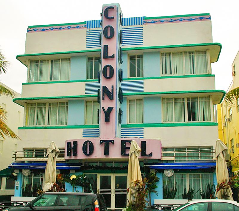
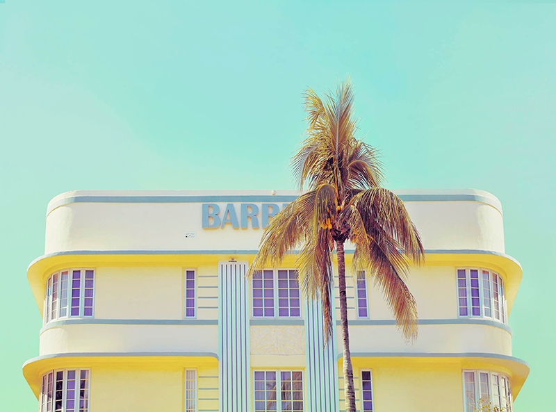
In 1980s Art Deco revival, especially in Miami’s architecture and street art, seafoam green was a key player.
Artists like James Turrell (light installations), Kristen Giorgi, and Studio Proba sometimes use pale greenish-blues to play with the perception of space.

Pierre-Joseph Redouté and other botanical illustrators often used seafoam green backgrounds or delicate seafoam hues in leaves and stems to create a soft, timeless aesthetic.

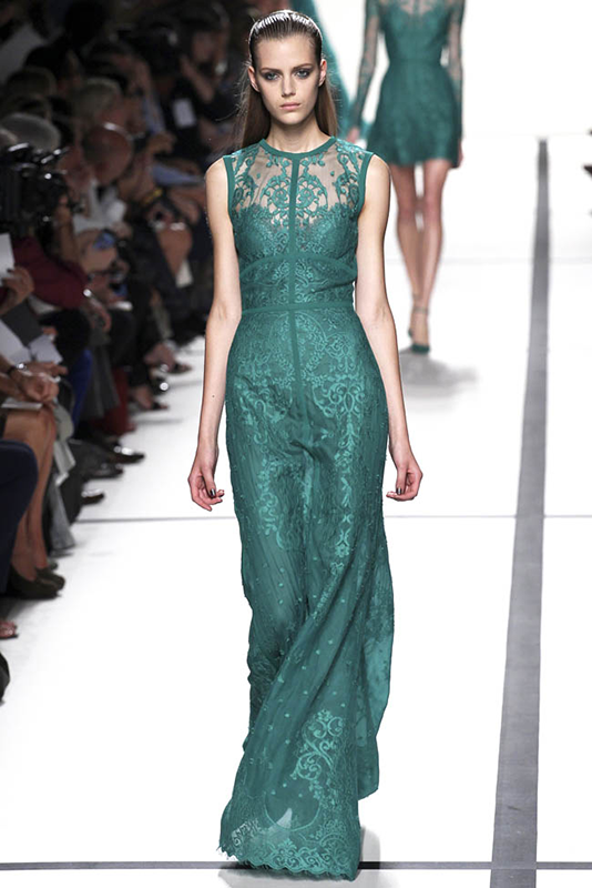
Seafoam green has had a quiet but consistent presence in the fashion industry across decades, especially in moments where designers lean toward soft, fresh, or retro palettes. Here are some specific examples of how seafoam green has been used in fashion:

Activewear brands like Alo Yoga and Lululemon have released seafoam green yoga pants, sports bras, and tanks.
Kate Spade and Michael Kors have both featured seafoam green handbags in recent years.
A: Seafoam green is a soft, light green with a hint of blue, named after the color of seafoam or shallow ocean water.
A: The seafoam green hex code is #93E9BE.
A: In design and fashion, people are often drawn to colors that evoke calm, clean, and refreshing feelings, and seafoam green does this beautifully. It became very popular in mid-century modern design (1950s–60s) — you’d see seafoam on kitchen appliances, cars, tiles, and fabrics. In the 1980s and early ’90s, seafoam green made a comeback in graphic design, fashion, and interiors (think Art Deco + Miami vibes).
A: It’s called seafoam green because the color is inspired by the pale greenish-blue tint you sometimes see in ocean foam, the frothy bubbles created when waves break or churn.
Several colors are similar to seafoam green, depending on whether you want to emphasize its green, blue, or muted pastel qualities:
| Mint green | Lighter, brighter, slightly cooler green | #98FF98 |
| Celadon | Pale green with gray undertone, more muted | #ACE1AF |
| Aqua | More blue than seafoam, bolder and brighter | #00FFFF |
| Turquoise | Richer and deeper than seafoam | #40E0D0 |
| Pistachio | Warmer, creamier pale green | #93C572 |
| Honeydew | Very pale green, almost white | #F0FFF0 |
Colors are impactful and can bring up a bunch of emotions. Scientific research even states that the link between colors and emotions can take your messaging to the next level. With a killer color combo, you can stay inspired and on top of trending colors. Just go through this guide to figure out how to put one together.
Now that you know what color seafoam green is and what colors go with it, don’t be afraid to use it in your designs. This color is powerful whether it’s used as an accent color or as the main star.
Explore movie typography trends shaping 2026, from bold film fonts to cinematic branding, with inspiring examples and practical tips for creating impactful, screen-ready typography.
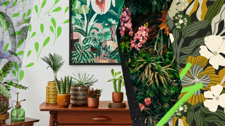
Explore the bold botanical design trend shaping 2026, from lush patterns and floral design to branding, interiors, and nature-inspired creative projects rooted in biophilic aesthetics.
Learn what font Disney uses, why it’s not downloadable, and discover Disney-style font alternatives to recreate that iconic, playful branding style in your own designs.
Explore PowerPoint templates with professionally designed layouts to create polished, modern, and visually cohesive presentations.