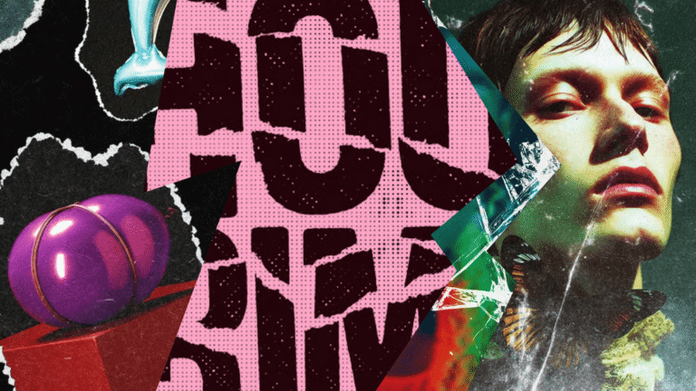
The grunge design trend: Why raw, messy aesthetics are back (and how to use them in 2026)
Discover why grunge design is trending again in 2026 and how to use textures, distressed type, and controlled chaos without sacrificing clarity or hierarchy.
Envato: Get every type of asset for any type of project, and access to AI tools. Start now
Want to learn how to evoke all the emotions of the rainbow using color? Here are the top color palettes that evoke emotion and the color psychology behind them...
TL;DR: Color isn’t just something we see; it’s something we feel. Every shade sparks emotion, shapes perception, and guides how people experience design. Understanding color psychology helps you move beyond aesthetics and use color with purpose, whether you’re building trust, sparking excitement, or creating calm.
When used thoughtfully, color becomes one of the most powerful storytelling tools in a designer’s palette, influencing mood, behavior, and even decision-making. With the right color choices, your visuals don’t just look beautiful, they connect, inspire, and leave a lasting emotional impression.
Ever noticed how some color palettes seem to pop up everywhere in design, while others quietly fade away? Or why brands lean so heavily on certain hues when crafting ads and visuals? It all comes down to two words: color psychology.
Most of us instinctively link colors to feelings. Blue feels calm and trustworthy; red feels bold, passionate, sometimes even dangerous. But what’s really happening behind those associations, and why do they matter so much in design?
Color psychology is essentially the science of emotion through color. It’s about using shades and tones to influence how people think, feel, and respond. Sure, personal experiences and moods can shape our reactions, but color psychology offers a creative framework, a kind of emotional color map, that helps designers craft visuals with intention.
When you understand how color works on the mind, you can use it to design experiences that resonate deeply and linger long after the first glance.
Color psychology explores how color shapes our perception of the world and subtly influences our emotions, decisions, and even buying habits. In essence, it’s the study of how we respond to color on both a psychological and emotional level.
Colors don’t just decorate our surroundings; they communicate. They can calm or energize, build trust or spark urgency, soothe or excite. Understanding this connection allows creatives, marketers, and designers to use color intentionally, not just because it “looks nice,” but because it feels right for the message they want to send.
When you grasp the psychology behind color, choosing a color palette becomes a strategic, emotion-driven decision rather than a matter of taste or design trend. It’s about guiding how people feel when they interact with your personal brand or design projects.
If you’re ready to infuse more meaning into your creative work, here’s a look at the top colors that stir emotion, and the psychological theory behind how and why they resonate.
Few colors command attention quite like vermilion red. It’s the color of energy, passion, and intensity, instantly stirring emotion wherever it appears. From stop signs to sale banners, red has a way of saying “look here” before anything else does. That magnetic quality is exactly why it’s so powerful in branding, marketing, and design.
Psychologically, red is known to heighten alertness and even quicken physical responses. Studies show that athletes facing competitors in red are more likely to lose, and students exposed to red before an exam tend to perform slightly worse; it literally gets the heart racing. But that same rush can also be harnessed in exciting ways.
Red’s associations with love, excitement, and impulsivity make it ideal for sparking action. That’s why it thrives in call-to-action buttons, flash sales, and limited-time offers, anywhere you want to create urgency and drive immediate response.
However, red’s power lies in its restraint. A little goes a long way. Used sparingly, it can feel luxurious or iconic, as seen in Christian Louboutin’s red soles or Coca-Cola’s classic red-and-white palette. But overdo it, and the emotion shifts from thrilling to overwhelming. The trick is balance, let red amplify emotion, not overpower it.
Positive associations:
Negative associations:
Ready to harness the intensity of this powerful hue? Explore our Ruby Red Collection on Envato, a curated set of assets perfect for adding boldness, heat, and passion to your next creative project.

If red is all fire and adrenaline, phtalo blue is its cool, composed counterpart, the color of calm, trust, and clear thinking. Often associated with the sky and the sea, blue brings a sense of depth and expansiveness to design. It’s no wonder that blue consistently ranks as the world’s favorite color; it feels familiar, soothing, and balanced.
Color psychology research shows that blue environments can actually boost productivity and focus, making it an ideal color for offices, digital interfaces, and professional branding. From airy Azure tones to dependable Navy, blue has a broad emotional range, able to feel refreshing or deeply grounded depending on the shade.
It’s also a go-to for brands like Facebook, LinkedIn, and American Express, which rely on blue’s association with trust, stability, and reliability to reinforce their credibility. While it can sometimes lean into feelings of detachment or melancholy, overall, blue brings a serene, confident energy that inspires calm and connection.
Positive associations
Negative associations:
Want to weave calm, clarity, and reliability into your next project? Explore the Blue Illusion Collection on Envato, a curated set of blue-inspired design assets that bring focus and serenity to any creative canvas.
Bright, bold, and full of energy, mustard yellow is the color of optimism and creative spark. Chosen as one of Pantone’s Colors of the Year for 2021, it embodies warmth, hope, and possibility. Think of sunflowers stretching toward the sun or the vibrant zing of citrus fruit, yellow brings instant light and life wherever it appears.
As the lightest and most radiant color on the spectrum, yellow has an unmatched ability to lift moods and ignite inspiration. It’s the shade of fresh starts and innovative ideas, making it a natural fit for designs that want to energize or motivate. In branding, yellow often communicates friendliness and fun; it’s approachable, happy, and confidently upbeat.
But like the sun itself, too much exposure can be overwhelming. Because yellow has one of the longest wavelengths, it can quickly shift from cheerful to agitating, triggering tension or frustration when overused. Studies have even shown that excessive yellow may cause babies to cry more frequently!
That said, when used thoughtfully, yellow is a master mood-booster. Its high visibility makes it perfect for signage, callouts, and fast-food branding, where quick recognition and stimulation are key. Iconic brands like McDonald’s, Subway, and Denny’s use yellow to evoke warmth, energy, and appetite, all tied to positive, social experiences.
Positive associations:
Negative associations:
Want to add some sunshine to your next creative project? Explore the Sunshine Yellow Collection on Envato, a radiant curation of templates and design assets that channel positivity, playfulness, and pure creative joy.
Perfectly placed at the center of the color spectrum, color green is the hue of harmony, renewal, and balance. It’s the color of life itself, lush forests, new growth, and the promise of spring. Much like blue, green brings a sense of calm and reassurance, grounding our emotions and helping us reconnect with nature.
Scientifically speaking, green is also one of the easiest colors on the eyes. Because it requires no adjustment when it hits the retina, it can reduce eye strain and promote visual comfort. That’s why it’s often used in night vision displays; our eyes can perceive more shades of green than any other color.
In design and branding, green radiates health, freshness, and sustainability. Brands like Whole Foods, Land Rover, and Starbucks embrace green to reflect wellness, growth, and environmental care. In interior spaces, performers traditionally wait in a “green room” before going on stage, a calming tradition that speaks to green’s restorative influence.
Of course, like all colors, green has its contrasts. While it’s a symbol of vitality and prosperity, it can also hint at envy, jealousy, or stagnation when misapplied. The key lies in tone; rich emeralds convey sophistication, while pale mint feels fresh and friendly.
Positive associations:
Negative associations:
Bring the calm, freshness, and natural harmony of green into your next project with our Go Green Collection on Envato, a handpicked range of design templates and assets inspired by nature’s most balanced hue.
Soft yet expressive, color pink has long been associated with love, warmth, and compassion. It embodies traditionally feminine qualities like gentleness, care, and kindness, but today, it’s also recognized as a color of creativity, transformation, and modern individuality.
From bold magenta tones to delicate Living Coral, pink carries a surprising emotional depth, making it both versatile and impactful.
Psychologically, pink encourages empathy and imagination. It’s often used to convey emotional connection and support, qualities that make it especially resonant in wellness, beauty, and lifestyle branding. On a deeper level, pink can spark creativity, symbolizing the birth of new ideas and fresh perspectives.
But like every color, pink has its contradictions. When overused or poorly balanced, it can come across as immature, frivolous, or impulsive. The wrong shade can quickly shift a design from sophisticated to superficial. The key lies in intention, knowing whether your palette is meant to soothe, excite, or disrupt.
In branding, pink has made a bold comeback thanks to the Millennial Pink trend that began in 2016. This muted, gender-neutral tone spread across social media feeds, product packaging, and runway palettes, redefining pink as a color of cultural relevance and modernity. Meanwhile, Pastel Pink remains a go-to for brands seeking a youthful, soft, and contemporary aesthetic.
Positive associations:
Negative associations:
Want to add a touch of warmth and modern flair to your next project? Explore the Flamingo Pink Collection on Envato, a curated selection of pink-inspired assets designed to infuse your work with creativity, confidence, and charm.
Pure, simple, and endlessly versatile, white is the color of clarity and new beginnings. Technically, it’s both the reflection and the absence of all color, making it a visual and symbolic “clean slate.” For centuries, white has been tied to purity, innocence, and renewal, which is why it often appears in wedding attire, healthcare settings, and minimalist design.
In modern design psychology, white is more than just neutral; it’s transformative. It creates balance, breathes space into layouts, and allows other colors to shine. That’s why it’s such a favorite in contemporary branding and digital design: white can make any visual feel organized, fresh, and elevated.
However, when misused, white can lean toward sterility or emptiness, evoking feelings of isolation or emotional distance. The secret lies in context; pairing white with warmth, texture, or contrast brings it to life.
In the minimalist design movement, white has come to represent elegance, sophistication, and quiet confidence. Brands like Apple have mastered this balance, using sleek white visuals to signal innovation, modernity, and simplicity.
Positive associations:
Negative associations:
Want to embrace minimalism and add visual breathing room to your next project? Explore the Ultra White Collection on Envato, a curated range of clean, modern design assets that celebrate simplicity, balance, and timeless style.
If white is the color of light and beginnings, black is its elegant counterpoint, the total absorption of all color and the absence of light itself. This duality gives black a fascinating depth. It’s both mysterious and authoritative, representing power, sophistication, and strength, but also carrying associations with darkness, grief, and the unknown.
Psychologically, black commands respect. It’s sleek, serious, and timeless, qualities that have made it a cornerstone of luxury branding. Think Chanel’s refined minimalism, Nike’s bold modernity, or The New York Times’ understated authority. Black lends weight and confidence to any visual identity, creating an impression of control and professionalism.
Yet, its power can feel intimidating if used without contrast. Overuse may evoke feelings of oppression, coldness, or melancholy, especially in heavy blocks or low-light contexts. The balance lies in using black strategically, as an anchor for color, a frame for content, or a tool to emphasize depth and focus.
In digital design, black has taken on new life through dark mode, offering a more comfortable and contemporary user experience. This resurgence highlights black’s adaptability; it’s not just classic; it’s cutting-edge.
Positive associations:
Negative associations:
Looking to bring bold contrast and timeless sophistication to your next creative project? Explore the Raven Black Collection on Envato, a sleek set of assets designed to infuse your work with confidence, style, and dramatic impact.
Elegant, balanced, and quietly confident, gray sits between the extremes of black and white, embodying neutrality, wisdom, and modern sophistication.
Named one of Pantone’s Colors of the Year for 2021 (Ultimate Gray), it represents strength, steadiness, and a grounded sense of resilience. Like the color of mountain stone or smooth beach pebbles, gray feels timeless and enduring, solid in a world of change.
Gray’s versatility makes it a favorite in contemporary design. It’s often used as a foundation color, a sleek backdrop that allows bold ideas or vivid hues to stand out. When used with precision, gray can elevate visuals, giving them a professional, luxurious edge. That’s why major brands like Apple, Swarovski, and Mercedes-Benz rely on gray to communicate innovation, elegance, and dependability.
However, this neutrality can also be its downfall. In excess or in isolation, gray can feel flat or uninspiring, potentially evoking melancholy or fatigue.
It’s a color that needs context; pair it with a strong accent shade or use it to frame content rather than dominate the scene. Done right, gray becomes the quiet hero of design: subtle, confident, and enduring.
Positive associations:
Negative associations:
Want to create a sleek, balanced, and enduring design aesthetic? Explore the Graphite Gray Collection on Envato, a modern mix of design assets that bring stability, refinement, and understated power to your next creative project.
Radiant and timeless, gold is the color of achievement, prestige, and success. Long associated with luxury and abundance, it embodies the pinnacle of prosperity and power. From ancient treasures to modern branding, gold has always symbolized excellence and triumph, a visual shorthand for value and accomplishment.
Beyond its material connotations, gold also carries spiritual depth. It represents wisdom, enlightenment, and higher ideals, reflecting warmth, generosity, and optimism. Like sunlight, gold has a natural ability to illuminate everything around it, making it both uplifting and empowering.
In design, gold conveys elegance, confidence, and exclusivity. It adds richness to visual compositions and pairs beautifully with dark tones for a striking contrast. That’s why luxury and heritage brands such as Versace, Lindt, and MGM embrace gold to communicate opulence and authority.
Interestingly, gold also leans toward masculine energy, symbolizing the sun’s strength and vitality, whereas silver is often linked to the moon’s feminine sensitivity and reflection. However, gold walks a fine line. When overused or poorly balanced, it can shift from sophisticated to showy or superficial.
The key is subtlety, allowing gold to accent rather than overwhelm. Its visual and emotional impact comes from how it catches light and implies worth without needing to shout.
It’s no surprise that gold has consistently ranked among Envato’s top color trends for three consecutive years, with creators searching for gold textures, logos, backgrounds, and typography to elevate their designs. Its allure remains as strong as ever, a symbol of aspiration that never goes out of style.
Positive associations:
Negative associations:
Ready to add brilliance and prestige to your next project? Explore the Glittering Gold Collection on Envato, a handpicked curation of shimmering textures, luxe templates, and golden assets designed to make your work shine with sophistication and style.
Color isn’t just decoration, it’s communication. Every hue tells a story, stirs emotion, and shapes how people experience your work. Whether you’re designing a logo, building a brand, or curating a creative campaign, understanding color psychology helps you choose intentionally, so every shade supports your message and moves your audience.
We hope this guide helped you see how different colors can inspire, influence, and transform your designs. When used thoughtfully, color theory becomes a powerful design tool, one that turns visuals into experiences.
Want more color inspiration? Explore our latest creative guides and design color trends roundups:
Bring your next project to life, one color at a time.
Color psychology is the study of how colors affect human emotions, behavior, and perception. It helps designers use color intentionally to shape mood and influence audience reactions.
Red and yellow are the most eye-catching, they boost energy, urgency, and engagement, making them ideal for calls-to-action or sale campaigns.
Absolutely. For instance, black can symbolize power and elegance, but also mourning or menace. It’s all about context, tone, and balance in your design.
Choose colors that align with your brand’s message and personality. For example, blue promotes trust, red sparks excitement, and green conveys a sense of natural balance.
Cool tones like blue, green, and soft gray promote serenity, focus, and mental clarity, perfect for wellness, tech, or lifestyle brands.
Discover why grunge design is trending again in 2026 and how to use textures, distressed type, and controlled chaos without sacrificing clarity or hierarchy.
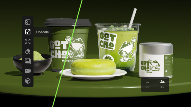
Learn how to upscale images with AI using ImageEdit. Enlarge photos 2x or 4x while preserving sharpness, texture, and detail for print, design, and marketing.

Swash fonts add a touch of drama and elegance to any design. Explore our curated selection of fonts with swashes and flowing tails to give your typography that extra flourish your projects deserve.

Explore 27 Norse fonts for standout branding in 2026, from rune-inspired and Viking display styles to modern Scandinavian typefaces with bold character.