How to edit with AI using Envato stock photos
Learn how to edit with AI on Envato stock photos, customizing images instantly by removing objects, changing backgrounds, and creating polished visuals without leaving the platform.
Envato: Get every type of asset for any type of project, and access to AI tools. Start now
A practical guide to creating AI infographic design systems using GraphicsGen and Illustrator workflows.

Infographics are a powerful way to turn complex ideas into clear, engaging visuals. Whether you are working with dashboards, educational explainers, or marketing graphics, they help people quickly understand patterns, comparisons, and processes. However, creating a polished AI infographic design where every icon, arrow, and chart feels consistent can still be challenging, especially when managing a smooth Illustrator workflow.
This is where AI design tools come in. Instead of building everything from scratch, you can generate a structured layout with a clear hierarchy and balanced visuals. From there, you refine and personalize the design, adding your own creative direction to make it stand out.
In this tutorial, you will learn how to create an AI infographic design using Envato’s GraphicsGen (AI infographic generator) and Adobe Illustrator. You will move from concept to final export while building a reusable system that scales across projects.
AI infographic design is the process of using artificial intelligence tools to generate, structure, and enhance visual data layouts. It combines automation with human creativity to produce scalable, consistent, and visually engaging infographics.
Instead of relying on fixed templates, AI tools generate layouts based on your input. This gives you a flexible starting point that you can refine, customize, and adapt for different use cases.
These tools work together to create a fast and flexible AI infographic design workflow.

Let’s move from idea to system. This is where the magic becomes method.
Before opening any AI tool, define your idea clearly. This step determines whether your infographic simply looks good or actually communicates something meaningful.
Start by identifying your core message. Ask yourself what the viewer should learn or remember. Then decide how the information should flow, whether that is top to bottom, left to right, or in a circular layout.
Next, break your infographic design into clear sections:
Grab a pen and sketch a rough layout. At this stage, don’t worry about aesthetics. Without this step, AI won’t be able to amplify your idea; it will just generate beautifully arranged chaos.
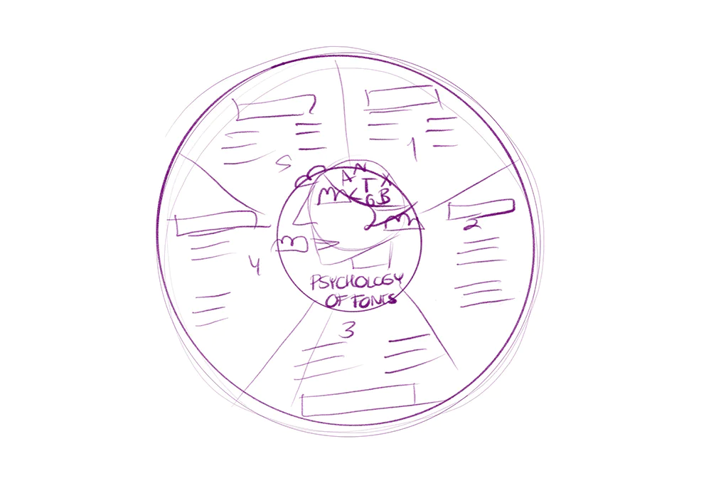
Now the fun begins. Open your AI infographic generator and start crafting prompts. Define the style (flat, isometric, minimal). Specify the color tone (neutral, vibrant, monochrome). Control the level of detail (simple vs. detailed). For the ‘Psychology of Fonts’ infographic, we used these prompts:
Generate multiple variations until you reach the image you need. Treat this as a brainstorming session. Once satisfied, export your components as SVG files.

Open up Illustrator and create a New Document (Command-N). Then start importing your SVG files using File > Place. This is where all those AI-generated pieces will come together as part of your Illustrator workflow. If you have many elements, it might feel like visual clutter. The goal here is to group similar elements together:
Once your assets are categorized, proceed to set up layers.
This step might not feel glamorous, but it’s important when you’re working with complex infographics. A well-organized file makes data visualization easier, from adjusting layouts to scaling your design later.

When you import AI-generated elements into infographic templates, you’ll often notice small inconsistencies. You might see different line thicknesses, proportions that are slightly off, or colors that don’t quite match. This part is all about cleaning up those details and making everything look cohesive.
Start by adjusting your main elements:
Then use Illustrator’s built-in tools to set your design:
For this infographic, we refined the pie chart’s color palette, using a warm, bold range of tones: #630D16, #E9D8A6, #D4AF37, #F98637, and #8B0000. These colors help separate each section while still feeling cohesive and balanced. To strengthen the composition, a circle was added at the center that serves as both a visual anchor for the main headline and a supporting graphic, guiding the viewer’s eye and balancing the layout.
Then we added five distinct font styles from Envato that showcase different typographic personalities.
Once you have added your text, it’s time to build your reusable elements library. Open the Libraries panel (Window > Libraries), and then create a library file to save fill colors, Stroke colors, and visuals as Graphics. Organize everything by category and label things clearly to keep everything tidy. While it’s optional, having this setup will become your go-to design toolkit for all your future projects, making your workflow much smoother and more enjoyable.

Now that you’ve got your design system ready, it’s time to get it out there for real use. Make sure to export your files in the formats you’re going to need for different platforms:
Then, don’t just stop at one project. A solid infographic is a reusable asset. Share your setup by:
This is where things get really rewarding. With a clear system, keeping your visuals consistent is a breeze, and scaling your designs becomes way easier.

AI can speed things up, but it doesn’t replace good design judgment. Here are some of the most common pitfalls to watch out for when creating your infographic:

Want to level up? Here are some solid tips to keep in mind.
An AI infographic generator like GraphicsGen takes your basic text prompts and turns them into full visual assets. This includes everything from layouts to icons and other design elements, making it super easy to create visuals.
Absolutely. GraphicsGen creates SVG files that are vector-based, so you can easily tweak and polish them in Adobe Illustrator.
Stick to a unified color palette, typography, and stroke styles. Features like Illustrator’s Recolor Artwork tool and libraries help maintain visual harmony.
Yes. Infographic assets created with Envato tools are licensed for commercial use, provided you have an active subscription.

AI infographic design is not about replacing creativity. It is about speeding up the parts of the process that slow you down.
By combining GraphicsGen with Illustrator, you can generate ideas quickly, refine them with precision, and build reusable systems that scale. This approach helps you create consistent, high-quality visuals in less time while focusing on what matters most: your creative direction.

Header image: Data analysis with statistics – Flat Illustration by limitype
Learn how to edit with AI on Envato stock photos, customizing images instantly by removing objects, changing backgrounds, and creating polished visuals without leaving the platform.

Designers and video pros work differently, but the friction is the same: too many tabs, too many tools, too many logins. Here's what staying in flow looks like with everything in one place.

Compare AI vs stock images to learn when each works best for customization, realism, speed, and commercial use in a modern creative workflow.

Discover how Envato GraphicsGen helps creatives with this AI graphics generator guide for icons, vectors, illustrations, and more.