Movie typography in 2026: why does it suddenly look so good?
Explore movie typography trends shaping 2026, from bold film fonts to cinematic branding, with inspiring examples and practical tips for creating impactful, screen-ready typography.
Envato: Get every type of asset for any type of project, and access to AI tools. Start now
It started as a gemstone, dazzled Renaissance masters, and now lives in your digital palette. Ultramarine blue is anything but ordinary.

Bold. Brilliant. Just a little bit bougie. Ultramarine blue isn’t your average pigment — it started life as powdered lapis lazuli, a semi-precious stone so luxurious it was once worth more than gold. Today, digital artists can summon its vivid charm with a simple hex: #4166F5. Want to go darker and moodier? Dip your brush into phthalo blue and thank us later.
Today, we’ll examine everything from the psychology of ultramarine blue to its history and famous uses in branding, art, and design. We’ll also give you some ultramarine-forward color palettes for your designs.
We have created five gorgeous ultramarine blue color palettes you can use to incorporate this versatile color into your designs.
Why not try a monochromatic palette if you’re looking for a harmonious ultramarine blue palette? These palettes combine variations in the hues’ tints, tones, or shades. We chose shades of ultramarine blue for our monochromatic palette below. To do this, we’ve added increasing percentages of black to darken the original ultramarine blue hue.
The hex, CMYK, and RGB codes for this palette are:
| Ultramarine blue | Han blue | Dark blue-gray | Arsenic | |
| Palette |  |  |  |  |
| Hex code | #4166F5 | #586FCA | #606DA0 | #41434B |
| CMYK | 82 60 1 1 | 74 55 0 0 | 67 52 8 9 | 74 63 54 41 |
| RGB | 65 102 245 | 88 111 202 | 96 109 160 | 65 67 75 |

Choose colors on either side of ultramarine blue on the color wheel to create a stunning analogous palette. Analogous colors play well together, creating a cohesive, harmonious color scheme.
| Turquoise | Brilliant azure | Ultramarine blue | Majorelle blue | |
| Palette |  |  |  |  |
| Hex code | #42D7F5 | #429EF5 | #4166F5 | #5842F5 |
| CMYK | 56 0 7 0 | 65 30 1 0 | 82 60 1 1 | 85 79 0 1 |
| RGB | 66 215 245 | 66 158 245 | 65 102 245 | 88 66 245 |

Take a deeper dive into color theory with this terrific video for beginners.
Create a complementary color scheme by pairing ultramarine blue with the opposite color on the color wheel. Together, these colors create a beautiful, eye-catching, and exciting contrast. We have added two shades of maize, the color opposite ultramarine blue, to bring depth and harmony to the color scheme.
| Ultramarine blue | Maize | Bronze | Olive camouflage | |
| Palette |  |  |  |  |
| Hex code | #4166F5 | #F5C742 | #A38E4D | #5C5339 |
| CMYK | 82 60 1 1 | 5 21 81 0 | 40 40 80 3 | 62 58 84 30 |
| RGB | 65 102 245 | 245 199 66 | 163 142 77 | 92 83 57 |

Creating a triadic color scheme is easy. Simply pick three colors equally spaced on the color wheel. This yields quite a colorful palette, so adding shades of your triadic colors is a good idea to create a more nuanced and grounded palette. We added a shade of Chinese orange as the fourth color in our palette.
| Ultramarine blue | French lime | Chinese orange | Deep taupe | |
| Palette |  |  |  |  |
| Hex code | #4166F5 | #9BF542 | #F56B42 | #795C53 |
| CMYK | 82 60 1 1 | 42 0 86 0 | 0 71 77 0 | 50 60 62 22 |
| RGB | 65 102 245 | 155 245 66 | 245 107 66 | 121 92 83 |

If you’re looking for a color scheme full of dynamism, the tetradic color palette is for you. The palette is made up of two pairs of complementary colors. To create this palette, start with your dominant color (in this case, ultramarine blue), and then draw a rectangle or square on the color wheel. Each of the other three corners of the rectangle/square will fall on the colors that complete your tetradic scheme.
The colors in this palette can be pretty loud, so it might be helpful to use neutrals like white, gray or black, and/or tints, tones, and shades of your triadic colors to keep your design from becoming visually overwhelming.
| Ultramarine blue | Maize | Magic potion | Screamin’ green | |
| Palette |  |  |  |  |
| Hex code | #4166F5 | #F5C742 | #F54268 | #42F55F |
| CMYK | 82 60 1 1 | 5 21 81 0 | 0 87 40 0 | 57 0 81 0 |
| RGB | 65 102 245 | 245 199 66 | 245 66 104 | 66 245 95 |

As we all live under a vast blue sky, blue is one of the most familiar and natural colors. It’s most often associated with serenity and calmness. For this reason, it is often used in interior design, where it can improve our homes and offices by helping to reduce feelings of stress and anxiety. The hue of blue used, though, heavily influences its impact. Too cool a blue can be seen as cold, icy, and uninviting.
In antiquity, ultramarine blue was so rare and expensive that it was only used by the rich or for special occasions, so it became associated with purity and wealth. Over time, it became linked to feelings of tranquility and stability.
In branding, it’s often used to convey trust, professionalism, security, and reliability. This is why financial institutions and health & wellness businesses often use it.
Learn more about the best logo color schemes and dive deeper into color psychology in this video:
Ultramarine blue is one of the oldest blue pigments in the world. It was initially made from a semi-precious stone found in northern Afghanistan called ‘lapis lazuli’ — Latin for the blue stone.
The first known use of this blue stone was in mural paintings around the 6th-7th century BC in the Bamiyan crypt in Afghanistan, and it can be found as far afield as Egypt, where it was inlaid in the 14th century BC Mask of Tutankhamun.
From the 14th century, the stone travelled via the Silk Road from Afghanistan to Europe. Italian traders brought it into the ports of Venice and ground it into a fine powder, which was then called ultramarine blue pigment. The name ultramarine comes from the Latin word ultramarines, which means “beyond the sea” and is a nod to its origins in the faraway mines of Afghanistan.
The pigment was incredibly labor-intensive and time-consuming, and only a relatively small amount of pure pigment could be extracted from the stones at any given time. This, combined with the distance the stone had to travel to Europe, made it extremely expensive, and at one time it was considered more precious than gold.
Early Renaissance artists were attracted to its intensity of color, but many couldn’t afford it. Those who could reserved it for significant (usually religious) works, and they used it sparingly even then.
It wasn’t until the discovery of a more affordable synthetic version of the pigment by Jean-Baptiste Guimet in 1826 that ultramarine blue paint, also known as French ultramarine blue, became enormously popular and widely used across Europe.
From the early importation of lapis lazuli into Europe and the creation of ultramarine blue pigment from this semi-precious stone, the color has had a rich history in art and design. Let’s look at some of the most popular uses of this incredible color in various industries.
From the 14th century until today, artists have prized ultramarine blue. During the Renaissance period in Europe, artists who could afford it often used it sparingly because of its cost and rarity.
Seen as a representation of wealth and purity at the time, ultramarine blue was reserved for important religious paintings, where it depicted the robes of the Virgin Mary and other holy figures. Sandro Botticelli, for example, incorporated it in his Virgin Adoring the Sleeping Christ Child (1485).
Artists like Michelangelo and Johannes Vermeer used ultramarine blue, but it was so expensive that Michelangelo struggled to afford it, and Vermeer’s frequent use of it pushed him into debt. His 1665 painting The Girl with the Pearl Earring is an excellent example of his use of ultramarine blue pigment.
Later painters like Pierre-Auguste Renoir were luckier: they could use a synthetic version of ultramarine blue, which was both very affordable and readily available. Renoir began his painting The Umbrellas in 188,1, using cobalt blue, in the figures on the right side of the painting. He paused painting the piece for a few years, and when he returned to it, he used synthetic ultramarine blue to complete the left side of the painting and for the umbrellas.
In 1960, French artist Yves Klein trademarked a version of ultramarine blue that he used extensively in his work, calling it “International Klein Blue.”
The rich history of ultramarine blue has always attracted fashion designers and brands that use the color in haute couture and street style in their runway shows.
One of the great things about ultramarine blue is that it can be used across the seasons. An ultramarine handbag or shoes make a bold statement piece, as is the case with these All Stars Converse sneakers in ultramarine blue.
And don’t think ultramarine has just been reserved for runways, shoes, and bags. Ultramarine blue in cosmetics is one of those trends that fashionistas can’t get enough of.
With its association with professionalism, stability, security, and reliability, it stands to reason that several financial institutions would choose ultramarine blue for their branding. American Express is one such company that primarily uses the color in its branding.
Visa also uses an ultramarine blue logo to underscore the company’s commitment to providing safe and trusted payment solutions.
But financial brands aren’t the only ones to use ultramarine blue. Brands in the health and wellness industry also use the hue. Oral-B uses ultramarine blue as its brand color to convey trustworthiness, reliability, and efficiency, all crucial for an oral care brand.
A: Ultramarine is blue, though it does have violet undertones.
A: Ultramarine is a cool color, although it is generally considered a warmer blue among different types of blue.
A: Digital creatives can achieve ultramarine blue using the hex code #4166F5.
A: Phthalo blue and cobalt blue are close to ultramarine blue, but there are key differences between the hues to bear in mind.
Hooked by ultramarine blue? Then you’ll need plenty of resources to incorporate into your creative projects. Check out this collection of terrific ultramarine blue creative assets from Envato.
If you want to explore other trending, terrific colors that can help you create stand-out projects, read about oceanic blue, cerulean blue, mustard yellow, and the psychology of green.
Explore movie typography trends shaping 2026, from bold film fonts to cinematic branding, with inspiring examples and practical tips for creating impactful, screen-ready typography.
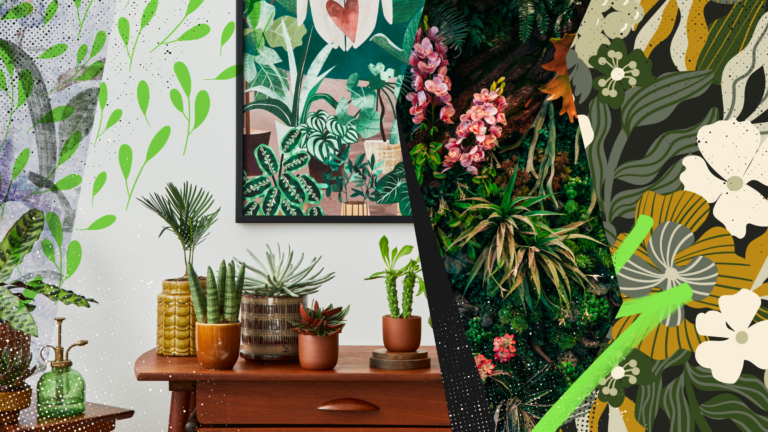
Explore the bold botanical design trend shaping 2026, from lush patterns and floral design to branding, interiors, and nature-inspired creative projects rooted in biophilic aesthetics.
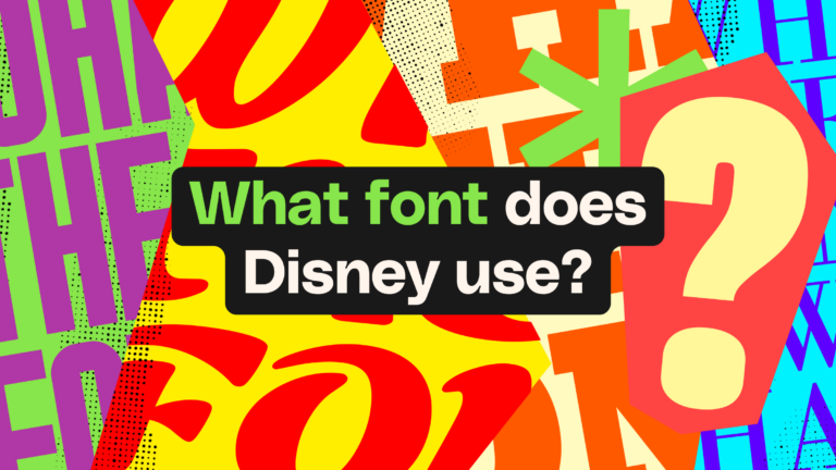
Learn what font Disney uses, why it’s not downloadable, and discover Disney-style font alternatives to recreate that iconic, playful branding style in your own designs.
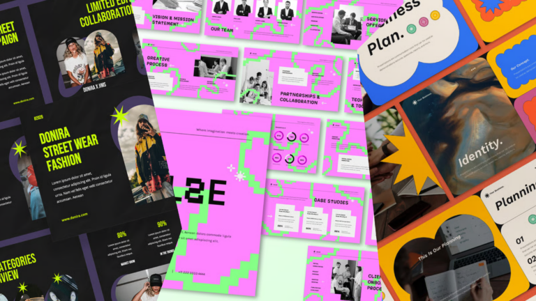
Explore PowerPoint templates with professionally designed layouts to create polished, modern, and visually cohesive presentations.