Envato: Get every type of asset for any type of project, and access to AI tools. Start now

27 Best Norse fonts (Viking, rune, and Nordic-Style fonts) for 2026

Norse fonts possess a mythical, ancient quality that can transform any design project. If you’re in the market for Nordic-inspired typefaces, you’ll love this curated collection for 2026.

Jessi Fuentes 32min read
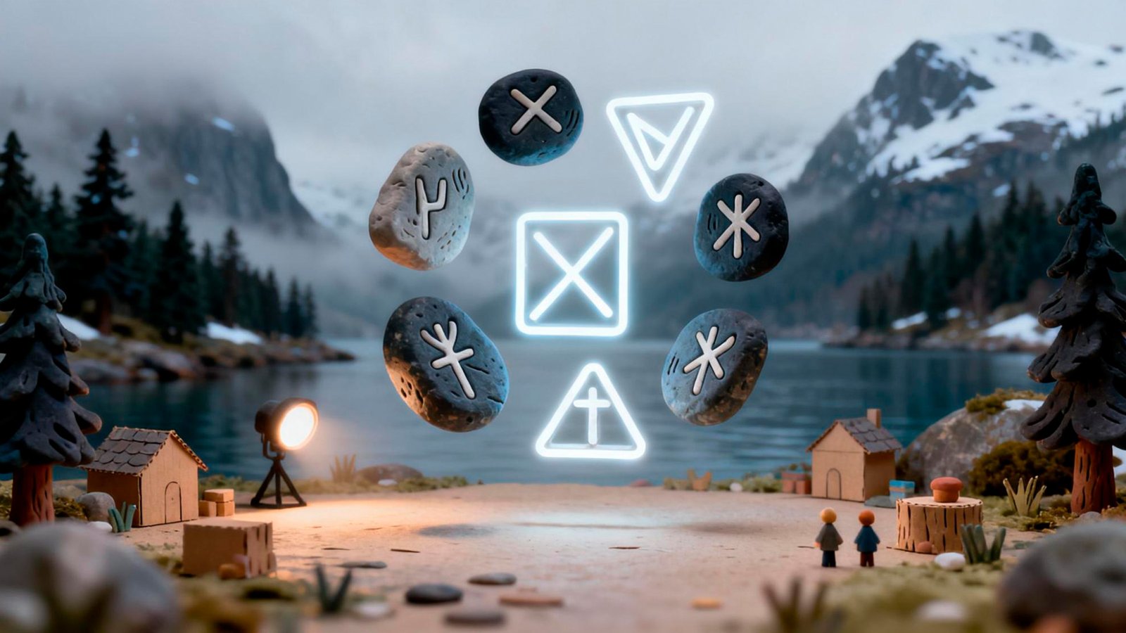
Norse fonts and Nordic runes displayed as glowing symbols on ancient stones with mountain lake landscape, showcasing traditional Scandinavian typography and runic alphabet

Norse fonts turn strength, myth, and heritage into typography you can actually use. This guide rounds up 27 of the best Nordic-style options for 2026, from raw rune-inspired and Viking display faces to decorative Scandinavian styles and clean, modern Nordic typefaces — with practical tips for getting the most out of each one.

Every featured font is available on Envato (along with our font preview tool), which puts millions of artist-made assets and AI tools in one creative subscription, so you can find the right typeface and everything else your project needs in one place. Envato’s font preview tool lets you test each one before you commit.

Last updated: August 2026.

What are Norse fonts?

Norse fonts are decorative typefaces inspired by Scandinavian history, Viking culture, and Norse mythology. They’re designed to feel ancient and tactile, often mimicking letters carved into wood, stone, or metal rather than drawn with modern tools.

Instead of clean, polished lines, Norse fonts lean into rough edges, sharp angles, and uneven strokes. Many take visual cues from historical runic writing systems, such as the Elder Futhark alphabet. Designers use them to evoke strength, myth, and heritage in logos, posters, game titles, album artwork, and branding tied to Viking or medieval worlds.

Nordic fonts vs. Norse fonts: Is there a difference?

The terms Norse fonts and Nordic fonts are often used interchangeably, but they don’t mean exactly the same thing.

  • Norse fonts are rooted in history, drawing inspiration from the Viking Age, runes, Norse mythology, and carved lettering. They tend to feel raw and ancient, with sharp angles and hand-forged details that echo stone inscriptions and wooden rune carvings.
  • Nordic fonts, on the other hand, are a broader and more modern category. They reflect Scandinavian culture as a whole, often featuring clean lines, minimalist forms, and the functional simplicity associated with contemporary Nordic design.

In practice, designers usually use Norse-style fonts for Viking, medieval, or myth-inspired projects, while Nordic-style fonts lean toward modern, minimalist, or folk-influenced aesthetics.

Key characteristics of Northern European typography

Like any typographic style, Norse and Nordic fonts share a set of visual traits that make them easy to recognize once you know what to look for. From ancient rune-inspired letterforms to clean, modern Scandinavian type, these characteristics help define the distinct aesthetic of Northern European typography.

Use the features below as a quick visual checklist — especially handy when you want to choose the right font or level up your typographic instincts.

Graurinko Norse font displayed over traditional Scandinavian cabin photograph

1. Angular construction

Rooted in ancient runic writing systems of Northern Europe, this style favors sharp angles and straight lines over soft curves. This angular construction reflects its historical origins in stone and wood carving, where clean cuts mattered more than fluid strokes.

2. Geometric precision

Modern Nordic fonts often emphasize balanced proportions and simple geometry. The result is a calm, functional elegance that prioritizes clarity, legibility, and structure — a hallmark of contemporary Scandinavian design.

3. Bold, commanding presence

Norse typefaces tend to carry strong visual weight. Whether rugged or refined, they project confidence and durability, echoing the strength and resilience commonly associated with Viking and Scandinavian culture.

4. Strong vertical structure

Inspired by early runic alphabets like Elder Futhark, many Northern European fonts rely on strong vertical strokes and deliberate spacing. This vertical emphasis makes them especially effective for headlines, logos, and short display text.

5. Symbolic and decorative details

Folk and decorative styles often embed Nordic symbolism directly into the glyphs. Common motifs include runes, stars, knotwork, mountains, and nature-inspired shapes that add cultural texture without overwhelming the letterforms.

6. Organic, handcrafted texture

From weathered, distressed Viking display fonts to subtle imperfections in modern designs, Northern European typography often feels tactile and human-made rather than purely digital or overly polished.

7. A spectrum from raw to refined styles

Northern European typography spans a wide aesthetic spectrum, from ancient, battle-worn styles to sleek, minimalist Nordic typefaces. What unites them is a shared European cultural foundation and a strong sense of symbolism and place.

Popular Norse and Nordic fonts that designers are using in 2026

In 2026, designers are leaning into Norse fonts when projects call for grit, mythology, and unmistakable character. You’ll see these typefaces everywhere, from branding and album artwork to game UI, posters, tattoos, and fantasy-inspired web design.

Whether you’re channeling raw Viking energy or a cleaner, modern Nordic minimalism, the right typeface sets the tone fast. Below, we’ve grouped the best Norse and Nordic fonts by category and shared practical tips for using them effectively in real-world creative projects.

Rune-inspired Norse fonts

Rune-inspired typefaces are a subset of Norse fonts, inspired by Viking-era Scandinavia and early Norse culture. They draw from ancient runic alphabets and carry a strong sense of history, symbolism, and myth. Influenced by Norse and Germanic traditions, particularly the Elder Futhark, these fonts echo letterforms originally carved in stone, wood, or metal.

Defined by angular shapes, strong vertical strokes, and rough, chiseled textures, rune-inspired fonts feel distinctly ancient and timeworn. Because of that heritage, they work best in display-focused designs such as fantasy branding, game titles, book covers, and poster art. Rather than feeling modern or refined, they feel handcrafted and expressive—ideal when you want typography to suggest legend, ritual, or a deeper narrative layer.

1. Nordica – Norse-style font

The beautiful Nordica font helps you bring the soul of the north into your design work. Designed with a raw, hand-sketched feel, Nordica channels Nordic heritage through rough edges and organic letterforms. It’s a strong choice when you want your typography to feel grounded, tactile, and a little untamed rather than polished or corporate.

Best for: posters, apparel design, branding, greeting cards, invitations, logos, and coffee packaging with a handcrafted, rugged aesthetic.

Tips for using it:

  • Let the texture do the talking. Nordica works best when its rough edges are left intact, so avoid heavy effects or over-processing.
  • Pair it with a clean, high-contrast sans serif for body copy to balance Nordica’s expressive style with modern readability.
  • Use earthy color palettes like forest green, slate gray, or burnt orange to amplify its Nordic, nature-driven aesthetic.

Watch out for:

  • Nordica includes uppercase characters only, along with numerals and basic punctuation, so plan your layouts accordingly.
  • Because of its heavy texture, it’s best reserved for headlines, logos, and short call-outs rather than long-form text.
  • At very small sizes, the sketched details can lose clarity, so keep it bold, spacious, and confidently sized.

Format: OTF, TTF

2. Scourge – Norse-style font

Scourge is a bold, textured runic typeface that includes uppercase and multilingual letters, numbers, and punctuation. Add this interesting Norse font to your special projects to give them a mysterious air. Thanks to its stone-carved feel, inspired by ancient inscriptions and forgotten monuments, it’s ideal for designs that need weight, drama, and a sense of myth or history.

Best for: Gaming titles, heavy metal branding, dark fantasy book covers, atmospheric event posters, and edgy streetwear with an ancient, rugged edge.

Tips for using it:

  • Keep backgrounds simple. Scourge’s built-in texture reads best on solid colors or very subtle imagery.
  • Increase tracking slightly to give each character space and enhance its monumental feel.
  • Stick to high-contrast palettes like black and white or deep stone grays to highlight the chiseled details.

Watch out for:

  • Scourge includes uppercase characters only, so it’s not suited for body copy or long text.
  • At smaller sizes, the heavy texture can affect legibility, so use it primarily for headlines.
  • It’s a visually dominant font; pair it carefully to avoid overpowering your layout.

Format: OTF, WOFF

3. Jotunheim – Norse-style font

Jotunheim is inspired by ancient runes. This Norse-style font features three distinct versions. The first is the cleanest and most legible style, the second is more complex with slightly reduced legibility, and the third is the most intricate and expressive of the three. 

Mix the three versions thoughtfully to achieve unique results without losing their ancestral characters. Its sharp geometry and layered symbolism bring the feel of ancient stone inscriptions into modern design, making it a strong choice for projects that lean into atmosphere, mythology, and visual depth. 

Best for: Cinematic title sequences, archaeological-inspired branding, high-concept game interfaces, luxury mystic packaging, and historical fiction book covers.

Tips for using it:

  • Use the three styles as a system. Keep the cleanest version for main titles, and bring in the more detailed cuts for logos or decorative moments where atmosphere matters.
  • Set it at larger display sizes so the sharp geometry and fine details feel intentional and easy to read.
  • Pair it with subtle, atmospheric visuals like stone, mist, or fabric textures to let the rune-inspired shapes stand out.

Watch out for:

  • The most intricate style works best as a supporting element, not for essential information.
  • Thin strokes can fade on light or busy backgrounds, so add contrast with overlays or texture separation.
  • Designed for short, impactful text, Jotunheim isn’t suited for long-form reading.

Format: OTF

4. Haext Bold – Norse-style font

Haext Bold combines the aesthetics of old Norse fonts with contemporary graphic expressions. Its tall, slender letterforms feel ritualistic yet refined, using sharp geometry balanced by a lighter visual weight. The result is a display font that feels expressive and atmospheric, making it a strong fit for storytelling-led design.

Best for: Boutique branding, spiritual or wellness editorials, minimalist record covers, experimental film titles, and artisanal social media graphics.

Tips for using it:

  • Increase tracking to highlight its slim proportions and give layouts a more editorial, airy feel.
  • Pair it with a clean, geometric serif to balance its rune-inspired character with modern elegance.
  • Subtle film grain or paper textures can help ground the delicate strokes and enhance its mood.

Watch out for:

  • While it includes special characters and accents, always check glyph support if you’re designing for specific Nordic languages.
  • Thin strokes can fade on busy backgrounds, so rely on strong contrast to maintain readability.
  • Reserve it for headlines or short statements, not for long-form text.

Format: OTF

5. Haext Pen – Norse-style font

Haext Pen has a strong influence of neo-gothic, rustic, and Scandinavian fonts. It’s fine, pen-like strokes feel organic and expressive, as if sketched with a quill rather than built on a grid. The result is a typeface that bridges historical rune-inspired forms with a contemporary, handcrafted aesthetic. 

Best for: Artistic posters, slow-fashion branding, independent book covers, wellness and spirituality graphics, and premium artisanal labels.

Tips for using it:

  • Create beautiful designs by pairing this Norse font with black and white or color.
  • Increase tracking to highlight its tall silhouettes and bring out the pen-drawn details.
  • Set it in light tones over dark, atmospheric imagery to emphasize its mystical quality.
  • Pair it with grainy or textured backgrounds, such as recycled paper or stone, to reinforce its rustic roots.

Watch out for:

  • Fine strokes can disappear on low-contrast or busy backgrounds, so keep layouts clean and readable.
  • At small sizes, the hand-drawn nuances may fade, making it better suited to display use.
  • Its strong gothic and runic personality isn’t ideal for corporate design. It works best in storytelling-led projects.

Format: OTF 

6. Old North – Norse-style font

Old North is a bold, rune-inspired display font built around strong geometry and an engraved, stone-cut feel. It captures the authority of ancient Scandinavian symbols while maintaining a clean, modern execution that keeps every letter sharp and deliberate. 

The result is a typeface that feels legendary and powerful without drifting into rough or unfinished territory.

Best for: Cinematic title cards, high-fantasy book covers, gaming logos, historical documentaries, and bold apparel branding such as gym wear or outdoor gear.

Tips for using it:

  • Use the stylistic alternates to break uniformity and create inscription-like lettering that feels coded and ancient.
  • Metallic finishes like aged silver, bronze, or steel amplify its forged, Nordic character.
  • Its weight and symmetry work best in centered, headline-driven layouts where it can take the spotlight.

Watch out for:

  • Test longer words carefully, as complex rune forms can tighten spacing in some combinations.
  • In busy photography, the heavy details may blur, so add contrast with overlays or subtle shadows.
  • Lowercase and uppercase styles differ in rune treatment, so choose the set that best matches your project’s tone.

Format: OTF, WOFF

Viking and medieval-inspired fonts

Viking and medieval Norse fonts capture the bold, historic spirit of Norse warriors and early Scandinavian kingdoms. Rooted in the Viking Age and medieval Europe, these typefaces feel solid and intentional, echoing letterforms carved into shields, weapons, and stone.

Drawing on runic influences and medieval ornamentation, they blend raw, geometric shapes with decorative details inspired by illuminated manuscripts. That combination makes them a natural fit for gaming logos, cinematic titles, event posters, and epic branding that needs drama and historical weight.

7. Lexaviers – Norse-style font

Lexaviers is an excellent font for giving your projects that strong Nordic touch. This bold, decorative display font features blocky letterforms balanced by distinctive circular details, giving the typeface a crafted, monumental feel inspired by ancient shields and carved stone. 

Confident and highly stylized, this Norse font works best when you need typography that leads the composition and makes an immediate impact.

Best for: Statement titles, t-shirts, labels, product packaging, event invitations, and bold advertising that needs a heroic, Viking-inspired focal point.

Tips for using it:

  • Mix uppercase and lowercase characters to create more dynamic logos or headline treatments.
  • When used with shadows or 3D effects, apply strong side lighting to enhance its carved, dimensional quality.
  • Pair it with a minimal sans serif for supporting text to keep attention on its decorative details.

Watch out for:

  • The small circular accents are essential to its look, so use sizes that keep those details sharp.
  • Its symmetry and weight suit centered, headline-led layouts better than long, left-aligned text blocks.

Format: OTF, TTF, WOFF

8. Mjölnir – Norse-style font

Mjölnir is a stunning tribal font inspired by the sharp geometry of Nordic runes and the legendary Viking era. This typeface strikes a beautiful balance between ancestral symbols and a clean, contemporary aesthetic, making it look incredibly sophisticated and visionary. 

It’s the perfect choice for creators who want to reference northern heritage through a modern minimalist lens and intricate tribal patterns.

Best for: High-impact headlines, unique logos, editorial titles, atmospheric posters, and branding for high-end products that want an “ancient-future” vibe.

Tips for using it:

  • The font offers uppercase and lowercase characters, special glyphs, and multilingual support. Use the uppercase characters for your primary focus—since they feature the most intricate tribal details—and the cleaner lowercase for supporting words to keep the design balanced.
  • Give this font plenty of negative space; its thin, precise lines look best in minimalist compositions where every detail of the glyphs can be appreciated.
  • It looks incredible in white over dark, foggy nature photography, reinforcing that ethereal and mysterious “soul of the north” feel.

Watch out for:

  • These letterforms are very delicate, so you’ll need a strong contrast between the text color and background. Without enough separation, fine strokes and intricate tribal symbols can easily disappear.
  • While this Norse font offers solid multilingual support and a wide range of special characters, some highly decorative glyphs can take a moment to read. Use them mainly for display text where visual impact matters more than speed.
  • The tribal aesthetic is very specific and visually dominant. Avoid pairing it with other heavily decorative elements, or the overall design can start to feel cluttered.

Format: OTF, TTF, WOFF

9. Noatun – Norse-style font

Noatun is a gorgeous and enigmatic font that reinterprets Viking letterforms through a modern, highly structured lens. Its sharp shapes and symbolic construction give it a mythic presence that feels deliberate and architectural rather than rough or distressed. With two stylistic versions included, Noatun lets you dial in the exact level of complexity your design needs.

Best for: Cinematic titles, avant-garde logos, event posters, high-concept branding, and statement-led layouts where typography takes center stage.

Tips for using it:

  • It comes in two different versions and features a unique geometric style. Use Version 1 for clear, readable headlines, then introduce Version 2 selectively to add coded, symbolic accents.
  • Its consistent geometric width makes it ideal for stacked or vertical layouts with a monumental, totem-like feel.
  • Pair it with moody imagery or abstract dark textures to reinforce its mythic character.

Watch out for:

  • The more abstract forms in Version 2 work best in short words, where legibility isn’t critical.
  • You may need to fine-tune kerning on certain characters to balance visual weight across a headline.
  • This is a display-only font, so avoid using it for small text or long passages.

Format: OTF, WOFF

10. Solaire Rough – Norse-style font

Solaire Rough is a fantasy font with a runic feel to it.  It feels like a “font of sunlight” found in an ancient northern kingdom, blending organic, hand-drawn textures with mystical symbols that ignite the imagination. 

For designers looking for versatility, this Norse font is a hidden gem: some letters have alternates that can be toggled via caps lock, making it as functional as it is beautiful.

Best for: Epic fantasy book covers, medieval-themed branding, cinematic credit sequences, RPG game interfaces, and luxury artisan labels that need a touch of old-world magic.

Tips for using it:

  • This font responds beautifully to bevels, embosses, and outer glows, enhancing its “magical artifact” presence in digital art.
  • It pairs beautifully with a simple, elegant script or a clean serif, creating a look that feels balanced and sophisticated.

Watch out for:

  • Some of the alternate characters have strong symbolic elements (like the ‘O’ with a diamond center); use them as focal points rather than in every single word to keep the design readable.
  • Because of its irregular, hand-drawn edges, you might need to do some manual kerning to ensure the letters sit together perfectly in tight layouts.
  • While it is a display font, its tall, vertical silhouette means it can take up quite a bit of room; plan your white space accordingly.

Format: OTF

11. Gareon – Norse-style font

The Gareon font features a unique, modern geometric style. Its sharp angles and wide, block-built forms feel modern and deliberate, delivering a strong sense of structure and authority. 

Designed to lead the composition, Gareon is ideal when typography needs to feel powerful, confident, and unmistakably present.

Best for: Logos, cinematic film titles, music posters, restaurant branding (such as steakhouses or grills), and high-impact designs that call for a modern Nordic look.

Tips for using it:

  • Stick to black and white to emphasize its sharp geometry and high contrast.
  • Use it as the primary visual element — Gareon has enough weight to carry an entire layout on its own.
  • Its consistent width makes it well-suited to stacked layouts, especially for logos and social media headers.

Watch out for:

  • Gareon is designed for uppercase display use, not body copy or long text.
  • Wide letterforms can overwhelm a layout if overused, so keep wording tight.
  • Fine-tune spacing between certain letter pairs to maintain visual balance in logo work.

Format: OTF, TTF, WOFF

12. Ornacle – Norse-style font

Ornacle is a futuristic display font that reimagines Norse-inspired forms through a sleek, digital lens. Its sharp geometry and pixel-like details give it a distinctly modern edge, blending rune-like structures with a tech-forward aesthetic. 

Confident and unconventional, Ornacle is ideal for designers exploring a more experimental, cyber-Nordic direction.

Best for: Futuristic logos, cyberpunk headers, sci-fi film titles, modern apparel graphics, tech branding, and bold urban posters.

Tips for using it:

  • Bright neon colors on dark backgrounds enhance its digital, holographic feel.
  • Use generous negative space and clean layout elements to let its geometry breathe.
  • High-contrast urban photography pairs well with its sharp, tech-driven forms.

Watch out for:

  • Fine dots and gaps can get lost on busy textures, so keep backgrounds simple.
  • This is a display font built for impact, not small text or long passages.
  • Adjust tracking where needed to keep blocky letter combinations visually balanced

Format: OTF, TTF

13. Nordiks – Norse-style font

Nordiks is an aggressive display font rooted in Norse mythology and heavy metal aesthetics. Its jagged, flame-like edges and dense letterforms deliver a raw, confrontational presence that feels forged rather than designed. Unapologetic and loud, Nordiks is built for projects that need attitude, intensity, and visual force.

Best for: Metal band logos, hardcore game titles, edgy streetwear branding, horror film posters, and designs that lean into a wild, Viking-inspired aesthetic.

Tips for using it:

  • High-contrast color choices like white, gold, or deep red on black help sharpen its serrated details.
  • Pair it with distressed textures such as rust, ink splatter, or worn metal to reinforce its underground feel.
  • Keep the copy short — one or two words deliver the strongest impact.

Watch out for:

  • Dense, thorn-like shapes can crowd together, so adjust tracking to maintain clarity.
  • At small sizes, fine edges disappear, making it unsuitable for reduced or secondary text.
  • Its extreme style isn’t designed for neutral or corporate branding contexts.

Format: OTF, TTF

Scandinavian folk and decorative-inspired fonts

Scandinavian folk and decorative-inspired fonts bring the warmth and storytelling spirit of Nordic folk traditions to life. Influenced by hygge, forest folklore, and traditional Scandinavian crafts, these typefaces feel cozy and handcrafted, like designs passed down through generations.

Drawing from Norse cultural heritage and folk art forms such as rosemaling, textiles, and illustrated motifs, they feature ornamental details, organic shapes, and nature-inspired symbols. 

This makes them a great fit for children’s books, festive branding, packaging, holiday stationery, and organic products that need an inviting, human touch.

14. Wild Dreams – Nordic-style font

This wonderfully whimsical Nordic font is a perfect display font inspired by Scandinavian folk art and storytelling. Each uppercase letter features delicate, illustrative scenes — from forests and mountains to night skies and campsites — turning typography into a visual narrative. Playful yet thoughtfully crafted, Wild Dreams is designed to spark curiosity and a sense of wonder in headlines.

Best for: Whimsical posters, children’s book titles, eco-friendly packaging, adventure-focused blog headers, greeting cards, and outdoor or camping lifestyle branding.

Tips for using it:

  • Use illustrated uppercase letters sparingly for keywords and balance them with cleaner lowercase characters.
  • Soft, nature-led palettes such as forest greens, muted pastels, or white-on-dark photography enhance its folk-inspired charm.
  • Choose words intentionally so the built-in illustrations help tell a visual story.

Watch out for:

  • Fine line details can disappear at small sizes, so keep text comfortably large.
  • Busy or high-contrast backgrounds can overwhelm the illustrations — simple backdrops work best.
  • This is a display font only, not suited for body copy or long passages.

Format: OTF, TTF, WOFF

15. Christmas Nordic – Nordic-style font

If you’re in the festive spirit? Try Christmas Nordic Font, a hand-drawn display font that will charm everyone who sees it. Each letter is filled with delicate hygge-inspired illustrations — from reindeer and snowflakes to pine trees and wooden cabins — giving your typography a warm, storybook feel. 

With both regular and bold styles included, it offers flexibility for festive designs that feel handcrafted rather than overly decorative.

Best for: Holiday greeting cards, seasonal packaging, winter event posters, children’s book titles, festive social media headers, and artisanal gift tags.

Tips for using it:

  • The font is offered in regular and bold styles and includes uppercase and lowercase characters. Use the regular style for detailed, lighter compositions, and switch to the bold version for headlines that need extra presence.
  • Classic Nordic Christmas colors like forest green, deep red, and soft white complement its illustrations beautifully.
  • Pair it with minimalist graphic elements to let the hand-drawn details take center stage.

Watch out for:

  • Fine internal illustrations can lose clarity at small sizes, so keep text comfortably large.
  • Lowercase characters are also highly detailed, which can feel busy if overused in long words or lines.
  • Its winter and Christmas motifs make it best suited to seasonal projects rather than year-round branding.

Format: OTF, TTF, WOFF

16. Paraoh – Sacred – Nordic-style font

Paraoh-Sacred is a stylish, hand-drawn Nordic script font with a refined, contemporary feel. Viewed through the lens of sacred geometry, its letterforms feel intentional and balanced, with delicate line work that carries a calm, meditative rhythm.

Drawing from ancient Nordic folk symbolism, Paraoh leans more ethereal than rugged. It’s best suited for display use in projects that call for mystery, ritual, and a quietly elevated aesthetic, rather than raw Viking aggression.

Best for: Mystical branding, yoga and wellness signage, sacred-geometry logos, luxury ritual packaging, and editorial titles for independent art magazines.

Tips for using it:

  • Keep compositions minimal so the symbolic characters can function as true statement elements.
  • Metallic finishes, such as gold or copper, and muted earth tones enhance its ceremonial feel.
  • Centered layouts reinforce the symmetry and balance inherent in the letterforms.

Watch out for:

  • Some glyphs are highly abstract, so use them in short words where mood matters more than instant readability.
  • Fine, consistent strokes can fade on textured or busy backgrounds — solid colors work best.
  • This font needs space and scale; reducing it too much will hide the intricate details that define its character.

Format: OTF, TTF, WOFF

17. Requiem – Nordic-style font

Requiem is a refined decorative display font that balances strong Nordic character with impressive readability. It offers uniquely styled letters that retain a high degree of legibility thanks to its precise geometric rhythm, enriched with subtle, ancestral details that feel architectural rather than ornamental. 

This Nordic font is available in two styles and includes uppercase characters, multilingual letters, numbers, and punctuation, making it perfect for designers who want structure, restraint, and a quiet sense of northern heritage.

Best for: Editorial headlines, branding for architecture or interior design studios, museum signage, upscale restaurant menus, and minimalist book covers.

Tips for using it:

  • Use the more detailed style for primary headlines, and the simpler version for subheads to maintain visual hierarchy.
  • Muted colors like charcoal, deep navy, or warm taupe complement its clean, architectural lines.
  • Its consistent widths make it ideal for grid-based layouts, justified text, and structured logo systems.

Watch out for:

  • Requiem is designed for uppercase display use, not long paragraphs or body copy.
  • Always review kerning in large headlines to preserve its rhythmic spacing.
  • Avoid pairing it with overly decorative elements that could compete with its refined letterforms.

Format: OTF, WOFF

18. Loura – Nordic-style font

Loura is a modern Nordic font with a fancy touch, designed for creatives looking for a more stylish, toned-down take on rune-inspired typography. Instead of leaning into rugged or heavy forms, it favors clean lines and delicate alternates, including subtle motifs like mountains and stars, giving it a spiritual yet fashion-forward feel. 

This Norse-style display font includes uppercase letters, numbers, punctuation marks, and alternates, making it a refined choice for premium, expressive designs that value restraint over excess

Best for: High-end jewelry branding, fashion editorial headlines, luxury wellness products, boutique hotel identities, and refined wedding stationery with a mystical tone.

Tips for using it:

  • Use stylistic alternates sparingly, such as on the first or last letter, to add character without visual clutter.
  • Give this decorative font a generous white space and let the typography lead in minimalist layouts.
  • Pair it with photography featuring soft light or natural shadows to enhance its understated, soulful feel.

Watch out for:

  • Fine strokes need strong contrast to stay legible, especially on textured backgrounds.
  • This is a display font, so avoid very small sizes where alternate details may disappear.
  • Its delicate personality suits premium and artistic projects more than bold, aggressive Viking themes.

Format: OTF, TTF, WOFF

19. LeOsler – Nordic-style font

LeOsler is a fun and modern take on Scandinavian font styles. Its hand-drawn, slightly irregular letterforms feel relaxed and friendly, bringing a sketch-like charm that’s expressive without being messy. 

With multiple styles included — Regular, Light, and Shadow — this Nordic font gives designers room to add depth, variation, and personality across larger layouts.

Best for: Children’s projects such as book titles, large posters, playful branding, nursery décor, creative blog headers, and eco-friendly packaging with a handcrafted feel.

Tips for using it:

  • Layer the Shadow style behind the Regular weight to create a simple, retro-inspired 3D effect.
  • Use contextual alternates to vary repeating letters and keep words feeling organic and hand-drawn.
  • Soft Nordic palettes like mustard, sky blue, or muted coral reinforce its warm, approachable tone.

Watch out for:

  • Irregular heights and baselines may need manual spacing tweaks in structured layouts.
  • The Light style needs solid, uncluttered backgrounds to stay readable.
  • Its casual personality suits creative projects better than formal or corporate contexts.

Format: OTF, TTF

20. Mqpegrh – Nordic-style font

Mqpegrh is a fun and linear display font that takes a distinctly abstract approach to Nordic typography. Built from tall vertical strokes and geometric symbols, it creates a rhythmic, almost hypnotic visual flow that feels modern, architectural, and intentional. 

Rather than referencing traditional runes directly, Mqpegrh offers a refined, contemporary interpretation of Nordic heritage.

Best for: Avant-garde branding, high-concept stationery, artistic letterheads and titles, fashion labels, editorial layouts, and decorative applications that call for a strong linear identity.

Tips for using it:

  • Use centered, symmetrical layouts to emphasize its vertical structure and architectural precision.
  • Monochrome palettes — such as white on slate, charcoal, or deep green — highlight its fine details.
  • Pair it with an ultra-minimal sans serif for body text to balance its complexity and create an editorial feel.

Watch out for:

  • Highly abstract letterforms can slow readability, so reserve it for short, impactful text.
  • Thin strokes and small symbols need generous sizing to remain crisp.
  • Long words can feel visually dense due to their narrow proportions.

Format: OTF

Modern Nordic fonts 

Modern Nordic fonts embody the clarity, balance, and quiet elegance of contemporary Scandinavian design. Shaped by Nordic minimalism and functionalist principles, they emphasize geometric precision, simplicity, and clean structure, creating a crisp, breathable aesthetic.

While subtly connected to traditional Norse heritage, these fonts strip typography down to its essentials. That makes them a strong choice for branding, editorial layouts, interfaces, and luxury packaging that demand clarity and refinement.

21. Forestarms – Nordic-style font

Forestarms is a mystical sans-serif font designed with thin, tall, straight letters with sharp corners. Its vertical silhouettes subtly echo the shape of pine forests, while faint runic influences add a quiet, mystical undertone. 

The Nordic font offers uppercase and lowercase characters and numbers for refined layouts that feel contemporary yet atmospheric.

Best for: High-fashion editorial headlines, minimalist branding for wellness or outdoor brands, cinematic posters, and interior design lookbooks.

Tips for using it:

  • Use it at larger display sizes to fully showcase its height and slender proportions.
  • It pairs beautifully with moody nature photography, such as foggy mountains or dense forests.
  • Slightly increasing tracking helps create a more airy, premium feel.

Watch out for:

  • Thin strokes require strong contrast, so avoid busy or heavily textured backgrounds.
  • This Nordic font works best at larger sizes, as readability can suffer in long body text or small applications.
  • Experiment with uppercase and lowercase combinations to find the most balanced rhythm for your titles.

Format: OTF

22. Garked – Nordic-style font

Garked is a beautiful display font that features runic elements of the Viking Age and contemporary font elements. All the letters have a subtle, decorative, and geometric appearance that will elevate your design projects, making them feel both expressive and controlled. 

The result is a distinctly “Nordic-chic” typeface — rooted in history, yet confident enough for modern, high-end design.

Best for: Luxury fashion branding, avant-garde logos, editorial headlines, modern art gallery signage, and premium lifestyle packaging.

Tips for using it:

  • Its tall, balanced proportions shine in centered or vertical compositions.
  • Pair it with minimalist or architectural photography to let the letterforms stand out.
  • High-contrast black-and-white treatments emphasize its sharp geometry and fine dot details.

Watch out for:

  • Some characters are highly stylized, so always test readability in keywords.
  • Fine lines and small circular accents need generous sizing to stay crisp.
  • Best used for headlines and display text, not long paragraphs or body copy.

Format: OTF, TTF, WOFF

23. Darksword – Nordic-style font

Use this Nordic font style for projects that demand precision and restraint. Darkswood’s tall, angular letterforms and light weight create a sharp, minimalist presence that feels deliberately “neo-Norse.” Clean and architectural, this light font works well in large-scale projects with a minimalist aesthetic, making a statement through form rather than ornament.

Best for: Luxury branding, architectural signage, tech startup logos, minimalist film posters, and high-end fashion editorials.

Tips for using it:

  • Use it at large display sizes to showcase its sharp geometry and refined angles.
  • Let negative space work in its favor; uncluttered layouts enhance its impact.
  • High-contrast monochrome palettes or deep Nordic grays emphasize its crisp structure.

Watch out for:

  • Darkswood’s thin strokes can lose clarity at small sizes, especially on lower-resolution screens.
  • Highly stylized characters (such as S or R) should be tested in keywords and logos.
  • Designed strictly for display use, not extended text or descriptive copy.

Format: OTF, TTF, WOFF

24. Jegbod – Nordic-style font

Jegbod is a bold, modern display font that brings structure and strength to Nordic-inspired design. Its thick strokes and circular geometry create a solid, professional presence, while subtle runic cuts hint at Nordic heritage without leaning into mysticism. Clean, architectural, and contemporary, Jegbod is ideal for projects that need authority and visual impact.

Best for: Corporate logos with a creative edge, industrial branding, tech startup headers, modern signage, and high-impact social media graphics.

Tips for using it:

  • Tighter tracking enhances its block-like geometry and strengthens its branded presence.
  • Pair with vibrant solid color backgrounds or high-contrast duotones to emphasize its precision.
  • Use it as a primary headline font; its density allows it to command layouts without extra decoration.

Watch out for:

  • Heavy characters require enough surrounding white space to prevent visual overload.
  • Limited glyph variety means it works best when clarity and impact are prioritized over decorative storytelling.
  • It’s designed strictly for display use; avoid small text or long paragraphs where legibility may suffer.

Format: OTF

25. Rosorup – Nordic-style font

Rosorup is a geometric display font that merges Nordic heritage with a modern, visionary aesthetic. Its bold, circular letterforms and horizontal cuts create a sense of motion and precision, giving typography a monumental yet futuristic presence. Clean, structured, and striking, Rosorup is perfect for designers who want a contemporary northern look with strong visual authority.

Best for: Tech branding, modern architectural titles, futuristic gaming logos, high-impact social media headers, and industrial design projects.

Tips for using it:
Bold, monochromatic palettes or neon gradients emphasize its futuristic geometry.
Wide, landscape layouts let its horizontal rhythms guide the viewer’s eye naturally.
Slightly increased tracking gives the text an airy, editorial feel and highlights each glyph’s geometric detail.

Watch out for:
Highly stylized letters (such as S or R) may affect readability in keywords.
Best suited for display use; not recommended for small text or long paragraphs.
Heavy visual weight requires plenty of white space or minimal supporting fonts to avoid overcrowding.

Format: OTF

26. Graurinko – Nordic-style font

Graurinko is a bold, Nordic-inspired display font with wide geometric letterforms and sharp diagonal cuts. Its design evokes the rugged landscapes of the North while maintaining a clean, high-fashion aesthetic. With full support for uppercase and lowercase letters, numbers, and extensive punctuation, Graurinko is a professional and versatile choice for impactful, modern layouts.

Best for: Avant-garde branding, creative editorial titles, modern outdoor apparel logos, cinematic travel headers, and high-impact social media graphics.

Tips for using it:

  • Use Graurinko for short, powerful headlines to highlight its strong geometric features, like the diamond-shaped O and D.
  • High-contrast photography, such as misty waterfalls or snowy peaks, enhances its adventurous, northern character.
  • Pair with minimal, thin sans serifs and generous negative space for a balanced, modern composition.

Watch out for:

  • Wide letterforms require careful layout planning to avoid cramped text.
  • Fine geometric details can lose clarity at small sizes; best suited for display use.
  • Adjust kerning as needed for letters with unique angles, such as K or R, to maintain visual rhythm.

Format: OTF, TTF, WOFF

27. Northern Glitch – Nordic-style font

Northern Glitch is a modern serif display font that combines Nordic elegance with a bold, digital twist. Its classic proportions are infused with high-fashion “glitch” details, creating a visual style that is both sophisticated and edgy. With full uppercase and lowercase support, numbers, and extensive punctuation, Northern Glitch is designed for creators who want to make a striking, luxury-forward statement.

Best for: High-end fashion branding, luxury editorial layouts, avant-garde posters, artistic web headers, and premium lifestyle product packaging.

Tips for using it:

  • Use at large display sizes so the “glitch” details can be fully appreciated.
  • Layer over high-contrast, moody photography to add depth and artistic intrigue.
  • Pair with a clean, minimalist sans-serif for secondary text to maintain a luxury feel.

Watch out for:

  • Fine glitch lines may flicker or lose clarity in video or motion graphics; check resolution.
  • Avoid busy or multi-colored backgrounds that compete with its intricate details.
  • Test uppercase and lowercase combinations to see how the glitch effect interacts with your brand’s rhythm.

Format: OTF, TTF, WOFF

Choose your favorite Norse fonts

Now you know just where to find the best Norse and Nordic fonts in 2026 for your next project. Head over to Envato to download your favorite from this list, or explore even more styles to match your creative direction.

With Envato, you also get unlimited creative assets to bring Nordic-inspired ideas to life, from fonts and graphics to video templates, sound effects, and AI tools. A mystical Viking concept or a clean, modern Scandinavian layout — either way, everything you need is ready to use.

Norse fonts FAQs

Related Posts

DesignNew

The return of the brand mascot (and how to create your own)

Football teams have them. Your local diner probably has one. Mascots are ever-present, but have rarely taken center stage in mainstream branding over the past decade. That’s all set to change as major brands launch an army of fresh mascot designs, vying to win over our hearts and wallets. In 2026, your brand isn’t really […]

Grace Fussell 12min read