How to edit with AI using Envato stock photos
Learn how to edit with AI on Envato stock photos, customizing images instantly by removing objects, changing backgrounds, and creating polished visuals without leaving the platform.
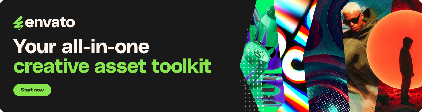
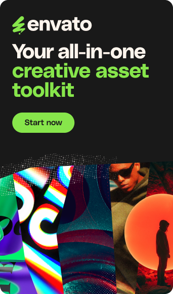
Envato: Get every type of asset for any type of project, and access to AI tools. Start now
Grunge design returns in 2026 with controlled texture, contrast, and intention.
For years, graphic design chased polish: smooth gradients, perfect kerning, friendly geometry, and brand systems so clean they felt vacuum-sealed. That aesthetic still works, but it’s no longer the default “good taste” signal it used to be, because everyone can do it now, and increasingly, generative AI can do it in seconds.
That’s why the grunge design trend is back in 2026. Not as one of many 90s design trends, but as a reaction to sameness. Rough textures, photocopy noise, torn edges, and imperfect type read as authored. They tell your audience someone made choices, left fingerprints, and didn’t sand every corner down for maximum neutrality.
Grunge design isn’t about sloppy design. It’s about intentional mess (think chaos packaging): building a clean structure, then adding grit in a way that creates mood, energy, and identity, without wrecking readability.
TL;DR: Grunge design is trending again because it feels human and specific in a world of smooth templates. Use it as a controlled layer: keep hierarchy clean, reserve distressed type for headlines, and re-check contrast after adding textures.

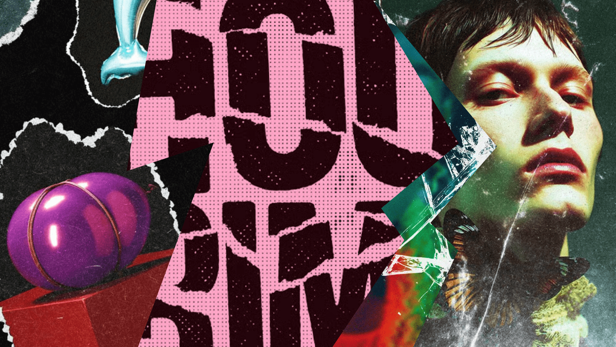
Grunge design is a graphic style that uses intentional imperfection — distressed textures, worn materials, messy collage composition, and type that looks stamped, scuffed, or photocopied — to create character and authenticity. Closely tied to the broader anti-design trend, it pushes back against overly polished, algorithmic aesthetics. The goal isn’t “ugly”; it’s an expressive, tactile, and emotionally charged design that still communicates clearly.
If you’re picturing sepia band flyers and a font that’s permanently stuck in 1994, take a breath. Modern grunge works more like a toolkit: you combine “imperfect signals” with clean layout thinking, sharper color choices, and brand rules that stop the chaos from becoming noise.
Modern grunge design loves anything tactile. You’ll see film grain, paper fibres, creases, torn edges, tape marks, halftone dots, scanlines, low-ink patches, and blotchy printing artifacts. The point is not decoration, it’s personality. These textures create a sense of material reality, even when the piece is 100% digital.
Expect asymmetry, overlaps, collage-cutout design, “bad” cropping, hand-drawn shapes, and margins that feel DIY. The best examples still have hierarchy; they simply hide the grid better. Think of it like stage makeup: you’re creating drama, but you’re still controlling what the audience looks at first.
While Gen Z might be hooked on Nirvana, the 2026 take isn’t a pure throwback. It’s grunge paired with crisp typography under the hood, brighter accent colors (acid pops against black and white), high-res product photography with lo-fi overlays, and motion that mimics analog jitter or VHS distortion. The contrast is the point: polished assets meeting rough treatment.
Graphic design trends don’t return just because the calendar says so. Grunge design is resurfacing because it solves very modern problems at the same time: differentiation, authenticity, and scroll-stopping impact.
Typography is where grunge design either sings or faceplants. The trick is simple: let type be expressive, but never let it become a puzzle.
Current favorites include distressed display fonts, stamped ink-bleed effects, warped letterforms, texture masks (grain, halftone, photocopy), and cut-and-paste “collage lettering”. They work because they communicate emotion in about half a second–before your audience even reads the words.
Grunge design doesn’t get a free pass on clarity. Use these guardrails so your design stays usable:
If you’re designing for the web, remember common contrast baselines: 4.5:1 for normal text and 3:1 for large text. Treat those as the “you can be expressive without being cruel” line.
A reliable modern grunge recipe is contrast: one distressed display font for attitude, one clean sans or serif for clarity, and one strong texture layer. Then add a stabilizer — consistent grid, brand color, or a clean logo lockup — so the piece feels designed, not damaged.
Grunge is a vibe. Vibes need context.
Grunge tends to work best when you want rebellion, urgency, or cultural credibility. Think music posters, album art, streetwear drops, festivals, nightlife, creator brands, and editorial graphics that want to feel alive rather than approved.
If trust and clarity are the product, go carefully. Healthcare information, finance, legal services, dense software interfaces, and safety-critical communication usually can’t afford “hard to read, but cool”.
You can still borrow the idea of texture in those spaces; just keep it subtle, keep type clean, and prioritise comprehension every time.
Ask yourself: are you building a long-term system or a short-term moment? Grunge often works best as a campaign layer: a capsule identity, seasonal drop, special event, or social series. Push it into every touchpoint, and it can start to feel like a costume you can’t take off.
Grunge is layer-based, which makes it perfect for templates, overlays, textures, and brush packs. The goal is speed and consistency: you want a repeatable mess.
Start with textures and overlays: grain/noise layers, paper textures, halftone patterns, scan overlays, ink stamps, and grunge brushes. They give instant tactility, and you can dial intensity up or down without changing your core design.
Then use templates when you want speed without losing hierarchy: posters, flyers, album covers, story packs, mockups, and editorial layouts are all grunge-friendly formats. If you’re pointing readers to a curated set, frame it as a shortcut to consistent layers (texture packs plus poster templates), not a random scroll.
| Element | Grunge | Brutalism |
|---|---|---|
| Texture | Texture-heavy | Often texture-light |
| Vibe | Worn, tactile, expressive | Stark, blunt, confrontational |
| Type | Distressed and stylised | Raw, sometimes “default-feeling” |
| Layout | Collage, overlap, disruption | Rigid simplicity, deliberate bluntness |
Both reject polish, but they reject it in different ways: grunge design adds material mess; brutalism strips refinement.
Use a clean grid for the date and venue, a distressed headline font for the band name, a single photocopy overlay across the whole poster, and a single neon accent colour for the callout. The texture brings attitude; the grid keeps it usable.
Pair high-res product photos with paper-tear frames, a halftone shadow texture, and a stamped “DROP 02” label repeated across posts for consistency. The repeatable stamp is what makes the series feel designed, not random.
Keep the core logo clean, but add tape marks, scribbles, and grain to campaign graphics only. Same brand, more bite — used when the message needs extra energy.
Grunge isn’t returning as a single preset; it’s mutating into hybrids and systems you can repeat without chaos. You’ll see Y2K design shine alongside grunge distress, clean vector icons set against dirty textures, and playful color pops against black-and-white grit. The tension is the style.
Motion design is also pulling grunge forward: analog jitter, scanlines, rough frame animation, and distortion transitions. Keep it restrained, and always give people a way out if motion sensitivity is a concern.
The real 2026 move is turning grunge into a mini system: define allowed textures, set intensity ranges (opacity and blend behavior), decide where distressed type is permitted, and build clean fallback versions. Document those rules, and suddenly “messy” becomes repeatable.
The Envato blog is a learning and inspiration hub featuring tutorials, trends, guides, and creative insights for designers, video makers, musicians, and digital creators.
The blog covers design, video and filmmaking, music and audio, creativity and AI, and updates on what’s new across Envato.
Yes. The blog features step-by-step tutorials, expert tips, and workflows for using Envato tools, including ImageGen, VideoGen, ImageEdit, and other creative resources.
Yes. Tutorials are written to be accessible and practical, with clear explanations, while still offering value to experienced creatives.
Articles often reference assets, templates, fonts, and tools available on Envato, showing how to apply ideas directly to real projects.
It’s for creatives of all levels, but particularly those working professionally and looking to upskill or hone their craft.
New articles are published regularly, including timely trend reports, tutorials, product updates, and creative inspiration.
Absolutely. Many articles focus on speeding up production, improving quality, and optimizing creative workflows using Envato assets and AI-powered tools.
Yes. All Envato blog articles are free to access and don’t require a subscription to read.
You can subscribe to Envato emails to receive the latest articles, trends, tips, and creative resources straight to your inbox.
Grunge is back because people are tired of perfection that looks mass-produced. Used well, it signals humanity, builds a distinct identity, and creates emotional punch through texture and tension. The key in 2026 isn’t chaos for chaos’ sake; it’s intention.
Build your structure. Then break it carefully. That friction is where originality lives.
Check out our ‘Rough Never Looked So Good’ grunge design collection of fonts, textures, and more.
Learn how to edit with AI on Envato stock photos, customizing images instantly by removing objects, changing backgrounds, and creating polished visuals without leaving the platform.

Explore the tennis aesthetic trend for 2026, from preppy style and color palettes to branding and design ideas inspired by tennis culture, fashion, and modern creative projects.

Fourteen World Cup shirts that still matter, from Brazil 1954 to Cameroon's banned vest. The design thinking behind the kits that lasted, and what they all have in common.

Canary yellow explained: meaning, hex code, color psychology and design ideas. Learn how to use this bold yellow in branding, UI and 2026 creative projects.