Movie typography in 2026: why does it suddenly look so good?
Explore movie typography trends shaping 2026, from bold film fonts to cinematic branding, with inspiring examples and practical tips for creating impactful, screen-ready typography.
Envato: Get every type of asset for any type of project, and access to AI tools. Start now
2026 is the year the chaos packaging trend takes over (finally).
After more than a decade of minimalist branding shaped by brands such as Apple and Calvin Klein, consumers are officially bored. As brands stripped back logos, color, and personality in pursuit of “clean” design, shelves and feeds began to blur into one beige, interchangeable mass.
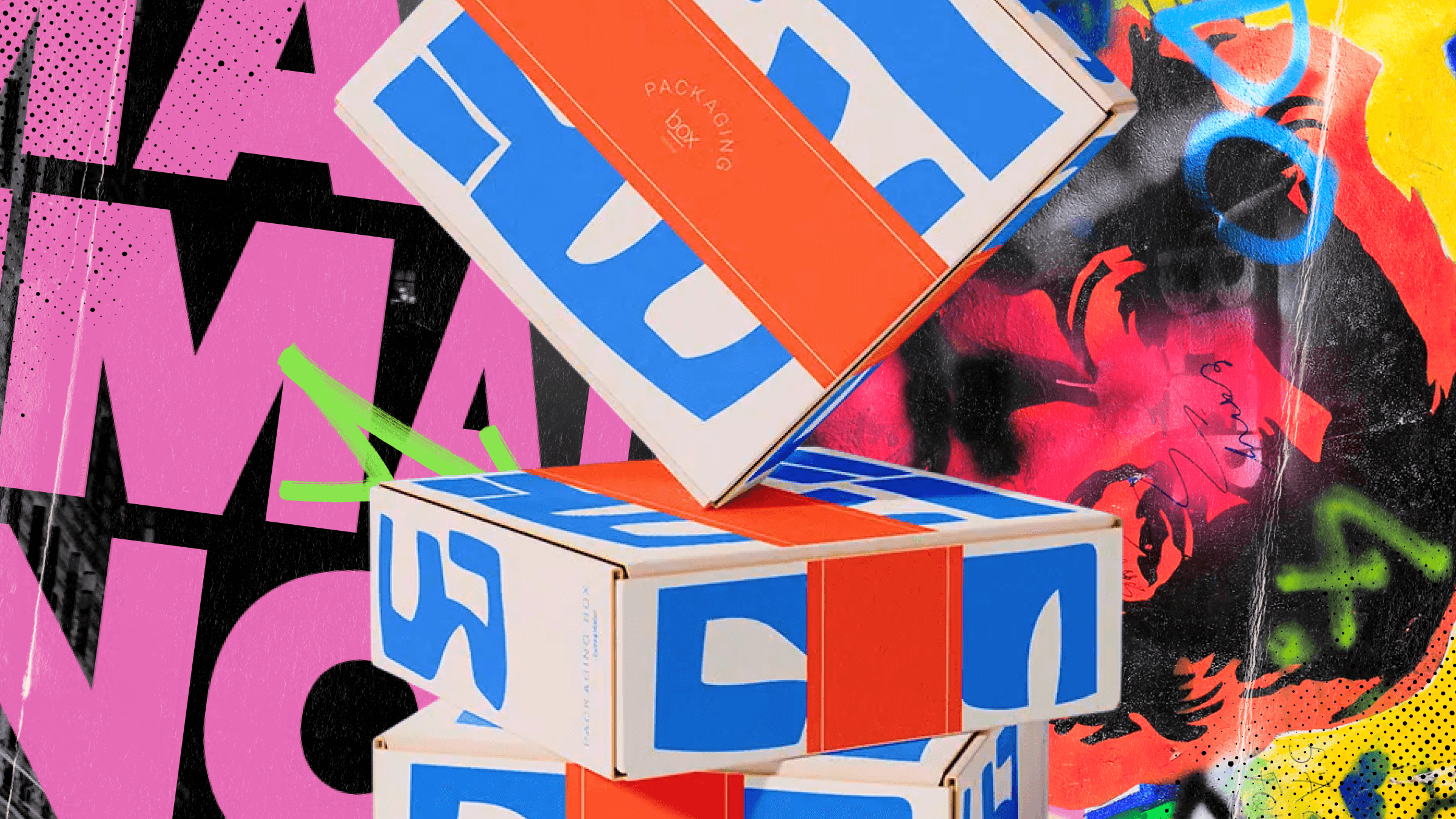
The chaos packaging trend is the backlash. Start-ups and underdog brands have begun crafting expressive, unexpected, dopamine-infused products and packaging that truly stand out on our shelves. Chaos packaging, one of the hottest graphic design trends of 2026, is a joyous antidote to sterile digital minimalism. And guess what, people want bold, arty, and daring design! The fact that searches for modern bold fonts are up 65.7% and searches for collage art are up 18.9% on Envato is a testament to this.
TL;DR: The chaos packaging trend is a 2026 backlash against minimalism. It celebrates maximalism in design, imperfection, and individuality through bold typography, clashing colours, collage visuals, and unexpected packaging formats.
The chaos packaging trend deliberately disrupts visual order, design hierarchy, and industry norms. Common traits of great chaos packaging design are: loud color combinations, distorted and mixed typography, collage-style imagery, hand-drawn doodles and graphic imperfections (we love this), and experimental layouts that bend readability rules. As well as using packaging that is unexpected for your product (like mountain water in a keg, thank you, Liquid Death). This concoction of chaos creates products that are visually engaging – and makes consumers stop, shop, and share.
Brand and packaging designer, Courtney Walker, sums this trend up perfectly: “Chaos packaging can be the much-needed disruptor in oversaturated categories, whether it’s fighting for attention on a crowded shelf or creating a shareable unboxing moment.” And here is where she spills the tea: “The key is to make sure the chaos is intentional and still makes sense for your customer – otherwise it risks tipping from exciting to confusing.” Chaos packaging isn’t about thoughtless design. It’s intentional disruption. It’s about breaking design rules, whilst creating exciting products and packaging that speaks to your ideal customer.
The chaos packaging trend was born out of rebellion. It’s a reaction to the domination of minimalism in design since 2010.
Minimalist design is all about muted color palettes, simple fonts, and negative space for days. With a ‘less is more’ ideology, inspired by sleek, digital aesthetics. But over time, as more brands in the beauty, luxury, and tech spaces jumped on this trend, branding became blander. Personality, color, and individuality were stripped away in favor of flat design and simple aesthetics, across both screens and shelves. This resulted in cultural fatigue with sameness, especially across digital products, as consumers grew weary of everything looking like an app interface. And with Pantone’s Color of the Year 2026 being ‘Cloud Dancer’ aka white, consumers are crying out for creativity and vivid colors to be back front and center once again.
What makes the chaos packaging trend so powerful is that it’s not just visual noise; it’s strategic disruption. In an era of algorithm-driven sameness, chaotic packaging gives brands a way to feel human again, standing out both physically on shelves and digitally across social feeds.
At the heart of the chaos packaging trend are two things: bold aesthetics and unexpected product packaging (often borrowed from another industry or product category). Like Graza selling olive oil in shampoo and beer can-inspired bottles. Or Vacation Inc’s retro-branded suncream, that squirts from a whipped cream can. Clever, bonkers. Brilliant.
Today’s chaos packaging revolution mirrors the anti-design movement, one of many 90s design trends that’s being reinvented for now.
Anti-design was all about rejecting traditional norms, structures, and systems of design. This artistic rebellion was spearheaded by David Carson, a self-taught designer who embraced anti-grid, anti-hierarchical, and intuitive design. Carson’s anti-design packaging explorations swam against the mainstream and critiqued the rigid rules of modern branding.
2026’s chaotic post-minimalism branding shares this anti-design ethos, and yet its disruptive energy has been adapted for digital-savvy consumers. By placing coffee in doodle-covered pouches or tomatoes in a monster-shaped cardboard box (we’re obsessed), brands are ensuring their products stand out in oversaturated social media feeds. Chaos design is the emotional, aesthetic, and, dare we say, spiritual reset that we all needed.
Several cultural, technological, and commercial forces are accelerating the chaos packaging trend, from Gen Z humour to social-first branding and AI-powered design tools.
Smart, deeply playful, and unexpected products? It’s got Gen Z’s fingerprint all over it. Like this glow-in-the-dark toilet roll packaging (brilliant). Or Moschino’s Fresh Couture perfume, inside a gold cleaning spray-inspired bottle (camp, iconic, we love it). Or collage-covered nut butter packaging? It’s giving Gen Z. So if you want to tap into a Gen Z audience, then this is your sign to jump into the world of chaos packaging.
Authenticity may be a buzzword, but in a world of misinformation and mistrust, we all want more of it. Chaos packaging gives us this because it’s created with intention and emotion! This helps consumers connect with these products. And after a decade of the minimal, ‘corporate clean’ aesthetic, emerging brands and bold designers are rebelling against bland branding, giving consumers colorful, fun, and personality-filled products (waahoo!).
AI-assisted tools like ImageGen and GraphicsGen allow faster, weirder experimentation. Designers also now have increased access to custom type, generative textures, and remix-friendly workflows. It’s the perfect storm for a bit of chaos.
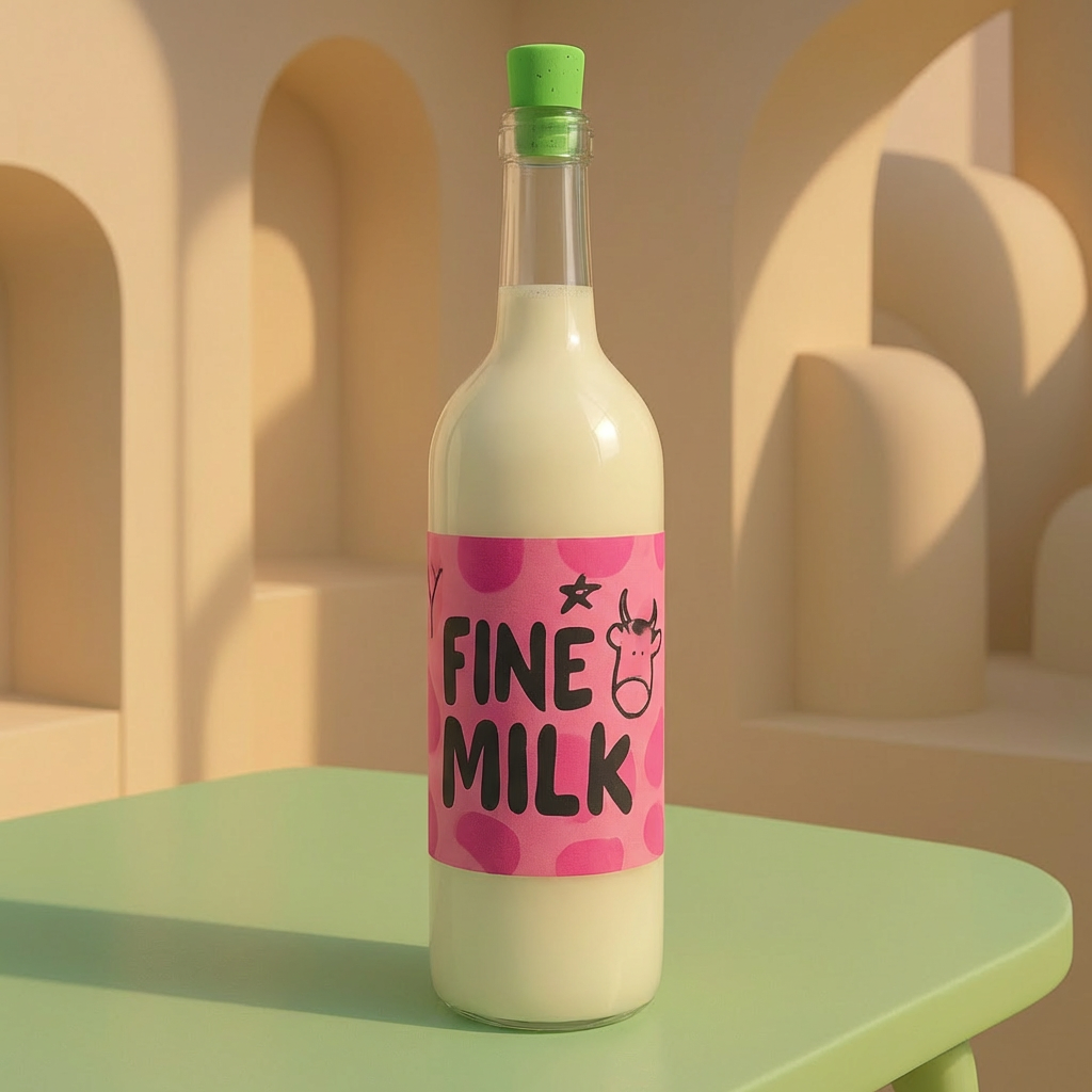
^ We used AI ImageGen to whip this up.
Emerging brands and bold designers are rebelling against the minimal, ‘corporate clean’ aesthetic of the last decade.
For start-ups especially, chaos packaging helps you stand out on a budget. As you’re not creating a whole new packaging format (necessarily), you’re utilizing cost-effective packaging solutions from other product areas (think coffee in a metal tube, yes, it’s a thing!). Oh, and your packaging becomes a marketing campaign, too. It’s a win-win.
What have you got to lose? You need to make a splash, and limited-edition chaos packaging is a great way to leave a lasting impression and stay top of mind with consumers. This is why having packaging formats different from your competitors’ works *hugely* in your favor.
While chaos packaging rejects rigid rules, the chaos packaging trend still follows recognizable visual patterns that designers can intentionally use.
We’re talking fonts that distort or overlap, hand-drawn lettering, and a mix of styles in one design. Play around with fonts that are unusual, fun, and stand *out* on the shelf. Take some inspo from Good Phats, they’re great. There’s been a surging interest in novelty and expressive typefaces, so give the people what they want already!!
Chaos packaging design is honestly an art form within itself. Brands in this space are experimenting with cut-and-paste textures, scanned images, and overlapping visuals across both product and digital design. Studio Hiba, a UK-based creative design studio, regularly crafts scanned artworks into serotonin-boosting branding. It’s glorious. Or what about these incredible pizza box designs that could literally be in an art gallery? Collage-infused packaging taps into zine culture, punk art, and scrapbooking-core, appealing to consumers who are craving analog culture.
Intentionally clashing colors and unexpected color pairings are the crème de la crème of chaos packaging. Bring together acid green and flecks of fuchsia, neon orange, and cobalt blue. Colors that zing and sing together. This is all about dopamine-design. Take inspo from colorful New Wave design. We’re moving away from soft, minimal hues and turning up the saturation.
Chaos packaging embraces rough edges, tape marks, brushstrokes, asymmetry, and crafty, messy elements. It’s design that’s human, imperfect – but not thoughtless. These imperfections are not the result of rushing or a lack of care, but instead speak to the intention, artistry, and authenticity poured into the design. More of this pls.
We’ve sprinkled examples of chaos packaging throughout this article, but now it’s time to spotlight some of our favorites.
Snack and beverage brands are some of the biggest pioneers of this trend. Liquid Death is a king of chaos packaging. Not only do they package fresh mountain water in gothic aluminum cans (which can be endlessly recycled). They also regularly work with other brands, creating chaotic collaborations that leave us thirsty for more. NoNormal Coffee is another industry disrupter, giving us coffee in a tube. Yep, it sounds weird – but it’s wonderful for outdoorsy folk. Or if you just want to spice up your Wednesdays. Departed Spirits is another innovator, packaging their beverages in metal tins (reminiscent of oil canisters). The bright colors, bold type, and cleverly enlarged hip flask design are wonderfully playful and chaotic. Also, pls can we have a moment for this curry sauce in a can, ty.
Let’s head down to the beauty & bathroom aisle. Here We Flo have brought us one of the best chaos packaging campaigns yet. The start-up placed their tampons in a cardboard ice-cream tub. So simple and clever!! Susan Allen Augustin, co-founder of Here We Flo, commented on how this viral packaging was driven by being a start-up on a budget: “We won’t be able to afford a billboard for a while, so we have to make the product a billboard.” And my oh my did it work. It grabbed people’s attention, the internet went wild, and it helped turn an underdog brand into a household name.
We’re also obsessed with the recent chaotic packaging from Benefit Cosmetics, fake eyelashes in a sardine tin? Yes please. What about Vacation Inc. serving sunscreen in a squirty whipped cream bottle? The 80s coded packaging is *everything* (psst, here’s some more 80s-inspired packaging to cleanse your palette). Indie cosmetics and lifestyle brands are using chaotic packaging and bright, chaotic visuals to stand out on both social feeds and shop floors. Designers, this is your opportunity to look beyond beauty standards and industry norms and create real emotional impact through your designs.
Underdog and sustainable brands are the true pioneers of this trend. Lots of chaos packaging uses formats typically outside of their category, in a bid to make product packaging more sustainable. Like Liquid Death (which packages water in aluminum cans instead of plastic), Who Gives a Crap (wrapping toilet paper in colourful paper, not plastic), and Tomatier (again, no plastic in sight, just cute cardboard monsters). Smart Life Co’s floss epitomizes chaos packaging: vibrant, eye-catching, playful, totally sustainable. All these brands have designs that feel ‘alive,’ and multi-sensory (esp the lil Tomatier monsters), and these products speak to eco-conscious consumers too. For conscious brands or brands wishing to become more sustainable, this is your sign to give chaos packaging a try.
There is order to the chaos when creating chaos packaging. Firstly, start with intent – don’t chase trends for the sake of it. Stay true to your brand personality; dive into colors, imagery, and textures that resonate with you and your target audience. Make sure to avoid pure clutter, and that hierarchy and brand message are 100% readable.
Use collage and illustrative accents with love and care, pls. Mix all the media types (I dare you), but make sure you have a cohesive visual rhythm running throughout the packaging. Blending analog and digital elements is the way to go – try scanning hand-drawn designs, adding in some vectors, and using Photoshop, Illustrator, or your tool of choice to create the overlays of dreams.
Finally, test test test! Test your final designs across irl labels and URL interfaces. What looks good on a label should translate digitally too.
To overcome these challenges, you need a strategy and great storytelling. When you use these tools, you distinguish successful chaos from background noise.
Chaos packaging is a trend that’s set to explode in 2026. We predict that this aesthetic could evolve towards more of a ‘controlled’ hybrid kinda chaos, especially in terms of color, textures, and typography. AI could also play a role in interactive packaging and motion graphics, adding another dimension to this immersive trend. 2026 is the year when chaos packaging will become more mainstream, with luxury brands reinterpreting this trend for high-end audiences. Unboxing is only going to get more imaginative, unexpected, and exciting. In all, chaos packaging represents creative liberation after a decade of restraint. Welcome to the fun era, party people!
Chaos packaging design is a bold, maximalist visual trend that breaks conventional design order with expressive typography, vivid colors, and collage composition.
Designers and brands are rebelling against sterile digital minimalism, embracing individuality and emotion in packaging aesthetics.
Start with expressive fonts, mixed-media textures, and unpredictable layouts, while maintaining a clear brand message.
It works best for lifestyle, fashion, or creative products where individuality and visual energy are key differentiators.
Chaos packaging design is a trend that embodies freedom, rebellion, and creativity in 2026. And we’d like to see more of it pls. Designers, dive into maximalism. Explore composition whilst maintaining meaning. Use the tools that enable chaos design. Use bold typefaces, mixed-media textures, and AI tools from Envato to create fearless, standout AI packaging design. For more design inspo, check out Pop Futurism in action or a breakdown of the Spotify Wrapped new aesthetic. You’re in for a treat.
Explore movie typography trends shaping 2026, from bold film fonts to cinematic branding, with inspiring examples and practical tips for creating impactful, screen-ready typography.
Explore the bold botanical design trend shaping 2026, from lush patterns and floral design to branding, interiors, and nature-inspired creative projects rooted in biophilic aesthetics.
Learn what font Disney uses, why it’s not downloadable, and discover Disney-style font alternatives to recreate that iconic, playful branding style in your own designs.
Explore PowerPoint templates with professionally designed layouts to create polished, modern, and visually cohesive presentations.