Movie typography in 2026: why does it suddenly look so good?
Explore movie typography trends shaping 2026, from bold film fonts to cinematic branding, with inspiring examples and practical tips for creating impactful, screen-ready typography.
Envato: Get every type of asset for any type of project, and access to AI tools. Start now
What font does Disney use? Explore the logo, history, and similar font alternatives.

Disney does not use a standard, downloadable font for its logo.
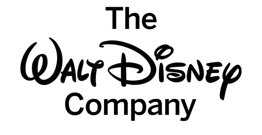
The iconic Disney wordmark is a custom-designed logotype, often called the Walt Disney script. It’s based on Walt Disney’s signature style and has been refined over decades into a consistent global brand identity.
While many fan-made versions exist online, the official Disney logo font is not publicly available.
There’s a special kind of magic that hits you when you see that fun, looped “D.” It’s not just a letter; your brain practically tunes into a soundtrack, smells popcorn from Main Street, and feels that childhood excitement all over again. It doesn’t matter if you’re five or fifty-five; the Disney font sparks a wave of emotions. It whispers nostalgia, yells imagination, and promises that “happily ever after”.
For graphic designers, Disney typography is not just nostalgic. We wonder, what font does Disney use? Is it available for download, and is it a single typeface or a custom lettering system? It takes something simple, like a rollercoaster ticket, and turns it into a special keepsake with its unique, fun letter styles, curvy, warm, and a bit quirky.
In this guide, we’ll dive into the real name of the Disney font, its cool backstory, and some awesome Disney-like fonts you can find on Envato. Whether you’re looking for the Disney logo font or some alternatives for your projects, we’ve got you covered to help you nail that magical vibe.
Let’s get the key detail out of the way: the Disney logo is not a font file.
If you’re searching for a “Disney.ttf” in brand guidelines, you won’t find one. The wordmark is a custom illustration, not a typeface you can install.
While you can find many fan-made versions online, the actual Disney logo font is a detailed illustration. It has been polished over the years to serve as a unique identity that belongs solely to The Walt Disney Company.
The typeface is famously based on Walt Disney’s signature style. However, if you look at Walt’s actual historical signatures, they were often much messier and more varied than the polished logo we see today. The logotype we recognize is an idealized, “Disneyfied” version of his handwriting, maintaining a human touch while remaining clear enough for products worldwide.
There is no single “Disney font.” What you’re seeing is a custom brand asset. Instead of searching for a download, focus on why it works:
These are drawn shapes, not typed letters.
Disney’s typography system extends far beyond the script logo.
For practical applications like UI, signage, and print, Disney uses more functional typefaces, including:
Each sub-brand also uses distinct typography:
The takeaway: Disney doesn’t rely on one font — it uses a system tailored to context.
To understand Disney typography, you have to understand the man behind the desk. Walt Disney was a master of self-branding long before the term existed.
In the early 1920s and 30s, the company’s logo looked vastly different. It leaned into the blocky, Art Deco trends of the era. However, as Walt’s personal fame grew, his signature became synonymous with the quality of his animation.
By the 1940s, a stylized version of his autograph began appearing on screen credits. Over time, studio artists took the raw energy of his handwriting and smoothed out the edges. They created a Disney-typeface that felt consistent, whether it was printed on a comic book or cast in bronze in front of a castle.

Disney’s typography stands out because it prioritizes personality over neutrality.
The wordmark is identifiable even when partially obscured.
It feels spontaneous, but spacing and proportions are carefully balanced.
It feels timeless — evoking both mid-century animation and modern branding.
The typography is tied to memory: films, parks, and childhood experiences.
So you want to capture that Disney spirit for your own whimsical projects? Consider these Disney font alternatives that are currently available via Envato’s font library to give you that same storybook energy and recreate the magic:
Best use cases
Limitations
Why it’s similar
Best use cases
Limitations
Why is it similar
Best use cases
Limitations
Why is it similar
Best use cases
Limitations
Why is it similar
Best use cases
Limitations
Why is it similar
Best use cases
Limitations
For designers diving into this type of typography, there are some key mistakes to avoid.
Disney’s typography stands apart from other major brands:
Disney is unique because it prioritizes character and emotion over flexibility.

The Disney typeface really shows how smart branding can be. Their secret? Sticking to the same basic style for years. Because they’ve kept that look consistent from the start, people have formed a strong emotional connection over generations. The Disney logo is so recognizable that you’d know it even if it was flipped upside down or in a totally different color.
Disney-inspired typography can really come in handy in various professional settings if you use it wisely:
Disney uses a custom logotype based on Walt Disney’s signature. It is not a standard font.
No, the official Disney logotype is proprietary.
Waltograph is a popular fan-made alternative.
You should not use Disney’s trademarked logo, but you can use similar styles.

So, what font is Disney? Disney uses Disney. There is no single Disney font name you can download to unlock the magic. The magic comes from the style and intention behind it. Walt Disney made sure his name looked special and fun, like a showman. He designed the “Y” to resemble a mouse tail and the “D” to look like a magic wand.
The story of Disney typography shows us a key design idea: Typography can be like a character in your story. Picking a Disney font is all about choosing a vibe that brings out fun, nostalgia, and that magical feel. As designers, it’s important to get why these fonts are used; they help tell stories, spark emotions, and build entire worlds. So, instead of just hunting for the “install” button, focus on finding your own unique style. The real magic is in the little imperfections.
Ready to build your own magical brand? Check out our guide on building a brand kit with Illustrator and AI, the biggest font trends we’ve seen so far this year, and learn how to design a logo in our tutorial.
Discover what font Disney uses, its origins, and the best alternatives. Learn how to recreate Disney’s iconic, playful typography style.
Explore movie typography trends shaping 2026, from bold film fonts to cinematic branding, with inspiring examples and practical tips for creating impactful, screen-ready typography.
Learn what font Nike uses, explore its typography evolution, and discover Nike font alternatives to create bold, minimal, high-impact designs for branding and campaigns.
From tactile, handmade aesthetics to sharp graphic minimalism and AI-assisted workflows, these are the illustration styles defining 2026, and how to put them to work in your own projects.
Discover why grunge design is trending again in 2026 and how to use textures, distressed type, and controlled chaos without sacrificing clarity or hierarchy.