50 best PowerPoint templates for 2026: education, business & more
Explore PowerPoint templates with professionally designed layouts to create polished, modern, and visually cohesive presentations.
Envato: Get every type of asset for any type of project, and access to AI tools. Start now
In a world saturated with information, images, and noise, Swiss Style graphic design offers something rare: silence. Let's see how it works.

Welcome to the sleek, grid-bound world of Swiss international design, the minimalist graphic design movement that turned graphic design into a discipline of simplicity, clarity, order, and timeless cool.
Born in post-war Switzerland, Swiss Style graphic design champions clean lines, sans-serif typefaces, and a fierce devotion to grids and whitespace. It’s the visual language of modernism: confident, objective, and quietly powerful.
As we explore this design trend, you’ll find a world where form follows function, and every element in design earns its place. You’ll also discover how to incorporate Swiss Style graphic design into your work using assets from Envato and our stack of AI tools.
Here’s what we’ll cover:
The Swiss Style in graphic design, also known as the International Typographic Style, is one of the most influential movements in the history of graphic design. It was developed by a group of Swiss designers in the 1940s and 1950s. Key figures include Josef Müller-Brockmann, Armin Hofmann, and Emil Ruder, who were influenced by Ernst Keller, often considered the “father of Swiss graphic design.”
The Swiss Style is not just a visual style, but rather a design philosophy rooted in the following modernist ideals:
These philosophical concepts manifest themselves in six key characteristics that still underpin much of contemporary visual communication, particularly in web design, corporate identity, and editorial design. These characteristics are:
Let’s examine each one of the characteristics of international typographic style in depth:
The Swiss Style pioneered the rigorous use of a mathematical grid system to consistently organize content and structure layouts. The grid is the foundation for arranging all visual elements in a design. Grids help align aspects like text, images, and other design components, creating visual harmony and structure. It’s this logical organization of information that enables readers to scan content quickly across pages or screens, making complex information easier to digest and emphasizing clarity, readability, and objectivity.
There are four types of grids used in Swiss Style graphic design:
While the grid offers a strict structure, layouts often use asymmetry to create dynamic compositions. This contrasts with more traditional symmetrical layouts and gives designs a modern, progressive feel while maintaining balance via the grid system. With Swiss Style layouts:
This approach breaks away from classical symmetry but keeps harmony and clarity.
Typography in Swiss Style is straightforward and functional. Sans-serif fonts are preferred because they are easy to read and appear neutral, offering no distractions from the message. Key fonts used are:
Typography rules to adhere to:
International typographic style designs typically use limited, purposeful color schemes focusing on functionality. Colors support legibility and comprehension rather than decoration.
Swiss Style mainly involves typography and grids, so it usually avoids heavy illustration or decorative imagery. When images are used, they’re often photographs because photography offers a more objective depiction of reality compared to the subjective nature of illustrations.
When photos or images are used, they are high-contrast, often black and white, positioned strictly according to the grid, and serve a functional purpose of supporting the message rather than decorative flair.
Minimalism is important to Swiss Design because it embodies the movement’s core philosophy: clarity, order, and functionality. Minimalist graphic design reduces visual clutter, allowing the message — whether in typography, layout, or imagery — to stand out and be easily understood. It strips away unnecessary elements, relying heavily on white space (negative space) to enhance readability, emphasize key content, and convey elegance and precision.
Here are contemporary brands and companies that apply Swiss Style principles today:
Apple is one of the most iconic modern adopters of Swiss Style graphic design, especially after Steve Jobs’ return in the late 1990s and Jony Ive’s rise in design direction. While Apple isn’t strictly Swiss in all areas, many aspects of its visual language, UI design, branding, and marketing are deeply influenced by Swiss Style (International Typographic Style) principles.
Apple uses San Francisco, a custom-designed neo-grotesque sans-serif typeface inspired by Helvetica and DIN. Before San Francisco, Apple used Helvetica Neue across macOS and iOS. Typography is treated functionally, with a clear hierarchy featuring bold headlines and light body text, with no decorative or expressive fonts. This follows the Swiss belief in a neutral, objective type that communicates without personality.
Apple’s marketing websites, product pages, and app interfaces use modular grid systems. Every Apple Store display, Keynote slide, and landing page is aligned with baseline grids, balanced with symmetrical white space, and designed with mathematical precision. This reflects the Swiss Style’s obsession with structural consistency and visual harmony.
Apple’s design is defined by large margins, minimal UI elements, and no visual clutter. Its white space enhances focus, readability, and elegance, all central values in the Swiss Style. Apple’s famous “Think Different” campaign and product ads are almost Swiss posters in motion: bold headline, sparse layout, full-bleed image, and plenty of white space.
Like the Swiss Style, Apple uses high-quality, functional photography that reflects simple product images on white or black backgrounds, with minimal shadows or distractions. There’s no lifestyle clutter unless absolutely necessary — the products are the hero, framed precisely. This reflects Swiss modernism’s preference for clear photography over expressive illustration.
Apple avoids visual noise. Every layout, line, and type choice is there to serve clarity. UI elements (like in iOS/macOS) are subtle and understated, helping the user focus on content. That’s the Swiss design philosophy at its core: form follows function.
Notion (the productivity and workspace app) is a strong modern example of Swiss Style graphic design applied in digital interface design, brand identity, and marketing. While it modernizes the aesthetic, many core Swiss Style principles are deeply embedded in its visual system.
For example, everything in Notion is grid-aligned, from pages to columns to databases. The block-based system is like a digital manifestation of Swiss grids. Each block (text, image, table, toggle) fits perfectly into a structured framework, which reflects the Swiss Style’s obsession with order.
Notion also uses simple, legible sans-serif fonts like Inter or Helvetica Neue in its interfaces. These emphasize function over flair — there’s no unnecessary flourish, only clean hierarchy. The typographic rhythm and visual contrast between headers, subheaders, and body text make scanning content easy, precisely as the Swiss Style intended.
Notion’s UI is famously spacious and uncluttered. Like in Swiss editorial layouts, a generous white space around content blocks improves readability and user focus. This visual breathing room mirrors the calm rationalism of classic Swiss poster design.
Notion also uses simple, black-and-white monoline icons, echoing Swiss pictograms. There are no gradients or drop shadows; icons and UI elements are clean, flat, and geometrically consistent. Notion’s brand and UI adhere to a monochrome theme, aligned with classic Swiss Style restraint.
Even its black serif “N” logo inside a white cube is bold and minimalist, resembling Swiss logotypes.
Muji, the Japanese lifestyle and retail brand, is one of the most compelling real-world examples of Swiss Style graphic design outside of Europe, despite its strong Japanese roots. Muji’s visual identity, product packaging, and communication design reflect core Swiss Style (International Typographic Style) principles, adapted with a uniquely Japanese sense of restraint.
Both the Swiss Style and Muji are rooted in functionalist philosophy: design is made to be valuable and uncluttered. This is seen in instruction manuals, retail signage, and even store layouts, all resembling Swiss graphic systems. Muji’s brand is almost iconically minimalist, using no logos on most products, straightforward layouts and packaging, and functional, neutral typography. This “no-brand” identity is aligned with the Swiss Style’s focus on objectivity and anti-ornamentation.
Muji’s catalogs, signage, and product packaging use strict grids. Product labels are laid out like typographic spec sheets, while manuals, ads, and print materials follow clean, modular grids with perfect alignment. This precision is directly inherited from Swiss graphic design’s emphasis on mathematical layout.
Printed materials, packaging, and UI extensively use white or kraft backgrounds, allowing typography and products to stand alone. Muji also uses a mix of Japanese and Latin sans-serif typefaces that are unadorned and modernist, similar to Helvetica or Univers in tone. They are consistent in weight and spacing and presented with a clear hierarchy, from headers to micro-labels, even with bilingual typesetting of Japanese and English. Muji maintains typographic balance and Swiss clarity.
A.P.C. (Atelier de Production et de Création), the French minimalist fashion label founded by Jean Touitou, is an excellent example of Swiss Style influence applied to branding and visual identity, especially in how it merges fashion editorialism with the clarity and structure of International Typographic Style.
The brand identity is highly consistent. The A.P.C. logo is rarely altered, scaled, or embellished. Product labeling, price tags, and garment tags follow a uniform, structured, almost utilitarian typographic system. A.P.C.’s materials value clarity over expressiveness.
A.P.C.’s logo is famously set in bold, geometric sans-serif type, often in uppercase, much like Swiss poster typography. Fonts used across print, packaging, and web are usually Helvetica, Univers, or similar neo-grotesques — core Swiss Style typefaces. The tone is objective, restrained, and never decorative, matching the brand’s minimalist fashion ethos.
A.P.C.’s lookbooks, advertisements, and website layouts often follow strict grid-based design: consistent column layouts, modular image/text compositions, even spacing, and alignment to margins. This grid approach aligns closely with Swiss design’s foundation in order and visual logic.
A.P.C. heavily uses white (or neutral) backgrounds, allowing clothing and content to stand on their own. Typography and imagery are sparse but intentional, making the layout feel calm, refined, and highly legible. This “less is more” approach mirrors the Swiss Style’s rejection of ornament.
Swiss Style design favored photography over illustration, with clean, direct compositions. A.P.C.’s campaigns often use simple, documentary-style photography with flat lighting, neutral expressions, and little post-processing. Images are presented without flourish, often full-bleed or centered with clean margins.
Kinfolk Magazine is an excellent example of a modern publication that channels Swiss Style graphic design in a refined, contemporary way. It borrows many core principles and adapts them to editorial and lifestyle publishing.
Kinfolk’s page architecture follows strict grid systems. Articles, photo spreads, and even white space are modular and mathematically arranged, echoing the rational structure Swiss design is known for. Every visual decision in Kinfolk serves readability and flow. Headings guide the reader, while pull quotes, captions, and margins follow clear logic and consistency.
The magazine uses modern sans-serif typefaces with a clear hierarchy (large, bold headers and light body copy), ample line spacing, and alignment to baseline grids. While not always Helvetica, the typefaces used (like Aperçu or Maison Neue) evoke a neutral, utilitarian aesthetic central to Swiss Style.
Probably its most obvious Swiss Style influence, however, is its use of plenty of white space, which creates a calm, clean environment. Pages often have single blocks of text paired with a photo or stand-alone images with large margins. This restraint amplifies the clarity and focus of each element: pure Swiss rationalism.
The Swiss Style emphasized photography over hand-drawn illustration, and Kinfolk follows suit. Large, thoughtfully composed photography dominates, often with natural light, minimal props, and centered subjects.
Applying the Swiss Style to your creative project involves embracing visual and design principles that prioritize clarity, simplicity, and order. Here’s how to effectively apply this minimalist graphic design to your project:
Why: By now you know that the grid is the backbone of Swiss design. It brings order and consistency to your projects, ensuring your layout is harmonious and your elements are aligned. Use software like Illustrator or InDesign to set up your grid system. The system you use will depend on the project you’re creating.
How:
Why: Asymmetry draws attention by disrupting predictability. It feels more dynamic, modern, and natural, and it allows for more expressive composition.
How:
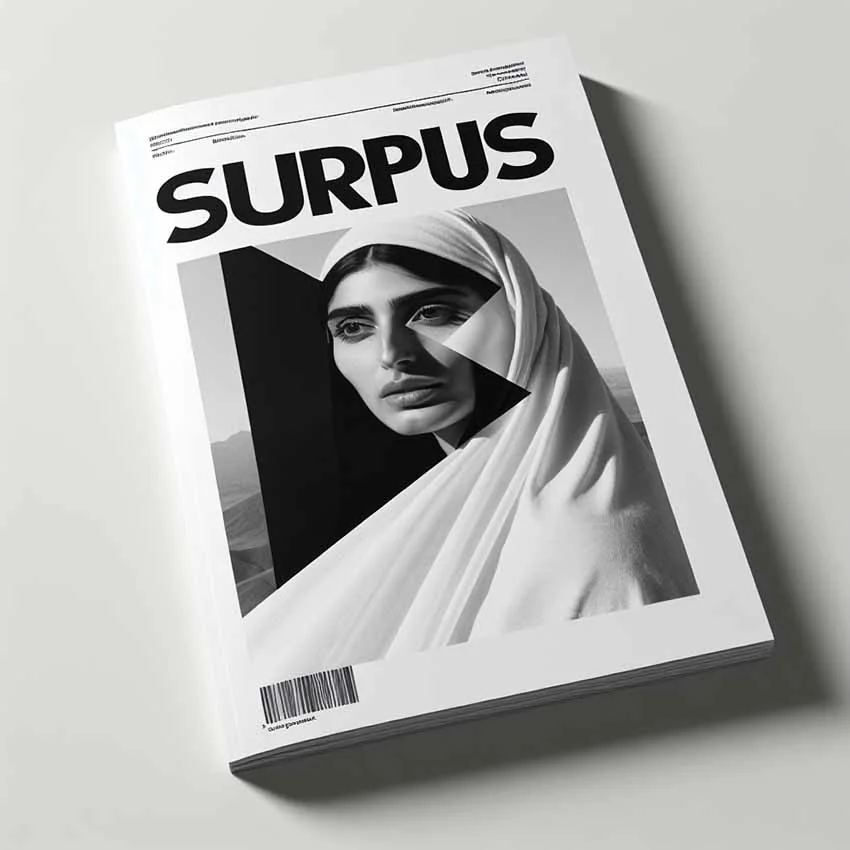
Try this prompt in ImageGen:
Swiss Style magazine cover with the title SURPLUS, in bold sans-serif typography. Clean, minimalist design featuring black and white photo of a woman. Asymmetrical layout with a focus on clarity and readability. High contrast and strong visual hierarchy.
Why: Hierarchy refers to organizing content so the viewer knows what to look at first, second, etc. Hierarchy is essential for clarity and storytelling. It helps communicate importance, priority, and structure. It leads to better user engagement and comprehension, and it can evoke mood or pace, especially when tied to movement or storytelling.
How:
Combining these two principles creates deliberate tension and intentional clarity. Asymmetry grabs attention, while hierarchy directs it. Asymmetry makes a layout feel alive; hierarchy tames that energy to maintain readability or function. This combo is powerful in editorial design, branding, digital interfaces, film composition, and architectural plans.
Why: Swiss design prioritizes communication. Too many colors can distract from the message or information hierarchy. Fewer colors make it easier to use color purposefully — to draw attention, differentiate sections, or indicate action. Also, restrained palettes contribute to the Swiss Style’s clean, modern, and timeless look.
How:
Why: Since Swiss design is about communication, legibility is paramount. Sans-serif typefaces like Helvetica, Univers, and Akzidenz-Grotesk are clear, modern, and highly legible at both small and large sizes. They offer minimal visual bias because they don’t carry decorative or emotional weight. This supports the rational, universal tone of Swiss design. Sans-serif fonts also work well in systems emphasizing grids, alignment, and hierarchy — key elements in Swiss design layouts.
How:
Why: While Swiss design is known for minimalism and precision, it often uses one bold, focused visual element to create impact, direction, and emotional engagement, without compromising clarity or function. A dominant visual element creates focus in a layout that may otherwise be restrained and minimalist.
A bold image, graphic, or shape can guide the viewer’s eye and support the overall communication goal. While typography and grids handle structure, the visual element adds context, mood, or metaphor. A strong visual element is simple yet striking, deliberately placed, and often isolated for emphasis.
How:
The Swiss Style evolved from earlier movements such as Constructivism, De Stijl, and Bauhaus, particularly embracing their emphasis on rationalism, functionalism, and reduction.
Let’s look at each aspect in depth:
Founded in 1919 in Germany, the Bauhaus school advocated for integrating art, craft, and technology. Designers emphasized minimalism, clarity, and functionality, rejecting excessive ornamentation in favor of clean lines and practical forms. This approach aimed to create accessible, affordable, and mass-produced objects and architecture that served everyday needs.
The movement’s impact extended across various disciplines, including architecture, furniture design, typography, and graphic arts, shaping the aesthetic and functional standards of the modern era in Europe and beyond.
In post-war Switzerland, designers sought a universal language—clean, objective, and neutral. Reacting to the chaos and devastation of World War II, Swiss designers aimed for clarity and order in visual communication, emphasizing simplicity and functionality over decorative excess. This period saw the emergence of what would become known as the Swiss Style or International Typographic Style.
Key features included using asymmetric layouts, sans-serif typefaces, grid systems, and a firm reliance on photography and sans-serif typography to create clear, legible, and highly structured designs. This approach was intended to transcend cultural and linguistic barriers, making communication accessible and effective worldwide. The principles developed in this era continue to influence global graphic design, branding, and typography.
Swiss design’s clean, objective principles were formally codified and taught at leading institutions such as the Zurich School of Arts and Crafts (Kunstgewerbeschule Zürich) and the Basel School of Design (Schule für Gestaltung Basel).
These schools became centers for nurturing the International Typographic Style, emphasizing the rigorous use of grids, precision in typography, and an analytical approach to visual composition. Students were trained to prioritize clarity, readability, and functional communication, often working with sans-serif typefaces like Helvetica, Univers, and Akzidenz-Grotesk. The curriculum combined theory and practice, encouraging designers to create aesthetically restrained and universally comprehensible work.
Graduates from these institutions influenced global design standards, spreading the Swiss Style through corporate identity, signage, publishing, and advertising. The schools’ methodologies helped establish design as a disciplined profession rooted in rationality and clarity.
Q: How does the Swiss Style differ from other graphic design styles?
A: Swiss Style focuses on objectivity, clarity, and order through grids and typography, avoiding ornamental or illustrative elements. Other styles may be more decorative, expressive, or chaotic.
Q: What kind of projects suit Swiss Style design?
A: Corporate branding, editorial design, signage, posters, wayfinding systems, and information design are common projects. It’s an ideal choice where clarity and functionality are paramount.
Q: Is the Swiss Style still relevant today?
A: Absolutely. Its clean design, grid use, and typography principles remain foundational in modern graphic design, especially in UI/UX, branding, and editorial work.
Q: Can the Swiss Style be combined with other design styles?
A: Yes! While Swiss Style has a strict approach, designers often mix its principles with other styles to create unique results, such as combining grids with expressive photography or color.
Q: What software is best for creating Swiss Style designs?
Any professional design software that supports precise layout control works well, such as Adobe InDesign, Illustrator, or Affinity Designer. The key is mastering the grid and typography tools.
The Swiss Style remains a cornerstone of modern design because of its clear, rational, and efficient approach to communication. While its minimalist aesthetics may seem cold to some, its influence endures in every realm where clarity and structure are paramount, from signage and branding to websites and mobile interfaces.
If you’re learning or working in design, understanding the Swiss Style is essential for its aesthetic and methodology — a blueprint for visual logic and communication.
If you need high-quality resources to incorporate nostalgic design into your projects, check out this collection of terrific creative assets from Envato or this stack of AI tools.
Learn more about the hottest trends in AI, explore the complete guide to creative AI art prompts, and discover how to use Envato’s AI features in your creative work.
Explore PowerPoint templates with professionally designed layouts to create polished, modern, and visually cohesive presentations.
Learn what font Nike uses, explore its typography evolution, and discover Nike font alternatives to create bold, minimal, high-impact designs for branding and campaigns.
Discover bold music video fonts for 2026, with top picks and bonus styles that help creators match sound, genre, and mood with striking visual identity.

Learn how to create an AI infographic design using GraphicsGen and Illustrator, from idea to reusable systems, with a step-by-step workflow for consistent, scalable visuals.