What font does The New York Times use? A complete typography breakdown
Discover what font The New York Times uses, including its logo, headline, and body fonts, plus similar alternatives for recreating the NYT typography style.
Envato: Get every type of asset for any type of project, and access to AI tools. Start now
Want to know why anti-design is back on the rise? Brat summer is heating up, and everyone from politics to branding is in on it!
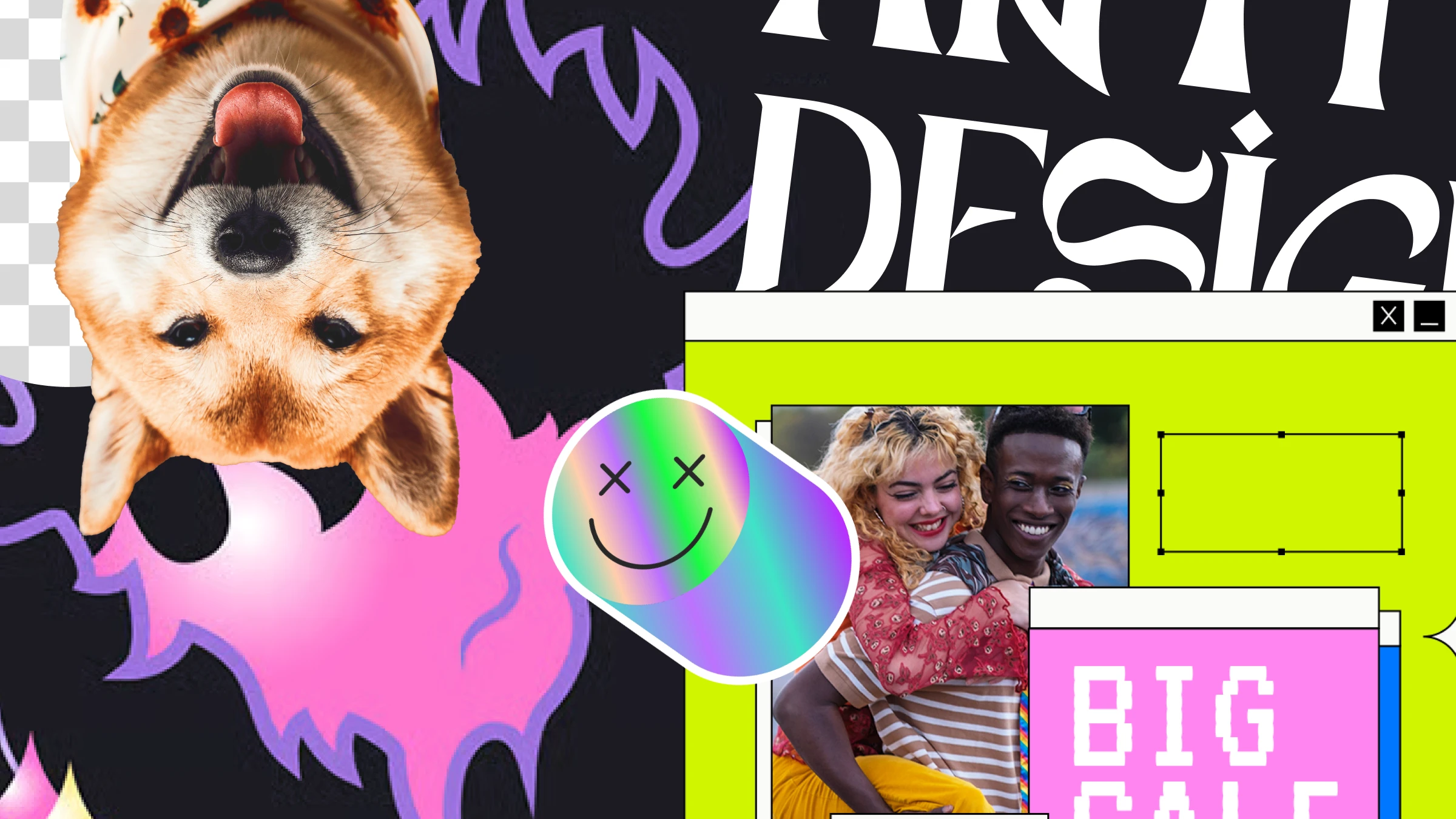
Call it an aesthetic, a design style, or even a lifestyle—anti-design is back, and it’s taking social media by storm. From Chappell Roan’s phenomenally successful Good Luck, Babe! lyrics video to Charli XCX’s Brat album art—which has spurred on it’s own viral trend, “brat summer”—a new wave of anti-design has officially arrived.
But anti-design isn’t new—it’s been around for over a century, rising to peak popularity in the 1960s and again in the 1990s. From the “graphic design is my passion” meme to Brat Summer, it’s now having another resurgence thanks to the rise of noughties nostalgia in pop culture.
Want to know why this divisive style is back in vogue? Let’s explore the history of the anti-design aesthetic and why it’s making a resurgence.
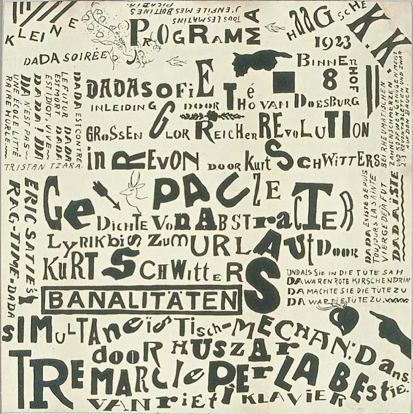
Anti-design, as the name implies, is a style of design that challenges conventional graphic design rules. While graphic design has existed since antiquity, the term didn’t appear until the early 1920s in a book called New Kind of Printing Calls for New Design by William Addison Dwiggins. In this book, he used the term to explain how he organizes visuals and combines typefaces.
From then on, plenty of artistic movements influenced the development of graphic design, with a number of manifestos that were typically a reaction to social and political events of the times and often included thoughts on technological advancements. Tied to political ideas, manifestos described specifics on using colors, proportions, and form. Many artistic movements, like Dada and De Stijl, can be considered anti-design.
The Swiss Style from the 1960s is the design style that stands out the most when we talk about following design rules. This approach to design was based on the books Grid Systems by Josef Müller-Brockmann and Designing Programmes by Karl Gerstner. This modern style refined graphic design into a series of rules that made design purely functional, required to use simple fonts like Helvetica and a rigid grid system, and took away all types of expressions.
Long story long, when we talk about anti-design, we’re referring to the act of going against the traditional graphic design rules imposed in the 1960s—free expression, personality, vibes, fun, and rebellion.
Freshly out of the 80s technological revolution, the 90s were all about making technology available to all, including 90s graphic design. There was plenty of software for professional designers at a high price point. For other computer owners who didn’t have formal training in design, applications like Publisher, Paint, Word, and PowerPoint were easily accessible and allowed people to create their own graphics and pamphlets. This is where we started to see the resurgence of the anti-design aesthetic. Personal computers were a household item, the internet became available, and CDs allowed us to share information more easily. Music is a direct influencer to graphic design, and it happened here with the grunge aesthetic. This music genre was all about loud noise and rebellion.
Anti-design can be applied in many forms, and in the 90s specifically, it was all about more is more—experimental graphics, disproportionate typography, and torn paper. Rave and trance music also influenced design with their psychedelic style, neon colors, bold layering, and surrealist graphics with fantasy themes. This came through in rave flyer designs of the time.
Dance pop was also big in the late 90s and early 2000s and inspired another style of anti-design. The McBling style was a big part of the anti-design style, with an overload of neon pink, animal print, and bedazzled cellphones. Technology paved the way for Cybercore with the use of CGI, and we saw an overwhelming amount of computer-modeled blobs and gradients, icy blue color, and lots of chrome.
How is the anti-design movement tied into all this? Well, it all started with computers turning into a household item that everyone could use. Suddenly, everyone had the power to create graphics without the help of a graphic designer. The clip art library allowed people at home to simply add graphics to a page, use a cute font like—*ahem*—Comic Sans, apply a default gradient and a shadow, and press ‘print.’ This often resulted in completely mismatched color schemes and shapes, creating a whole new form of anti-design.
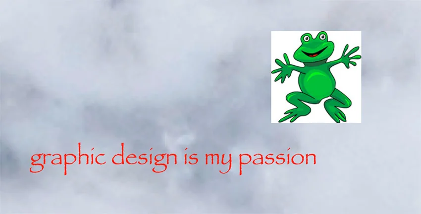
Over the years, the anti-design movement has evolved—into a meme aimed at designers who take their jobs too seriously. So, what does ‘graphic design is my passion’ mean? The original meme originated on Tumblr, when the user Yungterra shared an image with a cloudy background, a clip-art image of a green frog, and ‘graphic design is my passion’ in Papyrus—one of two fonts professional designers avoid like the plague.
There have since been many iterations of the meme, poking fun at designers with deliberately bad designs made in programs like Word and Paint—inadvertently encapsulating the core purpose of the anti-design movement.
Fastforwarding to today, Chappell Roan’s Good Luck, Babe! music video has taken inspiration from the “graphic design is my passion” anti-design. The video features a series of stills—á la PowerPoint presentation—featuring Comic Sans, watermarked photos, pixelated images, layering, and gradients. She tops it off with default-style animations, such as spins, grow and turn, and fly in.
What started as a meme mocking design over a decade ago has now evolved into a global viral sensation with 26 million views and counting. But why are Gen Z artists so obsessed with anti-design?
The pandemic disrupted nearly everything we once knew. People were online more than ever before, and many started to experiment with software. Since the early 2020s, we’ve seen the continued rise of the anti-design movement—sometimes called brutalism (while these two words are used interchangeably, brutalism has its own philosophy).
Throughout 2020, we saw a rise in designs that ignored traditional aesthetics and or combined them with new innovative elements. This style of anti-design or brutalist revival included multiple elements crowding the page, chrome modeling, and a dystopian look.
In the 1990s, the anti-design trend was all about ‘more is more’— a rejection of minimalism. In 2024, the anti-design revival seems more curated around nostalgia and online impact—in the age of social media, standing out is key, and anti-design is a perfect tool for doing just this.
The recently released Brat album art by Charli XCX took the internet by storm and jump-started the ultimate summer aesthetic. The album cover features a lime green background and the blurry word brat set in Arial.
But how is this anti-design? The word is intentionally disproportionate to encapsulate the core meaning of “brat”—a now popular slang term that means being a little messy with a healthy dose of self-awareness and introspectiveness.
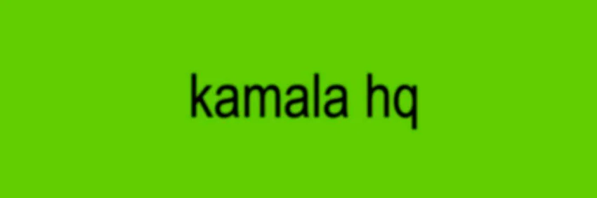
Brat summer has even extended to Vice President Kamala Harris’ presidential campaign, releasing her new playful brand appealing to Gen Z. The logo, or at least the image shared on social media replicates the Brat album art, with a bright green background, slightly distorted Arial font, a low-resolution look, and the text that reads ‘kamala hq’ in all lowercase. Anti-design? Yes. Smart? Hard yes.
Perfection has been a big part of both design and social media for as long as they’ve existed, and both the Brat album cover (and the presidential campaign branding) feature big no-nos in terms of traditional design rules. This intentional diversion from perfection creates a relatable sense of authenticity and reminds us that we’re all flawed.
Chappell Roan’s music video aesthetic, coupled with Charli XCX’s album cover, have intensified the anti-design movement’s popularity online. It’s grown at a rapid rate—faster than any styles we’ve seen in the past decade. Social media has played a big part in the growth of this trend, with these anti-design inspired graphics cutting through the curated imagery to change the online culture in a matter of weeks.
The anti-design movement is all about ignoring rules, but there are some common characteristics to help you spot it:
Anti-design can sound a little strong, but we believe that instead of being a rebellious movement, it’s more of a different approach to design. It’s one where there are no rules, and it can also pose a bigger question: what is beauty? Many would say that anti-design is not designed at all, but we beg to differ. If anything, anti-design is intentionally messy, intentionally ‘anti’, and there’s still a level of taste and decision-making when placing elements on a page.
The anti-design movement has become one that’s easily embraced not only by Gen Z but also by others like politicians and global brands. In order to appeal to a younger audience, it’s now necessary to look at what is becoming popular on social media and what’s making waves. We might just be over the hump with the obsession with perfection and can learn a thing or two from the anti-design philosophy.
Feeling inspired to recreate the anti-design graphic design trend? Envato has everything you need, from 90s fonts to Y2K graphics, grunge textures, patterns, backgrounds, and everything else you may need.
While you’re here, check out this article on 90s graphic design trends making a comeback—from grunge to anti-design—or brush up on the latest graphic design trends for 2024!
Discover what font The New York Times uses, including its logo, headline, and body fonts, plus similar alternatives for recreating the NYT typography style.

Explore movie typography trends shaping 2026, from bold film fonts to cinematic branding, with inspiring examples and practical tips for creating impactful, screen-ready typography.
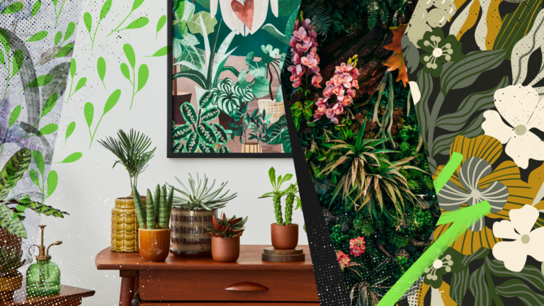
Explore the bold botanical design trend shaping 2026, from lush patterns and floral design to branding, interiors, and nature-inspired creative projects rooted in biophilic aesthetics.
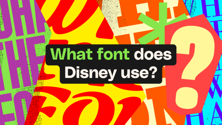
Learn what font Disney uses, why it’s not downloadable, and discover Disney-style font alternatives to recreate that iconic, playful branding style in your own designs.