Movie typography in 2026: why does it suddenly look so good?
Explore movie typography trends shaping 2026, from bold film fonts to cinematic branding, with inspiring examples and practical tips for creating impactful, screen-ready typography.
Envato: Get every type of asset for any type of project, and access to AI tools. Start now
Want to choose the most effective colors for your logo? Discover the best logo color schemes and find out why they work.

Ever stare at a logo and just feel something? That’s the magic of color psychology at work. To determine the best colors to use in your logo design, you have to first understand how and why people respond to color and how you can leverage color to affect the way people view your brand.
Color psychology experts have studied how color affects our emotions and behavior for years. What they’ve found is that culture, gender, upbringing, and personal preference all affect our responses to color, but we do all share some commonality in how color influences our choices.
Discover how to use these insights to create better logo designs with effective color schemes. Like so many aspects of design, color isn’t really that complicated if you start from the basics and work your way up. So let’s get started!
Before we discuss color schemes, let’s clarify the terminology so we’re all on the same page.
Color is an umbrella term used to describe hue, tint, tone, or shade, while hue refers to the dominant color family of a specific color on the color wheel. For example, red is a hue, but pink is a tint (see below). Blue is a hue, but twilight is a shade (see below).
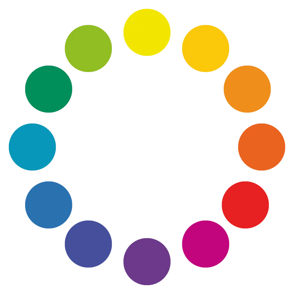
Primary colors are the three colors from which all other colors can be created by mixing. The three primary colors are yellow, red, and blue.
Combining any two primary colors will give you a secondary color.
Yellow + Blue = Green
Red + Yellow = Orange
Red + Blue = Purple

A third set of colors called tertiary colors can be created by mixing equal amounts of a primary and a secondary color that are next to each other on the color wheel.
Yellow + Green = Yellow green
Blue + Green = Blue green
Blue + Purple = Blue purple
Red + Violet = Red violet
Red + Orange = Red orange
Yellow + Orange = Yellow orange
Some colors are called warm colors, while others are cool. Red, yellow, and orange evoke a warm feeling because they remind us of things like the sun or fire.

Blue, green, and purple evoke cool feelings because they remind us of cool things like water or grass.

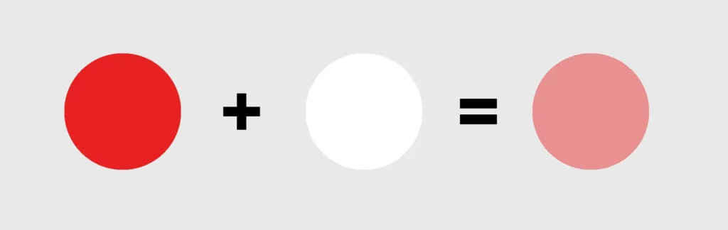
A tint is created when white is added to a hue, making the color lighter. For example, when white is added to red, it creates pink.
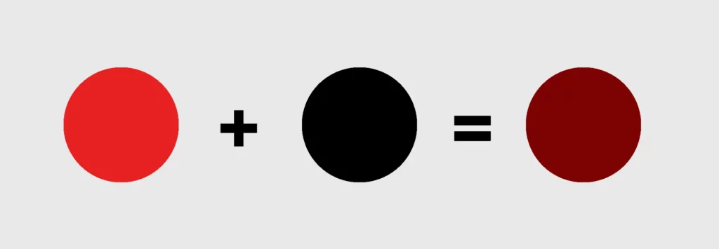
A shade is created when black is added to a hue, making the color darker.
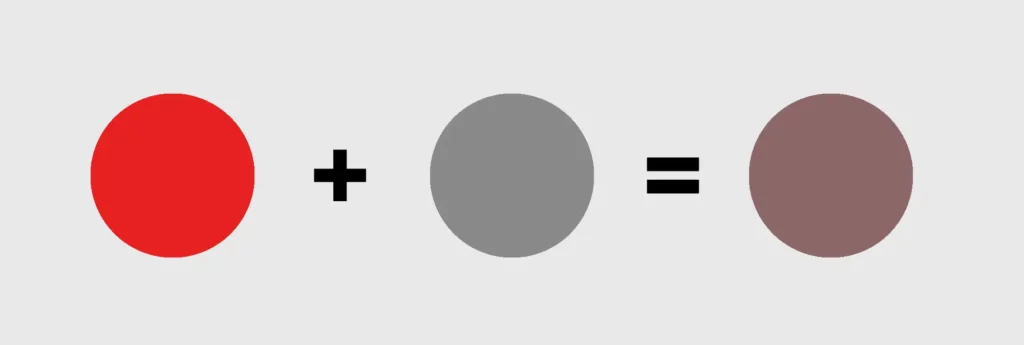
A tone is produced by mixing a hue with grey.
All these terms are covered more comprehensively in our Color Theory for Beginners course. If you want to know more about the fundamentals of color theory, that’s a great place to start.
So how do you know which colors you should use in your logo and what impact they’ll have? Psychologists have found that each color elicits a specific reaction in viewers, but it’s worth bearing in mind that when it comes to choosing logo colors, women tend to gravitate towards softer colors like tints, while men tend to prefer hues or shades of colors.
Learn more about color psychology in this video:
Here’s how to apply those lessons to logo design, with some great logo examples for each color.
Red is a primal color, deeply rooted in our biology and survival instincts. Think about it: our blood, our hearts, even our lips—they’re all red. This inherent connection links red to life, energy, and primal urges like eating and attraction. It’s no wonder red grabs our attention so powerfully. Whether stimulating our appetite or signaling us to stop and pay attention, red is a force to be reckoned with in design.
It’s no wonder, then, that a wide range of brands use red to enormous effect. Coca-Cola, Pizza Hut, McDonald’s, and KFC all use red to stimulate hunger and encourage action to quell that hunger.
Companies as diverse as CNN and H&M also use full red logos to attract attention and communicate a sense of urgency. This drives their target audiences to take action, whether by tuning in or making a purchase. If you’re thinking about red in logo design, consider using closely related colors like vermilion too.
Yellow, like a burst of sunshine, radiates warmth and cheerfulness. This vibrant hue is often associated with joy, optimism, and a friendly, approachable vibe. Think of how yellow makes you feel: happy, hopeful, and full of energy, right? It has a way of opening people up and encouraging a sense of spontaneity. In design, yellow can be a powerful tool to evoke positive emotions and create a welcoming atmosphere.
Interestingly, though, not many brands have used yellow as a dominant part of their identity. This is probably because yellow lettering is difficult to read against a light background.
Researchers have found, though, that yellow is actually the most visible of all colors in the spectrum, a fact that McDonald’s has capitalized on with their Golden Arches, which can be spotted by travelers along the world’s highways from miles away. Yellow’s ‘rise and shine’ cheeriness also made it the perfect candidate for the logos of breakfast products like Cheerios and NesQuick and has energized brands as diverse as Hertz and Nikon.
Orange is a vibrant and energetic color that reminds us of sunsets and autumn leaves. A combination of the primary colors yellow and red, it’s an energetic and refreshing color that communicates fun, youthful enthusiasm, playfulness, and exuberance. These characteristics make it perfect for companies looking to attract the young or young at heart.
Nickelodeon has differentiated itself from competitors with its use of orange in its branding. As a channel that targets and appeals to children, orange is critical to the company’s identity as an exciting, energetic, fun channel, so in spite of changes to its logo over the years, it’s always stuck with orange for its logo.
What do Dunkin’ Donuts, Mastercard, Harley-Davidson, and Penguin have in common? Aside from being hugely successful companies and leaders in their industry, they’re all brands that have harnessed the use of orange hues to differentiate themselves from their competitors.
The use of orange by Mastercard certainly made it stand out as a more exciting option in a financial sector which prefers blue, while Harley-Davidson uses orange to communicate excitement, adventure, and freedom, and Penguin uses it to communicate accessibility and friendliness.
Blue, the color of the expansive sky above and the ocean around us, is often cited as the world’s favorite color, especially among men. One reason for its popularity could be its non-threatening presence in our environment, which makes it a color people feel safe with.
Blue has been shown to make people feel peaceful and relaxed by lowering their blood pressure and pulse rate. This is one of the reasons healthcare providers and businesses use blue in their branding.
Blue also evokes trustworthiness, stability, authority, and security, which is why it’s so common across the corporate and financial services industries.
Green is the color of nature. A green world is abundant and full of life. It’s no wonder that green creates soothing and calming feelings and is associated with fertility, good health, growth, balance, and good luck.
That’s why brands that focus on agriculture, landscaping, recycling, and renewable energy often use green in their logos, but then there are companies like Spotify and Envato that also opt for neon green because they want to stand out as offering fresh and vibrant approaches to their industry. Read more about why we chose such a vibrant green in our recent rebrand.
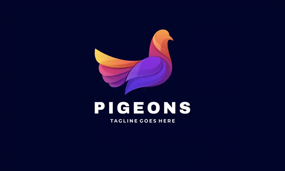
Purple is one of the rarest colors in nature, so it comes across as special and unique. Sitting at the intersection of blue and red, purple is perfectly balanced between the masculine and feminine, making it a very versatile color. From a psychology perspective, purple is uplifting: it promotes harmony of the mind and the emotions, contributing to mental balance, stability, spirituality, and creativity.
Associated with nobility, luxury, quality, and sophistication, purple has been used by a range of brands like Hallmark and Milka to communicate their specialness and quality.
Brown is another natural color, associated with the dependability of the earth and authenticity of tree bark. Found in nature but not on the color wheel, brown is created by mixing the three primaries. This down-to-earth color communicates earthiness, stability, reliability, practicality, and warmth.
It’s no wonder that luxury brand Louis Vuitton chose this humble color as its standard-bearer. After all, its products may be pricy, but they’re also practical and utilitarian. And many chocolate makers from M&Ms to Hershey have chosen brown to match the color of their products.
Scientifically, black isn’t considered a color; it’s the absence of light. In the world of design, however, it’s a color and is associated with sophistication, assertiveness, substance, and strength.
White isn’t strictly a color either—it contains all the wavelengths of visible light. However, again in the world of design, it’s obviously considered a color, and it’s associated with simplicity, purity, innocence, and cleanliness.
Together, black and white represent the epitome of contrast: simple yet substantial, timeless yet sophisticated, assertive yet pure. A pure white background with elegant black lettering has represented the Chanel brand for decades. Nike became an international brand with a simple black swoosh against a white background. Likewise, Puma, BBC, and WWF all use this simple and powerful combination. The beauty of the black logo against white is that it can also be switched to white against black, which many of these companies regularly do.
Love it or hate it, the color pink is a powerhouse in the branding world. Associated with femininity and youthfulness, pink is playful, charming, kind, soft, compassionate, and loving. So if you want to associate your brand with those qualities, a pink logo is an excellent choice.
The brand associations can be quite varied, though. Think of Cosmopolitan magazine, whose pink logo appeals to young women interested in fashion, lifestyle, and entertainment news. Barbie‘s iconic pink logo is synonymous with girlhood, imagination, achievement, and women’s liberation. T-Mobile’s magenta logo screams contemporary and innovative, while the Lyft logo says fun, spontaneity, convenience, and freedom.
Gray is a shade created by adding white to black. It’s a color that has no dominant association when it comes to the psychology of colors, but that doesn’t mean that it isn’t a powerful choice. Gray is contemporary, sophisticated, and versatile. Think cutting-edge technology companies like Apple or well-known media organizations like Forbes and Wikipedia. All use grey’s laidback, non-showy color to represent their brands with confidence.
Selecting great logo colors isn’t about choosing the colors you think are the prettiest or even the best logo color schemes. You need to consider the meaning of the colors you use, assess the potential impact of the logo color combinations on your target audience, and select company logo colors they’ll respond to positively.
To help you come up with the best logo color combinations, we’ve identified a selection of companies with great logo colors. We’ve also included examples to show how you can borrow from them to create beautiful and effective logo designs of your own.
Let’s start by looking at monochromatic logo color schemes. These combos use only one hue but can use various shades, tones, and tints of that hue to create the perfect logo.
This approach to logo colors is the cleanest and simplest to use. Here are four examples of monochromatic logo color schemes:

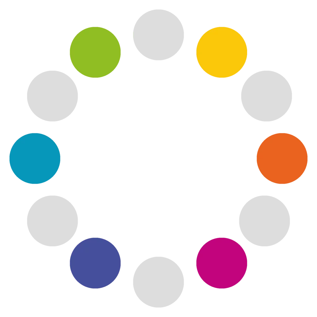
An analogous logo color scheme uses colors that are next to each other on the color wheel. These color combinations are usually harmonious and pleasing to the eye.
Complementary colors are opposite each other on the color wheel. The high contrast of logos with complementary colors creates a vibrant look that can be a bit much, but there are quite a few companies that have used them and used them well.
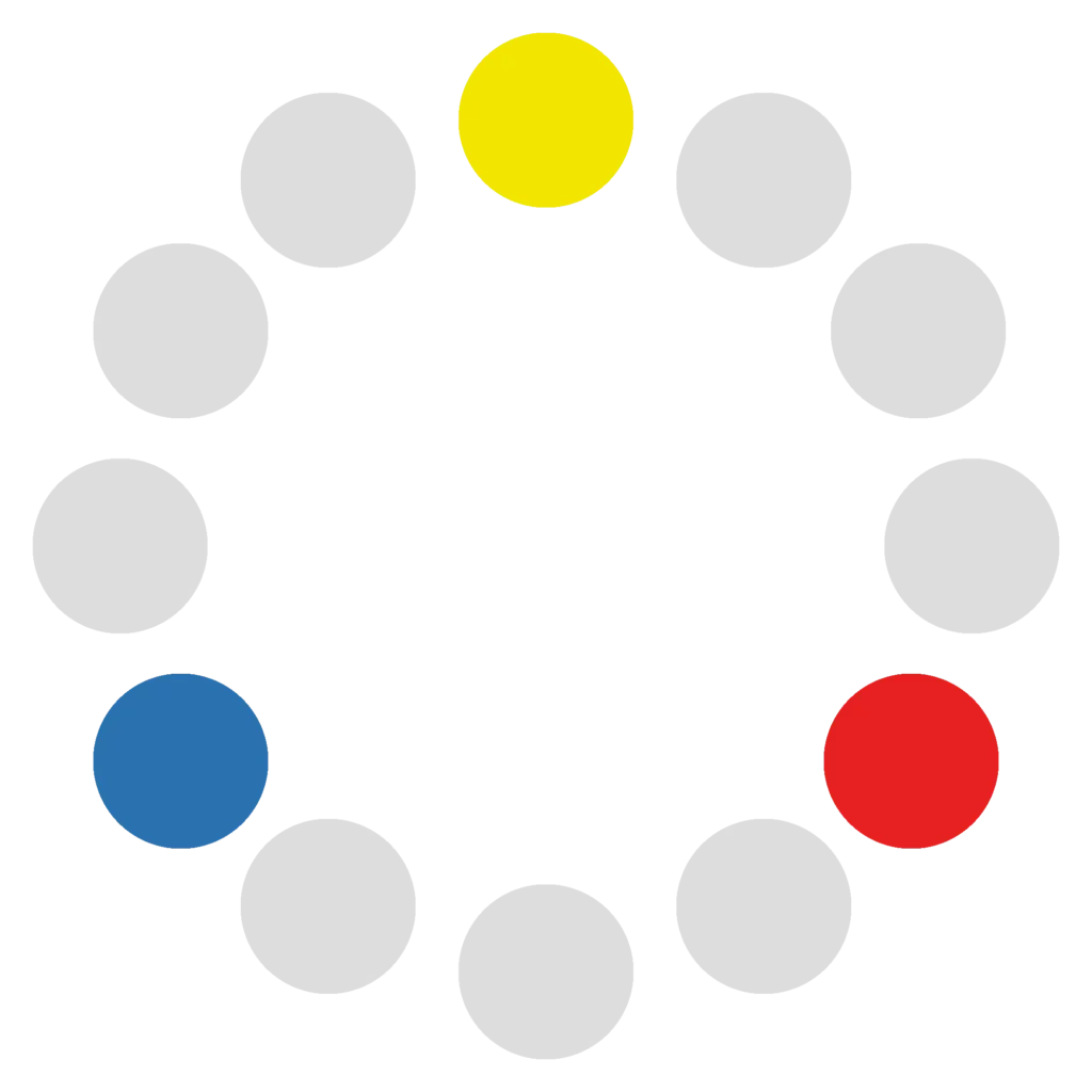
Triadic logo color schemes have three colors equally spaced around the color wheel.
Creating a logo and deciding on the best logo colors for your business isn’t easy or straightforward, but with what you’ve learned in this article, you can create awesome logo designs for yourself or your clients. Having great logo design tutorials and other resources at your fingertips will also help, of course—and be sure to keep an eye on the latest color trends to see how other designers are making creative use of color.
You can also explore the huge range of logo templates at Envato, your one-stop creative destination. Download all the Envato logos featured in this tutorial from this collection of top logo design templates.
Explore movie typography trends shaping 2026, from bold film fonts to cinematic branding, with inspiring examples and practical tips for creating impactful, screen-ready typography.
Explore the bold botanical design trend shaping 2026, from lush patterns and floral design to branding, interiors, and nature-inspired creative projects rooted in biophilic aesthetics.
Learn what font Disney uses, why it’s not downloadable, and discover Disney-style font alternatives to recreate that iconic, playful branding style in your own designs.
Explore PowerPoint templates with professionally designed layouts to create polished, modern, and visually cohesive presentations.