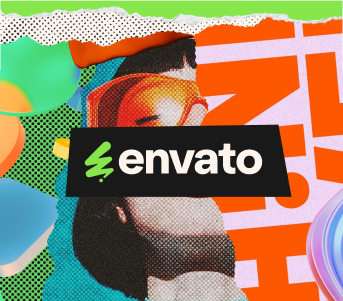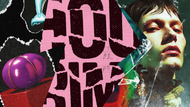
The grunge design trend: Why raw, messy aesthetics are back (and how to use them in 2026)
Discover why grunge design is trending again in 2026 and how to use textures, distressed type, and controlled chaos without sacrificing clarity or hierarchy.
Envato: Get every type of asset for any type of project, and access to AI tools. Start now
Vermilion is a vivid red-orange with rich history and bold design impact.

TL;DR: Vermilion (#E34234) is a standardized red-orange used across digital and print design. Originally derived from a pigment, vermilion is known for its warmth, intensity, and high visual impact. This guide covers ‘What color is vermilion?’, including color codes, palette pairings, and real-world applications, plus the history and psychology behind its lasting influence.
Color is never just color; it’s hierarchy, emotion, and attention control. Few hues embody that tension between warmth and visibility quite like vermilion.
In a design world dominated by neutrals and muted palettes, this red-orange doesn’t whisper — it asserts itself with clarity and confidence.
As brands lean into expressive color systems in 2026, vermilion is resurfacing with renewed purpose, not as decoration, but as strategy. Let’s unpack what defines this historic hue and how to use it with intention in modern creative work.
So, what color is vermilion? Vermilion is a vivid red-orange pigment that sits between pure red and bright orange on the color spectrum. It’s warmer than crimson and less pink than scarlet, with a distinct coral undertone that gives it a bright, almost glowing appearance.
Historically, vermilion referred to a pigment made from ground cinnabar, a mercury sulfide mineral. Today, the term primarily describes a standardized red-orange tone used in art, design, print, and digital color systems.
The word vermilion comes from the Old French vermeillon, which in turn is derived from the Latin word vermiculus, meaning “little worm.” The name traces back to the red dye produced from the kermes insect, though that dye is chemically different from cinnabar-based vermilion.
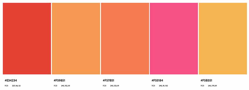
To use vermilion across different environments, it’s helpful to know its color code values.
Use these specifications to select the perfect red-orange background or build your own vermilion color palette. Discover how to convert CMYK to Pantone colors, and learn more about the Pantone color guide.
Now, let’s take a look at some of the shades and tints you can create using vermilion red. If you don’t know what shades and tints are, here’s a great color theory guide to get you up to speed.
You can obtain darker shades of vermilion by adding various percentages of black to its pure hue. In the image below, we start with pure vermilion and add 10% black incrementally to get darker shades until we reach black.

Alternatively, you can obtain lighter tints of vermilion by adding various percentages of white to the pure hue. In the image below, we start with pure vermilion and add 10% white incrementally to get lighter tints until we reach plain white.
You now know the vermilion definition and its meaning. For vermilion color palette inspiration, take a look at the following examples.
Let’s start with a beautiful, harmonious color palette based on colors that are similar to vermilion red. This palette is bright, bold, and cheerful. Use this on your website or marketing if you want to convey a positive attitude.
This combination, on the other hand, is darker and more serious. The earthy green and brown tones are very grounded, allowing the bright color vermilion to pop off the page or screen by contrast. Use this one if you want vermilion to be the star while the other colors help increase the contrast.

Here’s one that mixes the best of the first two color palettes. It contains complementary greens and browns, but that bright purple is much closer to vermilion and helps to brighten up the whole palette.

Inspired by the triad color combination, this elegant combo would be great for corporate branding materials. You can just picture a classy logo made from the first three colors, can’t you? Then, you could use the darker shades for the accompanying tagline or other text.

Using a square color palette produces an interesting combination, including one hue that’s similar to the popular seafoam green but a little darker. The overall effect is more serious than the bright, bubbly palette we started with, showing how different combinations can bring out completely different sides of the same color. Use this palette to convey maturity and reliability.

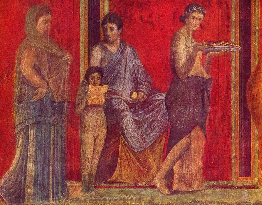
The first documented use of vermilion pigment dates back to a Neolithic village in the area that is now known as Turkey, around 8000–7000 BC. Since then, this vibrant pigment has been widely used throughout Asia and Europe.
It was used throughout all aspects of ancient Chinese royal life; by the Romans who valued it for painting the faces of triumphant generals; in illuminated manuscripts of the Middle Ages in Europe; and as the primary red pigment in the paintings of the European Renaissance.
In fact, between the 12th and 19th centuries, vermilion became so popular in Europe that supply couldn’t keep up with demand, and suppliers began to mix their vermilion with cheaper materials like brick dust, iron oxide, and red lead. Unfortunately, these techniques degraded the pigment and led to unreliable results.
It was not until the 20th century that interest in vermilion declined, mostly due to its cost and toxicity and the availability of a safer and cheaper alternative pigment, cadmium red, which offers a similar opacity and color. Today, vermilion pigment from cinnabar is mainly produced in China.
Beyond a definition, the vermilion meaning it’s important for what the color itself conveys. As a member of the red hue, vermilion shares certain meanings with all other reds. It can mean life, vitality, love, passion, romance, energy, anger, danger, or aggression, depending on the context and area of the world in which it is used.

According to one’s location and culture, vermilion symbolizes different things. Here are a few examples:
Want to add a burst of passion and interest to your projects with vermilion’s lovely red and orange hue? Whether you’re creating interesting patterns or business cards, this vibrant color is bound to capture attention. Here are some cool designs illustrating the hot–yet-cool edge that the color vermilion can add to your projects.
These chevrons are attractive, but add vermilion to make them eye-catching at a whole new level. This wonderful vermilion chevron pattern is available to download in both high-res EPS and JPG file formats. You can change the hue to the exact vermilion color code using the EPS file on the Adobe apps.
Who says business brochures have to be boring? There’s nothing like a cool design and a pop of vermilion to lift your design to the stratosphere. This red brochure layout template contains 12 unique page layouts, so all the work is done for you. All you need to do is add your own text and images.
Whether you need a portrait or landscape business card, you’ll love this vermilion Luxury Business Card template with its terrific combination with white. The template offers both back and front layouts which are fully editable in the software of your choice.
Are you looking for an awesome mobile phone mockup to showcase your designs? How about this vermilion iPhone mockup? It offers six fully editable PSD files that you can customize in a matter of minutes.
For a flyer to be effective, it has to capture the attention of its target audience, and there’s no better way to do that than with an awesome design and the color vermilion. This trifold flyer comes in both A4 and US Letter sizes and is easy to edit in InDesign.
Branding is an art and a science. It requires great design and the right color combinations to motivate your target customers and clients. That’s just what you get with this fabulous corporate identity branding mockup. Use Photoshop to customize your mockup features quickly and easily.
You know what color is vermilion, the vermilion definition, and everything in between! Vermilion is vibrant and exciting, and it will bring an explosion of color to your projects.
When you want to wake up the senses and inspire, there is no better color. It’s great for everything from business cards to brochures, branding designs, and any other cool project you have in mind.
Check out all the cool vermilion creative assets available at Envato for more inspiration.
Vermilion does not have a single fixed value, but a commonly referenced digital version is HEX #E34234, equivalent to RGB (227, 66, 52). In CMYK, it’s often represented around 0, 87, 84, 0, though exact print values vary by calibration. Because vermilion is a red-orange hue, small shifts in saturation can slightly change its appearance across screens and print.
In digital color systems, vermilion is created by combining high red values with moderate green, producing a vivid red-orange tone. A commonly referenced version is HEX #E34234, which captures its bright, warm character.
Historically, vermilion referred to a pigment made from cinnabar, a mercury sulfide mineral. Today, artists and designers recreate the hue using safe synthetic pigments or calibrated CMYK and RGB formulas, ensuring consistent color reproduction without relying on mineral-based compounds.
The complementary color of vermilion falls within the blue-green range. Because vermilion is a warm red-orange, its opposite appears cool and balanced, creating strong visual contrast. This pairing enhances brightness on both sides and is often used to emphasize focal points or build energetic compositions.
Red-orange is the closest substitute for vermilion. Scarlet may also work when a bright, warm red is needed, though it usually contains less orange. To maintain a similar visual effect, avoid cooler reds like crimson, which tend to shift the tone toward darker, less vibrant hues.
What is the difference between crimson and vermilion?
Crimson is a deep red with blue or purplish undertones, giving it a cooler, richer feel. Vermilion, in contrast, is brighter and warmer due to its orange influence. The undertone difference significantly affects mood: crimson feels dramatic, while vermilion appears more energetic and luminous.
Vermilion pairs well with deep blues, navy, and blue-green tones for strong contrast. Neutral shades like beige, cream, and charcoal help it stand out without visual competition. For warmer schemes, coral, burnt orange, and golden hues create harmonious combinations. Since vermilion is highly saturated, surrounding it with structured or muted tones keeps compositions balanced.
Vermilion is structurally closer to red but clearly influenced by orange undertones. It maintains the intensity of red while appearing warmer and brighter than crimson or scarlet. This balance gives vermilion its distinctive coral-like vibrancy, distinguishing it from deeper or cooler reds.
Vermilion is a warm color. Its orange undertone places it firmly within the warm side of the spectrum, alongside reds and oranges. Compared to blue-based reds, it appears brighter and more energetic, contributing to associations with vitality and visibility.
Vermilion and scarlet are similar but distinct. Both are bright reds, yet vermilion contains stronger orange undertones, giving it a clear red-orange character. Scarlet typically appears closer to pure red. While they are sometimes used interchangeably in casual language, color systems define them as separate hues.
Discover why grunge design is trending again in 2026 and how to use textures, distressed type, and controlled chaos without sacrificing clarity or hierarchy.
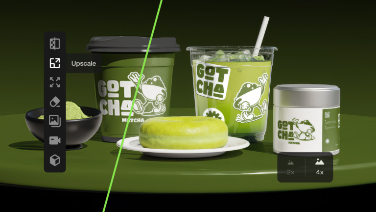
Learn how to upscale images with AI using ImageEdit. Enlarge photos 2x or 4x while preserving sharpness, texture, and detail for print, design, and marketing.

Swash fonts add a touch of drama and elegance to any design. Explore our curated selection of fonts with swashes and flowing tails to give your typography that extra flourish your projects deserve.

Explore 27 Norse fonts for standout branding in 2026, from rune-inspired and Viking display styles to modern Scandinavian typefaces with bold character.