How to edit with AI using Envato stock photos
Learn how to edit with AI on Envato stock photos, customizing images instantly by removing objects, changing backgrounds, and creating polished visuals without leaving the platform.
Envato: Get every type of asset for any type of project, and access to AI tools. Start now
A step-by-step guide to AI packaging design using bold chaos packaging principles and tools.
Packaging design has always been about grabbing attention, but today’s landscape demands more than just “nice-looking” visuals. Brands need bold, scroll-stopping, shelf-dominating concepts — and that’s exactly where AI packaging design and the rise of chaos packaging come in.
Chaos packaging is a deliberately loud, high-energy style built on clashing colors, layered graphics, distorted typography, and unpredictable layouts. It looks messy at first glance, but when done right, it’s carefully controlled chaos that stands out instantly.
By combining this trend with AI packaging design tools, you can move faster from concept to execution. Instead of starting from a blank canvas, you generate raw visual directions, refine them with professional tools, and shape them into production-ready packaging.
In this tutorial, you’ll learn how to create chaos-inspired packaging using Envato’s AI tools, asset library, and a professional Illustrator and Photoshop workflow.
AI packaging design is the process of using artificial intelligence tools to generate, explore, and refine packaging concepts, combining automation with traditional design workflows to create faster, more experimental outcomes.
Unlike traditional workflows, where every element is built manually, AI allows you to rapidly generate visual directions, styles, and assets. Designers then refine those outputs, ensuring the final packaging is both creative and commercially viable.
When paired with chaos packaging, AI becomes especially powerful. It helps you explore bold, unconventional ideas quickly, while still giving you full creative control during refinement.
Chaos packaging is gaining traction across industries like beverages, streetwear, and indie food brands — especially those targeting Gen Z audiences.
This style works because it:
Despite its wild appearance, successful chaos packaging still follows key design principles like hierarchy, contrast, and readability.
To create an AI packaging design using chaos packaging, you’ll need:

This combination gives you both speed (AI) and precision (design tools).
Before generating anything, define your concept clearly.
For this tutorial:
Now define the creative direction. Your packaging should feel:
Think in contrasts — neon colors, graffiti textures, surreal illustrations, and layered visuals.
Without this step, AI outputs will feel random instead of intentional.

Open GraphicsGen and begin exploring visual directions:
Here are some sample AI graphics prompts. Paste them in, tweak them, and make them your own:
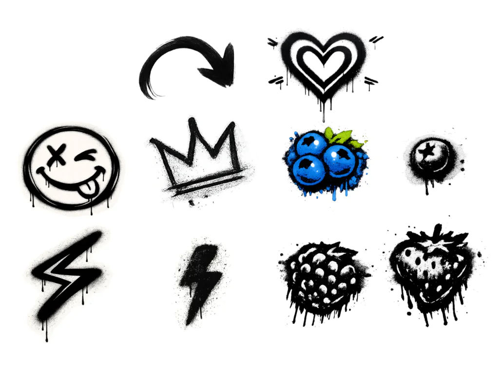
“Various isolated graffiti-style berries, including blueberries and strawberries, each drawn individually in rough black spray paint. The forms are hand-drawn with distorted, uneven shapes and thick, aggressive lines. Heavy overspray, speckled texture, and soft spray halos surround each berry. Visible paint drips, splatters, and gritty buildup create a raw, punk, distressed look with rough, imperfect edges.”
“A collection of hand-drawn graffiti symbols scattered. All are rendered in rough, textured black spray paint. The symbols include hearts, arrows, crowns, stars, scribbles, question marks, smiley faces, X’s, circles, wavy lines, and abstract marks. Each element looks imperfect and raw, with visible paint drips, overspray, smudges, and uneven pressure. They seem created quickly with a spray can. The style is urban and grunge, with high contrast between the black paint and the transparent background. The texture should feel dusty, gritty, and slightly worn. The composition is loose and playful, with symbols arranged organically rather than in a grid. It evokes spontaneous street graffiti tagging. Subtle noise, grain, and paint splatter details enhance realism.“

After you’ve fine-tuned your ideas, the next step is to nail down a cool visual look for your AI graphics. Pick your favorite designs and zoom in on the unique details that stand out. Check for recurring elements like the main colors, common shapes, illustration style, and the overall vibe of the designs. Spotting these traits helps you establish a consistent visual language that will guide all your design choices, ensuring your final packaging looks put together and intentional.
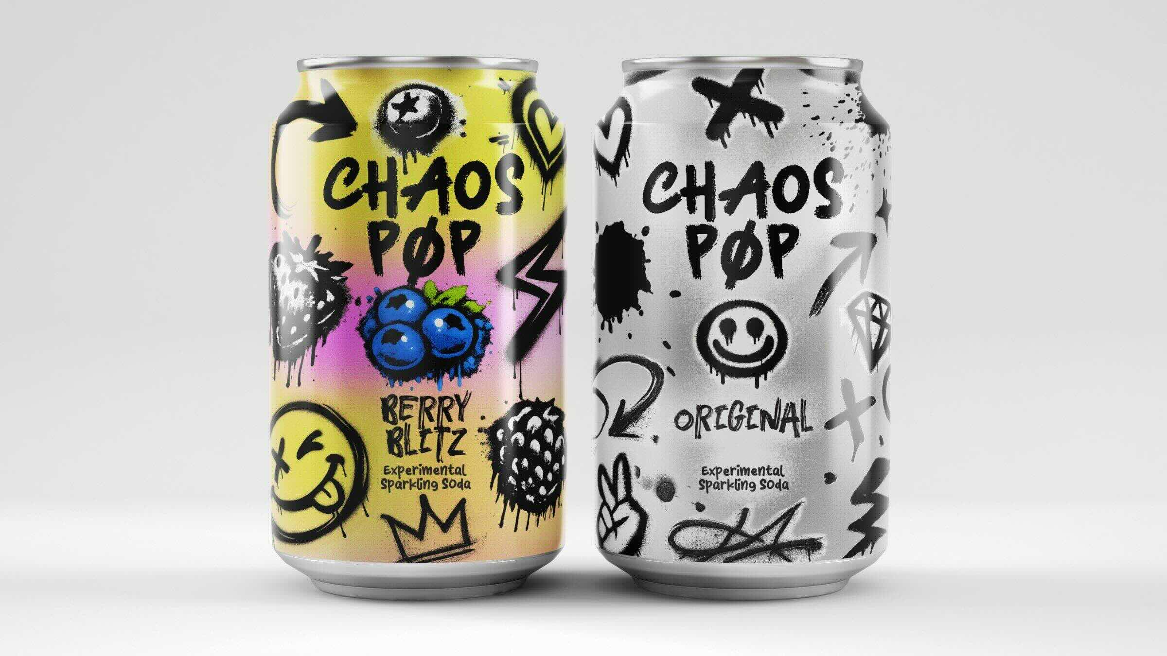
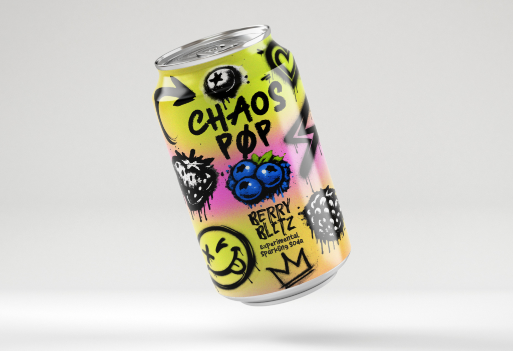
For this project, let’s lean into a graffiti-inspired theme, using raw, textured black spray paint graphics layered over a vibrant gradient background. The main visual cues come from the wild spray-paint stencils, paired with quirky elements like winking smiley faces and funky blueberries. The style is all about that energetic urban stencil-graffiti vibe mixed with exaggerated, playful fruit details. By homing in on these aspects, you’ll create the core visual style for your “Chaos Pop” packaging.
Once the main idea is established, the next step is to add structure by selecting standout fonts and design elements from the Envato library. For chaos packaging, fonts should match the energetic and expressive nature of the visuals rather than blend into the background. Bold hand-drawn fonts, graffiti-style lettering, or distorted typefaces can help create a sense of movement and personality. Chunky retro fonts can also enhance a nostalgic feel. Mixing different styles is key to building a clear hierarchy, with contrasting weights and unique shapes keeping the design dynamic while still maintaining readability.
For this concept, a sleek soda can mockup from Envato’s library can be paired with expressive brush fonts to achieve a raw, hand-sprayed aesthetic. A vibrant neon gradient background can further enhance the chaotic visual style, adding contrast and energy to the overall design.
Now it’s time to get practical. Head over to Envato’s library to grab a solid packaging template and ensure your art actually fits real-world production constraints. Just search for things like soda can label templates, beverage packaging layouts, or general product label designs.
These files are great because they come pre-loaded with all the technical boring stuff like dielines, bleed areas, and safe zones. By dropping your graphics and typography directly into the template, you can start building out your layout with total confidence that nothing important is going to get cut off at the printer.

Once the template has been selected, the next step is to move the design onto it and begin refining the artwork. It’s often helpful to use both Illustrator and Photoshop, depending on the task. Illustrator handles the technical foundation, making it ideal for typography adjustments, maintaining crisp vector graphics, and ensuring the label layout aligns perfectly with the dielines. Photoshop, on the other hand, is better suited for adding depth and character. It works well for introducing gritty textures, refining color grading, and applying lighting effects or compositing visuals to give the packaging a stronger visual impact. Combining both tools enables a flexible, efficient workflow.
After working across both applications, Photoshop can be used to finalize the layout when the design relies heavily on texture and visual blending. It simplifies the process of merging graffiti elements and adjusting neon color treatments on the soda can mockup. It also provides greater control over final compositing, ensuring all chaotic elements sit correctly within safe zones and feel cohesive before export.

The key to making the chaos packaging trend effective lies in balancing high-energy visuals with clear readability. While bold spray paint textures and neon colors create a strong visual impact, the design must still communicate essential information such as the brand name, product type, and flavor variant.
To prevent the layout from becoming overwhelming, techniques such as increasing contrast around key text or scaling up the brand name can guide the viewer’s attention. In some cases, simplifying overly busy areas is necessary to create visual breathing room. Even the most chaotic packaging must communicate quickly and clearly, especially when competing for attention on a crowded shelf.

To take the design to the next level, focus on adding finishing touches that bring depth and realism to the packaging. Small details, such as grainy paper textures, metallic foil effects, or spot UV highlights, can help key elements stand out. Subtle gradients and lighting can also be used to simulate how the packaging would catch light in a real-world setting. These enhancements transform a flat concept into a design that feels tangible, polished, and ready for the shelf.

To wrap things up, we’re applying the final artwork directly onto the high-res beverage can mockup we grabbed from Envato. It’s such a game-changer to see the design wrap around the can’s 3D curves in real time. This is where you can really tell if that “Chaos Pop” energy translates to a physical product. Using a professional mockup like this lets you preview exactly how the labels will catch the light and sit on a store shelf, making it way easier to spot any last-minute tweaks before you finalize the marketing visuals. Now that everything is perfectly mapped onto the surface, the design finally feels like something you could actually grab and drink!
Even when you’re designing chaos packaging, there are some common mistakes that can ruin a design if you’re not careful.
Just keep those essentials in check, and the chaos will work for you, not against you.

AI packaging design uses artificial intelligence to generate and refine packaging concepts, helping designers work faster while exploring more creative directions. It combines automation with traditional tools like Illustrator and Photoshop.
Yes. AI tools are useful for exploring illustration styles, visual motifs, and color palettes that can later be refined into a full packaging design.
Illustrator is often used for vector layouts and dielines, while Photoshop is ideal for textures, compositing, and realistic mockups.
GraphicsGen, Adobe Illustrator, and Photoshop are a strong combination. AI tools generate ideas, while design software refines and finalises the packaging.
Chaos packaging is a design trend that uses bold colours, layered visuals, and unconventional layouts to create high-impact, attention-grabbing packaging. Despite its appearance, it relies on strong design fundamentals.
No, AI cannot replace designers. It accelerates idea generation, but human designers are essential for refining, structuring, and making designs production-ready.
Yes, when used correctly. Chaos packaging is highly effective for brands targeting younger audiences and niche markets because it stands out and feels expressive.
Use hierarchy and contrast. Make the brand name prominent, limit clutter, and guide the viewer’s eye through the design.
AI packaging design is changing how creatives approach product design. Instead of starting from scratch, you can explore bold directions quickly and refine them into professional outcomes.
The chaos packaging trend shows that breaking the rules — when done intentionally — can create powerful, memorable designs. By combining AI tools with structured workflows, you can turn raw creative energy into packaging that not only stands out but also works in the real world.
If you are ready to experiment, start generating, refining, and building your own chaos-inspired packaging system.
Learn how to edit with AI on Envato stock photos, customizing images instantly by removing objects, changing backgrounds, and creating polished visuals without leaving the platform.

Explore the tennis aesthetic trend for 2026, from preppy style and color palettes to branding and design ideas inspired by tennis culture, fashion, and modern creative projects.

Fourteen World Cup shirts that still matter, from Brazil 1954 to Cameroon's banned vest. The design thinking behind the kits that lasted, and what they all have in common.

Canary yellow explained: meaning, hex code, color psychology and design ideas. Learn how to use this bold yellow in branding, UI and 2026 creative projects.