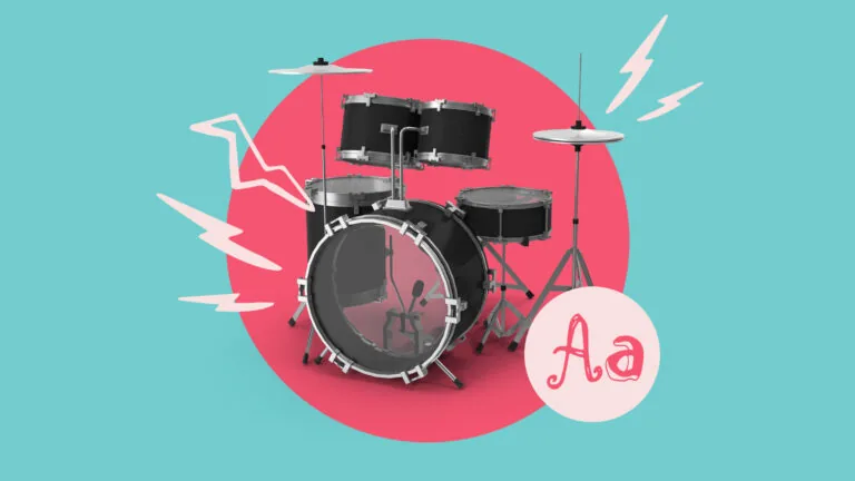
50 best PowerPoint templates for 2026: education, business & more
Explore PowerPoint templates with professionally designed layouts to create polished, modern, and visually cohesive presentations.
Envato: Get every type of asset for any type of project, and access to AI tools. Start now
Explore festival aesthetics and music festival design to create immersive, standout visual experiences.
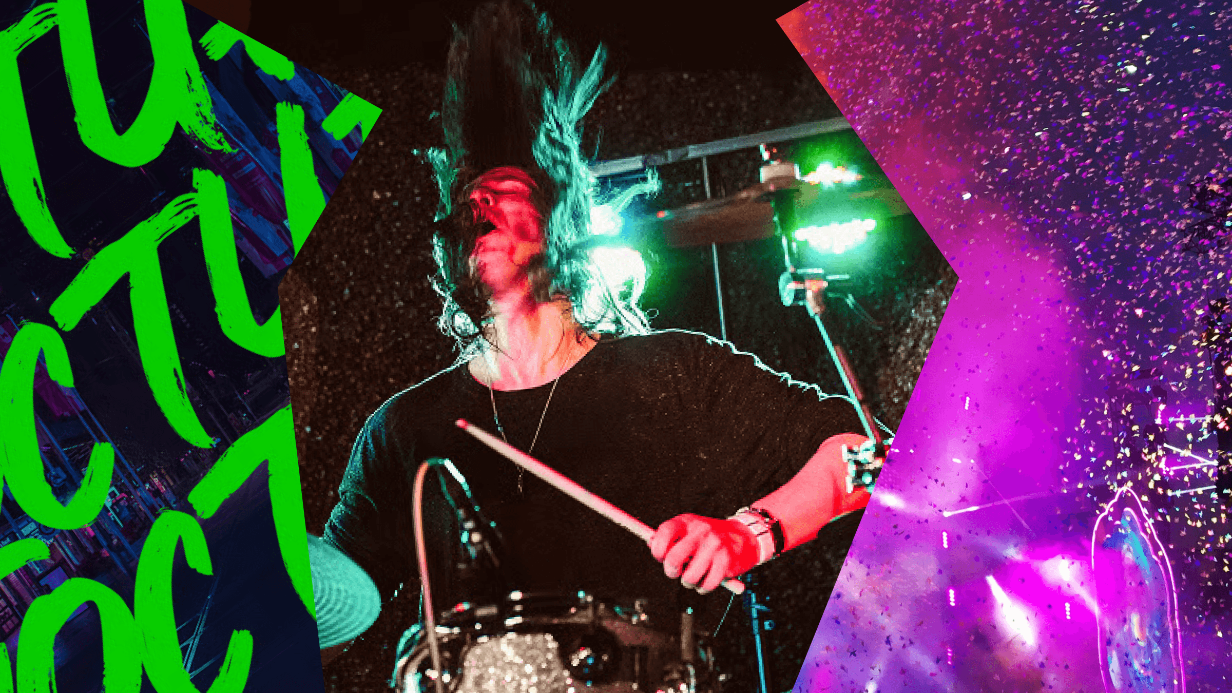
If you’re lucky enough to have bagged a ticket to Coachella, Lollapalooza, or Austin City Limits this year, no doubt you’ll already be planning the acts you want to see, as well as your festival wardrobe. But there’s more to festival aesthetics than fashion alone! The best music festival design curates a complete immersive aesthetic, transporting visitors into a unique world from ticket purchase to final headliner.
Over the last few decades, music festival design has evolved from simple visual identities into full design systems that extend the festival experience across social media, in-person pop-ups, motion visuals, and advertising. Take a deep dive into festival aesthetics with our complete guide to music festival graphic design and branding, which tours festival design history, explores the key elements of festival aesthetics, and shares tips and resources for creating festival posters, videos, and more.

Music festival design is the visual and experiential system that shapes a festival, including branding, posters, motion graphics, typography, and immersive environments that define the audience experience.
Today, festivals are often major branded events, attracting top artists and major sponsors. However, even the most branded festivals make a nod to the independent spirit of historic music events, referencing bohemian counterculture and the grunge origins of rock music.
Way back in the 1960s, festivals began as grassroots events, independently owned and run. Woodstock in 1969 was defined by the Free Love movement, with an easygoing hippie aesthetic that modern festival design often still emulates today.
The 70s and 80s are sometimes referred to as the ‘Free Era’ of festivals, as these events were organized by nonprofits or free to attend. This fed into the bohemian, alt-culture aesthetic of festivals during these decades.
In the 1990s, the anarchic Britpop movement put British festivals like Glastonbury on the map, which championed anti-design and grunge aesthetics, and made a style icon of the humble wellington boot. Festivals began attracting more fashion-forward types, with the likes of Vogue staging photo shoots on the festival’s infamously muddy fields.
The Coachella Valley Music and Arts Festival debuted in October 1999, with headliners Beck and Rage Against the Machine. Despite the founders, LA-based promoters Goldenvoice charging attendees $50 a day, the festival lost money, with fears it wouldn’t be able to come back. But having made a name for itself as the place to see the best bands (with Radiohead’s booking in 2004 proving to be a significant turning point), Coachella gradually morphed into the mega-festival we know it as today.
Interestingly, despite successfully attracting major corporate sponsors like American Express and Red Bull, the festival has retained its original 90s Coachella brand identity, consisting of a naively lettered logo and an evocative desert backdrop. If it ain’t broke…
It wasn’t until the late 1990s and early 2000s that festivals really became the high-earning events that they are today, and this is when we start to see music festival aesthetics evolving into established brand identities. This is partly because there was simply more competition in the music festival market, with branding and TV advertising becoming a big part of attracting music fans to events.
It became more important for each festival to carve out its own distinctive festival identity, with music festival logo design, posters, and social media strategies giving potential visitors an immersive taste of the experience. Music festival design became more polished over this period, lending a glossy feel to festival aesthetics like boho, indie, and grunge.
Alongside aesthetic evolution came the big bucks. Leading festivals now have much larger budgets to experiment with music festival design, leading to hyper-digital, immersive aesthetics that combine video, pyrotechnics, and, more recently, AI.
As for ticket prices? They now reflect the scale of these international events. Burning Man and Coachella consistently top most-expensive-festival lists, but Iceland’s Secret Solstice Festival steals the top spot with a reported VIP package advertised for an eye-watering $1 million. Ouch.
From hippie roots to brand land, festivals have certainly transformed drastically in the last sixty years, with music festival design now playing an intrinsic part in promoting and hosting music events.
Music festival design is varied and experimental, with the best music festival design striking a balance between alternative counterculture aesthetics and recognizable brand identities. In fact, festival design is one of the most innovative areas within graphic design and branding, as it rarely adheres strictly to corporate branding rules.
Some of the key elements of music festival design include:
In the 2000s, something shifted. Millennials began attending festivals and demanded more than just the opportunity to see a few great bands live. Festivals became about immersive, life-changing experiences (that could also be shared on Instagram Stories). This new audience of experiential festival-goers reshaped the purpose of festival design. Going beyond a simple festival poster design, festival aesthetics became about curating an experience before, during, and after a major event, ensuring attendees were still talking about it in the lead-up and afterward.
Today, the best festival design uses aesthetic choices to create a longer-lasting experience that extends beyond the weekend event. It’s about consistent branding across digital and print media, sensory design techniques that transport online viewers into the festival environment, and referencing wider cultural trends to make the festival feel like the still point of the turning world. As a result, festival branding might draw on design aesthetics from the latest music trends, fashion, TikTok, streaming, and advertising to build a holistic identity.
The aim of the game?
For festival design to contribute to the year-long success of an organized festival, building anticipation for ticket sales, encouraging sharing, and setting cultural trends that will generate major buzz.
Festival design is no longer an afterthought—it plays a crucial role in making festivals hugely aspirational, profitable events.

The best music festival design combines experimental energy with a keen eye for attention-grabbing aesthetics. Some useful tips for creating music festival designs include:
Music festival designs should reflect each event’s unique identity, so the actual look and feel can vary widely. However, there are common festival aesthetics that designers can tap into, including grunge, boho and glitch, that will give your projects instant star quality. Here are some handy resources for nailing the festival look.
Give prospective festival-goers a backstage pass with behind-the-scenes footage of preparations, which you can circulate on social media. Use VHS video templates or polaroid-style overlays to give videos of artists and festival organizers preparing for the big event a raw, personal edge.
Above all else, music festivals have to be cool (otherwise, why would you bother?). Analog textures strip the digital polish from high-resolution photography and AI-generated videos, creating something far grittier. And given that Gen Z is the nostalgia-crazed generation, noise overlays, dirt textures, and vintage light effects strike just the right note.
Designers can afford to be more experimental with music festival logo designs and typography. Colorful, 3D display fonts ensure billboards draw as many eyes as possible, while hand-drawn fonts with rough textures make a nod to festival aesthetics like grunge and indie. Be brave, be bold! Just make sure you use secondary brand fonts that are clear to read for key information on tickets and posters.
Glitch video templates are a great way to introduce new artists on stage, referencing the grunge festival era of the 90s and tapping into that anti-establishment energy. Don’t worry about making images and videos feel too polished—the best music festival design is a little scruffy and imperfect. So seek out off-beat color palettes, irregular frames, and handwritten punk fonts for a DIY mood.
Music festival poster design was the original way these kinds of events were advertised, and its power still hasn’t dimmed today. These showcase enticing glimpses of the booked artists, day-by-day lineups, and the festival’s branding. Use a festival poster template to create your own designs for posters and flyers, keeping large-format print in mind and adapting sizes for social media posts.
Festival design is often at the forefront of wider pop culture trends, making it a really exciting, innovative industry to be creating in. This year’s festival trends are next year’s mainstream aesthetics, so designers can really push the boat out with experimental projects for festival content. Remember when Gorillaz became the first ever 3D animated band (setting the bar high for festival visuals ever since), or when Daft Punk played an iconic Coachella set inside a giant light-up pyramid? Or Lady Gaga’s Dune-like theatrical set from last year’s Coachella?
These unique, trailblazing moments are only seen at music festivals, with festival design mirroring the experimental approach of the artists they showcase. In recent years, we’ve seen festival design branch out into experiments with AI design, 3D holograms, and interactive motion visuals, as well as tapping into wider branding trends. As artists’ sets evolve in quality and creativity, so do the festival designs that promote them. It seems when it comes to festival aesthetics, the only way is up.
Ultimately, great music festival design isn’t just about visuals; it’s about creating a world people want to step into. To get started, check out our music festival design aesthetic collection – where bold color, layered textures, and motion-driven visuals come together.
Most modern festivals will benefit from a fleshed-out brand identity, including logo, graphics, typography, color palette, image styles, and video styles. By establishing a consistent identity, you’re more likely to make your event recognizable, and it conveys the message that your festival is professionally run and managed (unlike Fyre Festival, a notoriously mismanaged disaster that has sparked talk of a Broadway Musical).
In 2026, festivals like Coachella and Burning Man are set to explore a range of aesthetics, including environmental themes (Burning Man’s theme is based around the Tree of Life) and carnival design (Coachella’s 2026 theme is ‘The Grand Revivre’, featuring playful games and immersive design). Across music festival design more broadly, we can also expect to see nostalgic design and throwback festival aesthetics, such as indie, grunge, and pop futurism.
To promote a music festival, you’ll need to create campaigns for both print and digital advertising, including banners, posters, flyers, and social media video content. Billboard and streaming advertising, as well as online ads, can also help to boost ticket sales.
Explore PowerPoint templates with professionally designed layouts to create polished, modern, and visually cohesive presentations.
Learn what font Nike uses, explore its typography evolution, and discover Nike font alternatives to create bold, minimal, high-impact designs for branding and campaigns.
Discover bold music video fonts for 2026, with top picks and bonus styles that help creators match sound, genre, and mood with striking visual identity.
Learn how to create an AI infographic design using GraphicsGen and Illustrator, from idea to reusable systems, with a step-by-step workflow for consistent, scalable visuals.