Movie typography in 2026: why does it suddenly look so good?
Explore movie typography trends shaping 2026, from bold film fonts to cinematic branding, with inspiring examples and practical tips for creating impactful, screen-ready typography.
Envato: Get every type of asset for any type of project, and access to AI tools. Start now
What font The New York Times uses explained, including logo, headlines, and typography system.
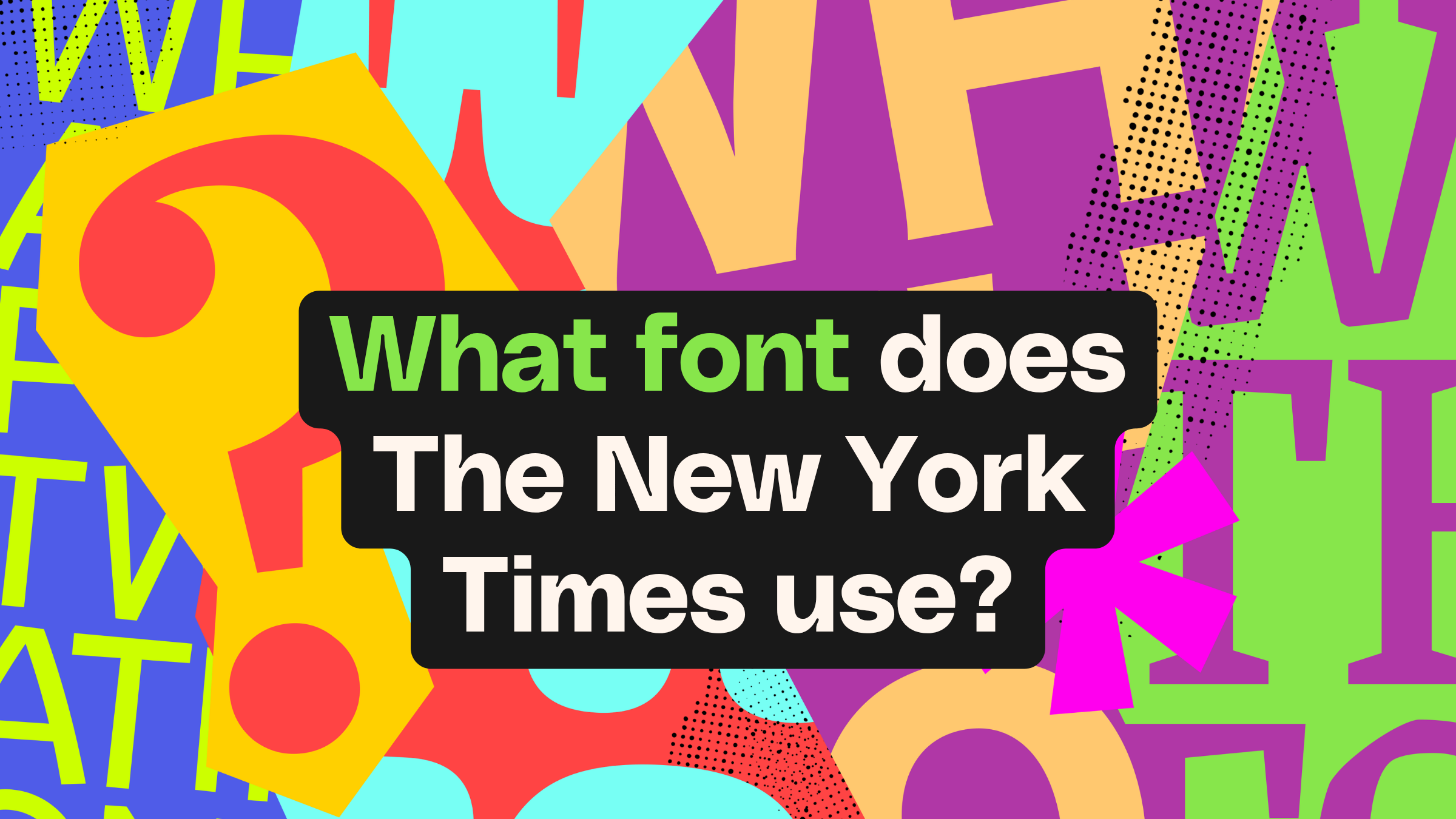
One of the most recognizable names in media publishing, The New York Times boasts a journalistic and typographic heritage that keeps it at the forefront of both news and publication design. But what font does The New York Times use?
The answer isn’t just one typeface. The New York Times uses a carefully crafted typography system that works seamlessly across print and digital platforms.
In this guide, discover the exact fonts used by The New York Times, explore their history, and find alternatives you can use in your own editorial designs.
The New York Times uses multiple fonts depending on context:
This combination allows the newspaper to maintain a consistent, authoritative identity across print, web, and mobile experiences.
There is no single “New York Times font.” Instead, the publication relies on a system of custom and adapted typefaces, each designed for a specific role — from headlines to body text to digital readability.
The New York Times brand uses a typographic system that works across print and digital. While some fonts have remained relatively consistent over the paper’s 175-year history, others have been introduced to improve legibility on modern interfaces.
The New York Times logo font is Engravers’ Old English BT, a blackletter display font designed by Morris Fuller Benton in 1901.
While the logo has remained largely unchanged over nearly two centuries, the version we recognize today was introduced in 1967. It became bolder and less condensed, and the ‘stop’ was dropped from the end of the newspaper’s name, losing a reported 1,000 outraged subscribers at the time.
A typographer named Edward Benguiat was also tasked with subtly refining the logo, replacing the arrow inside the “T” with a diamond. The update was so subtle that only the most eagle-eyed readers noticed.
The print newspaper uses NYT Cheltenham, a heavily customized version of the 1896 Cheltenham typeface, originally designed by Bertram Goodhue and Ingalls Kimball.
With its strong editorial tone and excellent readability, NYT Cheltenham has become synonymous with The New York Times’ headline style.
For body text, The New York Times uses NYT Imperial, a custom serif font and a close relative of Times New Roman.
This typeface ensures clarity and legibility across long-form articles, making it ideal for dense editorial layouts.
In supplements such as The New York Times Book Review, the newspaper uses NYT Karnak, a slab-serif font based on the original Karnak from the 1930s.
On digital platforms, including the website and social media, the typography system expands to include NYT Franklin — a custom version of Franklin Gothic — used alongside NYT Imperial and NYT Cheltenham.
In The New York Times Magazine, three additional custom fonts set the publication apart: NYT Mag Serif, NYT Mag Sans, and NYT Mag Slab, designed by Henrik Kubel in 2015.
The NYT is acutely aware of the heritage and authority that this oldest of American daily newspapers represents, with any changes to its typography — however low-key — extremely considered. Even the newspaper itself fell foul of the typographypolice, when a journalist misidentified the font used on nytimes.com as Georgia, which had actually been replaced by Imperial in 2017.
Over time, the newspaper has honed this multifaceted brand system through its typography, turning to custom fonts for brand control and cross-platform usability, with a particular emphasis on the accessibility of web typefaces.
No surprise really, given that now more than 95% of the newspaper’s 12.78 million total subscribers are digital-only.
The key takeaway for designers looking to take a leaf out of The New York Times playbook? In an increasingly competitive and uncertain media environment, newspapers need to evolve, and their typography should adapt with them. The NYT font deck executes this to perfection, with every typeface perfectly suited to its use and context.
And while designers can emulate The New York Times typography style, keep in mind that it’s not possible to purchase and licence the actual NYT fonts commercially. But no problem. There are plenty of New York Times font alternatives to try.
| Usage | Font Name | Style |
|---|---|---|
| Logo | Engravers’ Old English BT | Blackletter |
| Headlines | NYT Cheltenham | Serif |
| Body text | NYT Imperial | Serif |
| Digital | NYT Franklin | Sans-serif |
| Supplements | NYT Karnak | Slab serif |
The New York Times is acutely aware of the heritage and authority it represents. Every typographic decision—however subtle—is carefully considered.
Over time, the newspaper has refined a multifaceted typography system that prioritizes:
This is especially important today, with more than 95% of the newspaper’s 12.78 million subscribers being digital-only.
Newspapers were among the first print publications in the US, connecting disparate states and increasingly sprawling cities in the 19th century. The first port of call for essential current events, as well as birth, marriage, and death announcements, the earliest newspapers were made available to the general public on newsstands in major cities like New York and San Francisco. As the oldest daily in the country, The New York Times (formerly the New-York Daily Times) occupied a unique place in American culture, forging the model of what newspapers could be in this early era.
As more rival publications emerged, the design value of newspaper typography became apparent.
Larger, bolder headlines captured the attention of passing folk, while distinctive logotypes helped newspapers to carve out their own niche in the growing newspaper market.
Cheltenham was originally designed by architect Bertram Goodhue for publishing company The Cheltenham Press in New York, before being refined by Morris Benton at American Type Founders (ATF) in 1902. The typeface was soon recognized by the wider publishing community for its Arts and Crafts-inspired style and clear legibility, and was adopted by The New York Times as part of a mixed repertoire of headline typefaces as early as 1912.
However, it wasn’t until much, much later, in 2003, that the newspaper adopted its own custom version of the font, NYT Cheltenham, for almost all of its headline copy. With its distinctive character and editorial tone, it’s the perfect fit for the newspaper’s modern era, balancing old-school intellectualism with readable clarity for both screen and print.
The New York Times takes a measured approach to typography that can feel at odds with the fast-moving digital climate it now operates in, but it’s all for good reason. Here are three features that make The New York Times typography unique:
Looking for newspaper fonts like The New York Times uses? For publishing and editorial projects, as well as blogs and social media, these New York Times font alternatives will ensure important messages resonate with your audience.
A worthy match for The New York Times logotype, Cambridge is a traditional Blackletter font in the English tradition. Set this gothic typeface in crisp black lettering to mimic The New York Times logo font.
A good Cheltenham font alternative, Capires is a fluid font with a 1930s feel. It perfectly captures that bridging style between Art Nouveau and Art Deco.
It may not be a spot-on copy of The New York Times typography, but Goldoni successfully captures that intellectual editorial mood. Use for headlines, magazine designs, and blog titles.
Aureate is a simple and sophisticated serif that makes a credible New York Times font alternative to NYT Imperial. With its slightly rounded letterforms, it also softens body text, keeping it within that 1930s aesthetic.
A bold Blackletter typeface that is highly legible, Aither is a worthy alternative to the New York Times logo. You could experiment with bolder color choices than the newspaper brand if you want to create something a little different.
Pesto Mafio taps into that vintage European aesthetic The New York Times does so well. This is a highly readable typeface that would suit headlines and pull quotes for newspapers, blogs and magazines.
Keep your body text crisp and traditional with Media Times, an elegant serif typeface that is a close New York Times font alternative to NYT Imperial or Times New Roman.
Pair the original Media Times font above with this swankier version, which will give titles and quotes a curvy character for a cohesive brand look.
Looking for newspaper fonts like those used by The New York Times? Fonseca is a vintage-inspired typeface that would make a fitting alternative to the paper’s favored Cheltenham.
This wildcard New York Times font alternative may not be an exact copy of the newspaper’s branded type, but it would sure look good on magazine and blog titles, wouldn’t it? And as with all of The New York Times fonts, Milano ticks the boxes for intellectual influence and strong legibility.
Looking to replicate the look and feel of The New York Times typography for your own projects? Whether you want a close match to The New York Times style or a unique spin on newspaper branding, these pro tips will help you cultivate the right journalistic aesthetic.
The New York Times needs to appear both trustworthy and at the forefront of fast-moving current events. Their typography strategy achieves both by combining old-school or transitional serif fonts with more contemporary, quirky type styles. In your own designs, try a traditional serif for body copy alongside a more characterful logo font or headline font to strike the perfect balance of heritage and modernity.
Newspaper articles contain (unsurprisingly) a lot of text, so a typeset design will benefit from the bones of a good typography structure. This means dividing your fonts and font weights across a descending range of categories, from headlines and subheadings to bullet points, quotes, and body text. And once you have this in place, stick strictly to the type hierarchy to promote consistency across your entire publication.
When recreating The New York Times’s type-focused aesthetic, it’s really important to let typography breathe. With fewer images and distractions to break up long-form paragraphs, allocating plenty of white space alongside columns and between sections can make a world of difference to the overall design.
If it’s too crowded, visitors will simply click away (or disappear to track down their best reading glasses). See white space as your design reset. And breathe…
It’s no secret that the publishing industry has traveled a rocky road over the last couple of decades. As readers turn away from traditional print formats to digital content, we’ve seen some titles fail to adapt quickly enough to a rapidly changing environment.
In your own projects, even if you are creating a print-first publication, don’t neglect the possibility (probability!) that your publication will probably fare better as a digital edition, whether in blog or email format. With this in mind, select typefaces that include compatible web fonts, and look for type styles better suited to website and app design. Think accessibility, contrast, and legibility, even on the smallest of screens.
Designers are only human, but these common mistakes can help you swerve the pitfalls of editorial design and steer your newsworthy designs to the top of the publishing charts.
Don’t be drawn in by that overly fancy font. Put it down. Good. Now go back to that font that you could actually read.
Yes, Cheltenham is a serif font, so in fact The New York Times does just this, but what we’re getting at is combining a traditional serif, like Times New Roman, for headlines with a very similar old-style serif for body copy. This will take your editorial designs back in time, not in a great way. It’s giving more FT than NYT.
Newspapers are meant to have denser text than other types of content—you’re aiming for ‘intellectual journalist’ after all, not ‘infinite-scroll influencer’.
As a result, certain type rules apply. One is that text should be neatly spaced or kerned rather than heavily spaced out. Keeping a tight kerning on body text can actually improve readability and flow, while also pulling paragraphs together into neat columns. You may also want to justify text to maintain visual neatness.
Aside from The New York Times itself, there are other inspirational websites, brands, and blogs that use similar type traits to NY’s oldest newspaper. Here are some New York Times style examples from different industries as food for thought.
Online blogs, magazines, and zines, as well as print magazines and newspapers, often use fonts like The New York Times or adopt similar typography styles. A case in point is the magazine The New Yorker, which uses a custom masthead font designed in 1925 that isn’t a million miles away from Cheltenham.
The Atlantic also uses a serif font for its masthead and titles: a custom typeface called Atlantic, based on old American versions of Garamond. Another Magazine also adopts a similar typographic style to The New York Times Magazine, with a sans-serif body copy and subtle serif headline font.
You’ll find plenty of New York Times branding traits in the luxury and heritage sectors. Loewe and Hermès have both adopted 1930s typeface styles for their brand typography, often setting these in bright or jewel colors for a fashion-forward touch.
British luxury house Burberry has also returned to a subtly serif logo typeface after flirting with a sans-serif font since 2018. Perhaps a counter-reaction to the mass ‘Helvetica-ization’ of modern luxury branding that has seen a large number of brands dropping their traditional serif logos over the last decade.
Over recent years, we’ve seen digital designs U-turn on sans serif typefaces, with more websites adopting serif typography. Even industries that would have been the traditional stronghold of minimal sans serifs, such as design agencies and architecture practices, have turned to New York Times font styles to lend authority and elegance to web layouts.
Creative agency Studio Herrstrom has a very NYT-coded web design, rendered in striking black and white, while architects and interior designers Studio Dado have embraced a beautiful vintage serif for their serene website, designed by digital agency Motto.
The New York Times is an institution in more ways than one. Journalism heavyweight, heritage newspaper…and typographic icon. While the newspaper’s design choices whisper rather than shout, they offer a type masterclass in elegant restraint. Its authority is no accident, but by intentional design, and it’s clear the newspaper has gone to great lengths to refine and protect its brand typography over the years.
If you’re designing your own blog, magazine, or editorial layout and wondering what font does the New York Times use, The New York Times typography system is a powerful reference point. Study it, adapt it, and build your own distinctive typographic voice.
Discover more New York Times font alternatives for both print and digital projects, plus discover how to create editorial-standard infographics in Illustrator and GraphicsGen. And don’t miss Envato’s new font preview tool, which allows you to test fonts before you download!
The New York Times logo font is Engravers’ Old English BT, a blackletter font designed in 1901. Subtly changed in the 1960s, the logo still looks very similar to the design used by the newspaper over its 175-year history.
No, the fonts used by The New York Times are not commercially available to purchase, as they are exclusively licensed to the newspaper. You can, however, find good New York Times font alternatives.
No, the official NYT fonts are custom and not publicly available, but there are many similar alternatives.
The New York Times uses NYT Imperial for body text and NYT Cheltenham for headlines.
One of the most recognizable names in media publishing, The New York Times boasts a journalistic and typographic heritage that keeps it at the forefront of both news and publication design.
Explore movie typography trends shaping 2026, from bold film fonts to cinematic branding, with inspiring examples and practical tips for creating impactful, screen-ready typography.

Explore the bold botanical design trend shaping 2026, from lush patterns and floral design to branding, interiors, and nature-inspired creative projects rooted in biophilic aesthetics.
Learn what font Disney uses, why it’s not downloadable, and discover Disney-style font alternatives to recreate that iconic, playful branding style in your own designs.
Explore PowerPoint templates with professionally designed layouts to create polished, modern, and visually cohesive presentations.