How to edit with AI using Envato stock photos
Learn how to edit with AI on Envato stock photos, customizing images instantly by removing objects, changing backgrounds, and creating polished visuals without leaving the platform.
Envato: Get every type of asset for any type of project, and access to AI tools. Start now
Do your designs convey a compelling message, or do they just look great? Turns out, there’s a big difference. Learn all about the power of storytelling through design.

As creatives, we don’t just make things look good — we shape how people feel, think, and remember. From color to composition and from the perfect imagery to well-chosen typography, every element we choose says something.
Think about the designs that stopped you in your tracks. It wasn’t just the font or the palette — it was the story underneath. The ones that hit different? They meant something.
That’s because, at its core, design is storytelling, just without the page-turns. In this piece, we’re breaking down the art of storytelling through design. Let’s get into it.
When most people think of storytelling, they imagine an elaborate movie plot or an enchanting novel. However, creatives also use storytelling in graphic and web design. Every visual choice they make tells a story. Colors, shapes, and layouts transform into narratives that guide the audience through an experience.
Whether it’s a logo, a website, or a motion graphic, storytelling makes a design feel intentional and engaging.
Every element in design plays a role in shaping the story:
Storytelling can span several design mediums. It shapes how people experience and interact with visuals.
For example, in graphic design, a well-composed image can tell a story instantly. How? You can use contrast, hierarchy, and color to guide the viewer’s eye.
The design of this magazine cover tells a visually compelling story through its color, texture, and contrast. The beauty of storytelling is that you can interpret it in several ways.

Video editing is another medium that uses storytelling. It builds tension and emotion through pacing, transitions, and movement. This can bring a narrative to life over time.
Web design takes storytelling a step further by creating immersive experiences. Layout, animation, and interactivity guide users on a journey.
The most powerful brands tell unique stories that spark emotions, build trust, and make people feel connected.
Think about it. When a brand has a story, it becomes relatable. Why? Because storytelling helps:
To fully understand the importance of storytelling for creatives, let’s examine some well-known designs that master storytelling.
Nike’s Swoosh is a classic example. When you see it, you automatically think, “Oh, that’s a checkmark.” But its history goes deeper than that. The famous Swoosh symbolizes speed, movement, and triumph.
In 1971, its designer, Carolyn Davidson, came up with the concept while thinking about the wings of Nike, the Greek goddess of victory. Every time you see the Swoosh, it reinforces the brand’s slogan: Just do it. And you’ll never forget that it’s all about pushing boundaries, taking action, and achieving greatness.
FedEx is known for its bold color palette, with purple and orange being the primary brand colors. But have you ever noticed the hidden arrow in the negative space between the logo’s ‘E’ and ‘x’?
This clever detail isn’t there by accident. It symbolizes speed, efficiency, and precision, core values for a logistics company. It’s a subtle design choice that reinforces the brand’s message whenever you see it.
You don’t need decades of history to tell a great story — just the right design. Create your own story with Envato’s logo templates.
Airbnb is also a master at storytelling. Its website entices travelers to book a stay at a breathtaking vacation rental, but it also invites visitors into the stories of hosts and other travelers.
When you land on the homepage, you see vibrant images of real people in beautiful locations.

Humans are hardwired for stories. From ancient campfires to modern-day social media, stories have always been how we share knowledge, build relationships, and make sense of the world.
This instinct is rooted in our biology. When we hear stories that evoke emotions, our brains release dopamine, the “feel-good” chemical. This helps us connect emotionally, as it taps into our basic need for meaning, understanding, and empathy.
And that allows us to relate personally to experiences that may not even be our own. Because stories strongly impact our emotions, we’re 22 times more likely to remember facts and details.
Add visuals to the mix, and you’ve got an even more powerful tool: visual storytelling. Visuals engage multiple parts of the brand at once, triggering both cognitive and emotional responses.
This is probably why processing an image can take as little as 13 milliseconds to process an image. That’s 30 times faster than you can blink your eye!
So a well-designed visual can convey complex ideas and emotions almost instantly. These visuals can help you amplify the story’s impact, making it easier for your audience to connect, understand, and remember.
Storytelling is everywhere in creative work. It’s how brands connect with their audience, evoke emotions, and make messages stick.
Let’s dive into a few key areas where storytelling works wonders.

When you design purposefully, you create a story that speaks to your audience. You can use everything from color to layout to set the mood and convey meaning.
Let’s break down how key design elements can create a powerful narrative.
Visual hierarchy guides the viewer’s eye through the story. Arranging elements thoughtfully ensures that the most important parts of the narrative grab attention first.
By adjusting size, color, and placement, you can prioritize the flow of information so the viewer knows where to look next without even thinking about it.
Composition combines all this by arranging and balancing those elements to create flow.
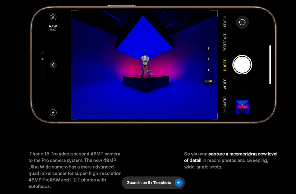
Let’s peek at Apple’s iPhone 16 Pro page. It gives you a full view of the titanium smartphone, which immediately captures your attention. The “Built for Apple Intelligence” white tagline pops against the dark background, making the message impossible to miss.
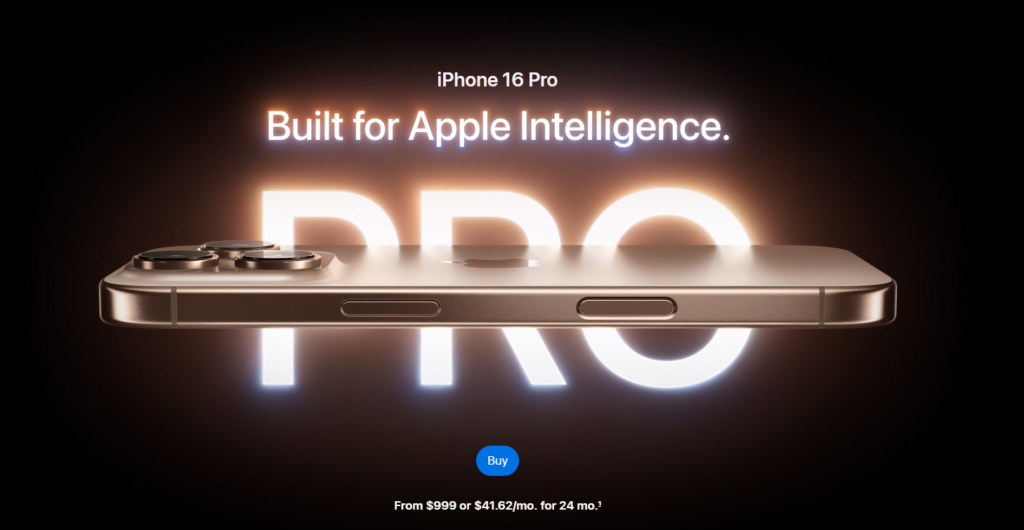
Apple’s website is aesthetically appealing, as text and image blocks are not placed too close to each other. This uncluttered layout instantly signals the brand’s commitment to high-quality, premium service.
Color is no doubt a visual element. However, according to color psychology, different hues, shades, tints, and tones can influence emotions and set the mood of a design.
For example, warm colors like reds and oranges can add energy, passion, or excitement. On the other hand, cooler shades like blues and greens are calming. People tend to associate them with trust and serenity.
Designers use these color cues to align the story with the emotional response they want to evoke in their audience.
Typography and fonts carry their own emotional weight (pun intended).
They can directly impact how the message resonates with the viewer. For example, serif fonts like Times New Roman are more serious and authoritative. That’s why you’ll typically see them in more formal settings like legal documents or academic writing.
In contrast, sans-serif fonts like Helvetica or Arial are sleek and modern. This makes them ideal for projects that aim to feel approachable and informal. Think tech brands, startups, or even contemporary art galleries. Then, you have styles like script or handwritten fonts, which bring a more personal and emotional touch.
The weight of a font also affects the narrative. A bold font grabs attention, while a lightweight font feels softer, more elegant, or subtle.
You should also pay attention to kerning (the spacing between letters). It helps your text read smoothly, but it can also impact the mood and personality of your design. Tight kerning (less spacing) creates a sense of urgency or boldness. This is great for logos or branding materials that need to make a statement quickly. Loose kerning (more space between letters) creates a more elegant, open, or relaxed vibe. Think high-end fashion brands or minimalist designs.
Icons, illustrations, and images are powerful storytelling tools in design. They communicate ideas, stir emotions, and create connections with the audience.
Icons represent concepts in a way that’s easy to understand. For example, if you see a heart-shaped icon, you’d probably instantly associate it with love or care. Or a lightbulb icon might symbolize innovation or ideas.
Illustrations offer a more dynamic, personalized way to tell a story. They range from whimsical and playful (e.g., hand-drawn cartoon characters) to detailed and realistic (e.g., highly stylized representations of a cityscape or landscape). The style of illustration shapes how the audience connects with the message.
Images, especially photos, evoke real emotions because they’re tied to real life. A photo of a cozy home can make you feel warm and cozy, while a shot of a busy city street can bring on that hustle and energy. And if you’re using a photo of people, you can tap into all kinds of emotions, like connections, happiness, or nostalgia.
When choosing images for a landing page, make sure they reflect its intent.
Headspace nails this on its homepage. One of the things you notice is the orange rising sun illustration that suggests a fresh start, calm mornings, and positive energy — all key themes for a meditation app.
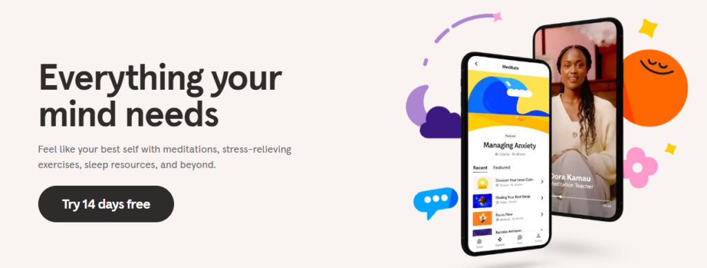
The minimalist illustration keeps the page uncluttered, while the sunny palette triggers feelings of warmth and optimism. This imagery tells visitors, “We’re here to help you greet the day with a clear mind,” perfectly matching Headspace’s promise of stress relief and mindful living.

An exceptional design uses visual elements to communicate your message and evoke resonating emotions.
Here are some key ways to master this craft.
You must know who you’re speaking to to tell a great story through design. So do some research to understand your audience’s needs, preferences, and cultural influences.
Knowing their age, location, job, and lifestyle can also give you insight into the types of visuals, colors, and language that will appeal to them. For example, if you’re targeting millennials, you might embrace bold, playful visuals. For professionals, you may stick to minimalist, sophisticated styles.
Remember that whatever works in one region or county might not resonate in another. For example, something as simple as a color palette might have different meanings depending on the culture. In some countries, red might represent love or happiness, but it could symbolize danger or anger in others.
Take time to learn these cultural nuances and ensure that your design doesn’t unintentionally offend or mislead.
A good design doesn’t just sit there—it pulls you in, makes you curious, and keeps you engaged before you even realize it. It’s not just about making something look polished; it’s about creating visual storytelling that tells the story as you want it to be told, whether through contrast, hierarchy, or the careful use of space.
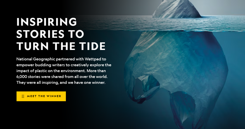
Take National Geographic’s “Planet or Plastic?” page. One photo shows what looks like an iceberg, but it’s really a plastic bag poking out of the ocean. There is no extra clutter: just a clear picture and a short line of text. Every detail—the crop, the colors, the big font, and the open space—pulls your eyes to one idea: our plastic trash is hurting the planet.
Before diving into the design process, ensure you clearly understand the story or message you want to communicate. Ask yourself: What do I want my audience to take away from this design?
Next, consider the message’s emotional impact. How do you want people to feel when they encounter your design? Do you want them to feel inspired, motivated, or calm? The emotion you want to evoke should guide the entire design process.
Once you’ve nailed down the core message and emotion, simplify it. A clear, concise message is more likely to stick with your audience. Avoid adding unnecessary details or clutter that might confuse the viewer.
Finally, test your message across different contexts and platforms. Will the message resonate equally in various formats, like social media, print, or mobile? Consider how the design will translate across platforms and if your message still stands out.
Once you’ve got your design rolling, it’s time to fine-tune. A great design is never truly finished on the first try. It’s a process of iteration and experimentation. The more you test, refine, and listen to feedback, the more powerful your storytelling will be.
Here’s how you can make sure your design evolves into something that resonates with your audience:
Are you dying to see examples of great storytelling through design? Let’s break down some of these Envato designs.
This stock video uses neon, motion, and sound waves to tell a compelling story. The neon lights create a modern digital feel, while the seamless motion of the sound waves makes the design feel dynamic. It represents how information is constantly flowing.
Fractals and gradients are a design match made in heaven. The use of fractals suggests an ever-expanding world, and the intense, vibrant colors bring the design to life.
The Free Bird Logo is simple yet powerful. The bird in flight tells the story of freedom and unlimited potential. The clean lines and minimalism create an elegant, straightforward message. It speaks to a sense of independence and adventure.
This font has a modern, elegant, and relaxed vibe. It pairs sophisticated typography with an image of a coffee cup, inviting a feeling of calm and leisure. It’s a narrative of slowing down, enjoying life’s moments, and finding sophistication in everyday comfort.
The photo conveys a joyful celebration. The bright colors of the confetti and costumes immediately set a vibrant, upbeat tone.

Storytelling has existed for as long as anyone can remember, but that doesn’t mean it’s not evolving.
New technologies like interactive storytelling, augmented reality (AR), and AI-driven design will take storytelling to another level.
Interactive storytelling, for example, lets the audience control or shape the narrative. It creates a more profound connection by allowing people to make choices that influence the story. Whether through a website, app, or game, the audience has a sense of control, boosting engagement.
AR brings stories to life by layering digital elements over the physical world. With AR, customers can see a product’s appearance on or in their homes before buying it. As a designer, you can use storytelling to guide users through these experiences.
Lastly, AI-driven design can help automate parts of the design workflow. It can suggest layouts, predict trends, or even generate content. But remember, it’s up to you to ensure the final message is coherent, meaningful, and resonates with your audience.
As a creative, storytelling makes your work connect on a deeper level. In an ordinary design, the visual elements are there. But do they really speak to the audience?
To make an impression, there must be a compelling message — something that sticks. Whether a digital experience that immerses users or a simple logo that conveys a brand’s history and roots, storytelling gives purpose to your design choices.
Ready to elevate your story design? Check out Envato’s creative tools and resources and start letting your designs speak for themselves. And check out these 7 great brand storytelling examples.
Learn how to edit with AI on Envato stock photos, customizing images instantly by removing objects, changing backgrounds, and creating polished visuals without leaving the platform.

Explore the tennis aesthetic trend for 2026, from preppy style and color palettes to branding and design ideas inspired by tennis culture, fashion, and modern creative projects.

Fourteen World Cup shirts that still matter, from Brazil 1954 to Cameroon's banned vest. The design thinking behind the kits that lasted, and what they all have in common.

Canary yellow explained: meaning, hex code, color psychology and design ideas. Learn how to use this bold yellow in branding, UI and 2026 creative projects.