Movie typography in 2026: why does it suddenly look so good?
Explore movie typography trends shaping 2026, from bold film fonts to cinematic branding, with inspiring examples and practical tips for creating impactful, screen-ready typography.
Envato: Get every type of asset for any type of project, and access to AI tools. Start now
Explore the Fallout aesthetic and learn how retro futurism meets post apocalyptic design. This guide breaks down the atompunk style and shows how to recreate the look in your own creative projects.

Fallout returns in 2025, continuing with the distinct visual style that the show is known for. If you’re a fan of the Fallout universe – including the TV show and video games – and you love gritty dystopian visuals, keep reading because we’ll show you how to capture the same look and feel for your own projects.
The aesthetic of post-apocalyptic TV shows like Fallout is direct and readable. Nothing polished, everything has history. The mix of dystopian style and post-apocalyptic style is often tagged as atompunk or the atompunk aesthetic. And it’s ripe for the picking when it comes to design inspiration!
If you want to achieve the Fallout art style (or a broader Fallout design look), let the materials carry the mood. The Fallout art style works best when the scene feels handled and used, not freshly made. This article will explore the visual ingredients behind the style and how you can use them in your own work. And if you’re wondering what Fallout is about, check out the FAQs section at the bottom!
The look of post-apocalyptic TV shows like Fallout is built from two things. The optimism of the 1950s and the wreckage of a world after disaster. This clash is often called atompunk or Fallout retro futurism. It’s a mix of atomic age art and post-apocalyptic style, and it gives the series its familiar mood.
The post-apocalyptic style is built on images of collapse and survival. It shows cities after the blast, roads overgrown, signs burned out. In design terms, that means distressed textures, broken type, and muted palettes. It strips away polish to show the mark of time. Post-apocalyptic TV shows like The Last of US and The Walking Dead are good examples of this style.
In the 1940s and 50s, design leaned on simple shapes and soft colors. Brand mascots often had cheerful faces, and product logos looked upbeat. In Fallout, those same elements reappear (but they’re faded and rusted). This atomic age design helps the world feel familiar yet eerie.
Atompunk is a mix of mid-century design with the fear of nuclear war. Think glowing dials, ray gun curves, and CRT screens. In Fallout, this atompunk aesthetic adds a sense of retro futurism, where yesterday’s idea of “the future” survives in broken form.
Mid-century design gives the color and form, while dystopian style adds the damage and decay. Peeling paint, cracked concrete, and failing neon signs make sure nothing looks new. This is where the post-apocalyptic style of Fallout comes through most clearly.
The Fallout art style is easy to spot. Below are the main elements that shape its post-apocalyptic style, and that creatives can use in their own work.
Rust, peeling paint, cracked walls, and worn metal cover most surfaces. These details show age and damage. They’re a core part of the Fallout design, reminding us that nothing in this world is new.
These textures can turn a flat design into something with age and depth. On Envato, distressed overlays and grunge packs help create that same dystopian style in seconds.
Colors in Fallout stay muted, with lots of dust and dull paint. Neon lights in green or orange give short bursts of brightness against that decay.
Envato has ready-to-use LUTs and color grading packs that help recreate this post-apocalyptic style.
Fonts in the Fallout aesthetic often look stencilled, eroded, or glitchy. Letterforms feel like they were cut for military use or worn down by time.
For creatives, this means exploring stencil fonts, distressed typefaces, or display packs with erosion effects. This style also works well for a Fallout logo.
Fallout scenes are full of old machines. Radios hum, CRT screens glow, and heavy dials click into place. All of it looks built in the 1950s but imagined as future tech. This mix of retro design and science fiction has become known as Fallout retro futurism, part of the wider atompunk aesthetic.
A big part of the Fallout retro futurism look comes from 1950s graphics. Mascots grin, slogans are short and bold, and cartoons use plain shapes. In Fallout, these images turn up on posters, packaging, and old signs, but most of them are worn out, faded, or torn.
Retro illustration packs and vintage poster templates are an easy way to capture this same Fallout art style in new projects.
Fallout often shows hazy light and rough film effects. Lens blur, grain, and flicker give scenes a worn look. Creatives can use film grain textures, light leaks, or LUTs to bring the same Fallout style feel into their own work.
The Fallout art style is shaped by sound, too! The games and the new Fallout season mix old swing or crooner tracks with dark, ambient sound design. That contrast helps set the dystopian aesthetic. Cheerful mid-century songs playing on a broken radio.
Vintage-inspired tracks can create the retro feel of atomic age art, while ambient dystopian soundscapes can give projects the right atmosphere for trailers, social content, or motion graphics.
The Fallout aesthetic draws deeply from real 1950s culture — especially Cold War propaganda and atomic age design. The optimism of that era, seen in smiling mascots and chrome gadgets, becomes unsettling when placed in a destroyed world. That contrast explains why Fallout has a 50s aesthetic: it reflects a world frozen in the moment before the bomb dropped.
The 1940s–60s produced countless posters, safety manuals, and “duck and cover” leaflets. These pieces carried bold type, smiling mascots, and simple diagrams. Fallout reuses that same atomic age design, but sets it against cracked walls and ruined cities.
Mid-century product ads often showed cheerful cartoon faces and short slogans. The Fallout logo and Vault Boy mascot are direct riffs on that style. For creatives, you can use vintage poster templates or retro vector packs to echo the same Fallout retro futurism tone.
Mad Max showed deserts and wrecked machines. Blade Runner showed cities with neon lights and rain. More recently, post-apocalyptic series like The Last of Us use the same kind of post-apocalyptic style that also appears in Fallout.
High fashion sometimes borrows from survival themes. Balenciaga’s FW22 show staged models in a bleak, snow-filled space that felt close to Fallout artwork style. Editorial spreads use gas masks, survival gear, and neon lights to nod toward the atompunk aesthetic.
Fallout shows a lot of 1950s Americana. These include things like drive-in theatres, diners, and fairground rides. In the game, they are wrecked or abandoned. That contrast is part of the Fallout aesthetic. Artists can try the same trick by taking retro Americana images and placing them in a post-apocalyptic style.
The Fallout games laid the groundwork for the TV series. Since 1997, they’ve created a world marked by ruined landscapes and a sharp sense of dark humour. The show builds on that same foundation, carrying over the mood and atmosphere so that long-time players feel the world is instantly familiar.
The Fallout aesthetic can be recreated in design projects with a few clear steps. Follow these steps to recreate the Fallout artwork style for your work.
Start with a cheerful and nostalgic design. For example, a diner with pastel colors or a small town street under a perfect blue sky.

Now bring in something to draw the eye. It could be a big neon sign or a row of shiny vintage cars. This is a good opportunity to add some playful retro graphics.

Now take that happy scene and destroy it! The world is now falling apart, so add things like cracks in the road, rust, and broken glass. The contrast between bright mid-century optimism and post-apocalyptic grit is what sells the Fallout style.

Finish the image by adding a final lighting pass to tie it all together. You can use things like film grain or LUTs to give the image a dystopian aesthetic. Check out some shots of post-apocalyptic series like Fallout and The Last of Us for some inspiration when you’re going for this look.

The Fallout artwork style isn’t limited to games or TV. It can be applied across different types of design work.
The post-apocalyptic style works naturally for Twitch overlays, YouTube banners, or indie game branding. Stencil fonts, rust textures, and glitch transitions can set the right mood fast.
A Fallout retro futurism look works well for posters, flyers, and themed events. Using muted colors and worn type gives them a clear dystopian aesthetic.
Film grain overlays, CRT effects, and glitch templates bring the atompunk aesthetic into video. This is useful for trailers, social ads, or cinematic openers.
Vintage mascots, bold slogans, and layered textures can make magazine spreads or Instagram posts stand out. Using the Fallout logo style with retro graphics helps tie everything together.
The mix of ruined textures and bold retro logos can be applied to product labels, beer cans, or streetwear packaging. Adding these touches gives ordinary items a unique Fallout design twist.
A: It’s the post-apocalyptic series based on the Fallout games. The setting is a future ruined by a nuclear war in 2077. Survivors grew up in underground Vaults run by Vault-Tec. The story follows Lucy as she leaves her Vault to find her father and discovers how the wasteland really works. You’ll see the same dark humour and the same Fallout aesthetic that the games are known for.
A: Season 2 of the post-apocalyptic series Fallout comes out on December 17, 2025, on Prime Video.
A: Fallout takes style cues and inspiration from 1950s America. This includes things like the clothes, ads, logos and household gadgets that come from that era. The twist is that these details show up in a future wasteland, which gives the series its odd mix of nostalgia and decay.
A: Two eras at once. The design borrows from the 1950s, while the story sits centuries later. This mix shapes the atompunk aesthetic seen across the series.
A: It’s the period after the Second World War when nuclear tech shaped everyday life and design. Fallout picks up those cues and bends them into a post-apocalyptic style.
A: The key is contrast! Hopeful, bright, everyday optimism clashing with the ruins of a broken world. It’s this mix and contrast that makes the look of Fallout style really work.
The look of the post-apocalyptic TV shows like Fallout comes from mixing old-fashioned details with ruined settings. Posters, mascots, and rusted type all play a part. You can pull the same elements into your own work without needing to copy the world exactly.
On Envato you’ll find all the tools you need to try it out. Things like textures, fonts, graphics, and audio that fit the Fallout artwork style. Use them in posters, videos, or social posts if you want that post-apocalyptic style.
Season 2 of Fallout is on the way this December. So now is a good time to explore the Fallout retro futurism look and see how it fits your projects.
Explore movie typography trends shaping 2026, from bold film fonts to cinematic branding, with inspiring examples and practical tips for creating impactful, screen-ready typography.
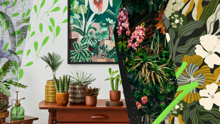
Explore the bold botanical design trend shaping 2026, from lush patterns and floral design to branding, interiors, and nature-inspired creative projects rooted in biophilic aesthetics.
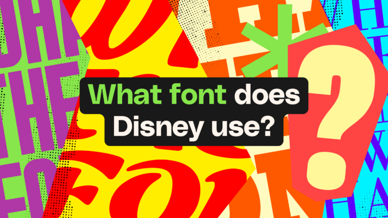
Learn what font Disney uses, why it’s not downloadable, and discover Disney-style font alternatives to recreate that iconic, playful branding style in your own designs.
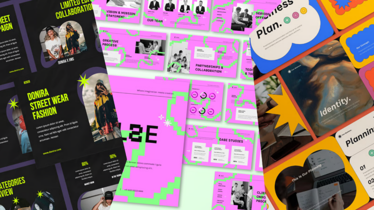
Explore PowerPoint templates with professionally designed layouts to create polished, modern, and visually cohesive presentations.