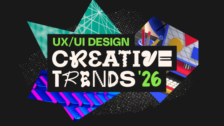
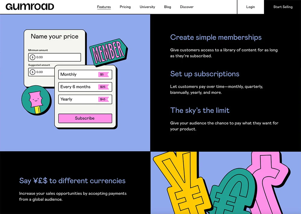
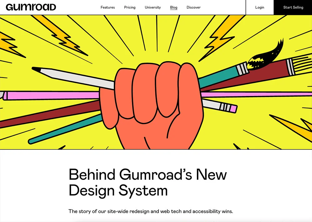
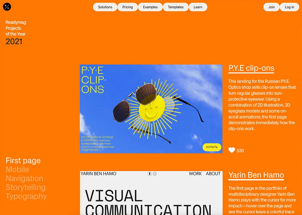
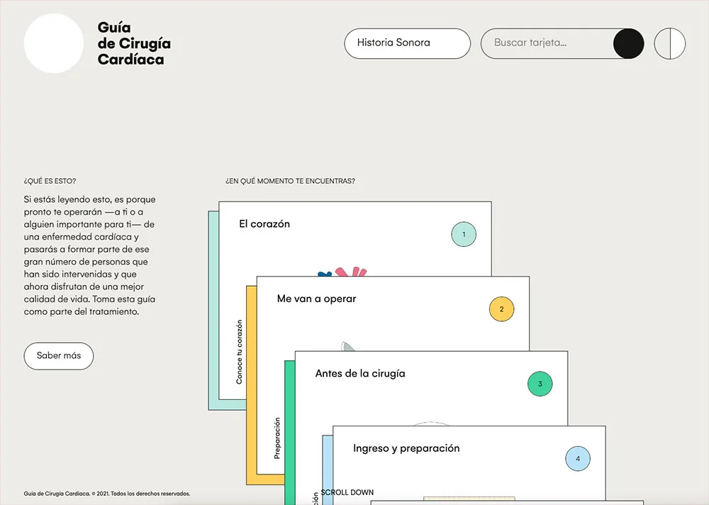
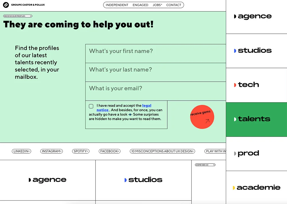
8 color scheme trends in mobile app design 2026
Looking for the latest mobile app color scheme trends this year? From vibrant gradients to high-contrast, inclusive palettes, here are the color ideas inspiring modern app design.
Envato: Get every type of asset for any type of project, and access to AI tools. Start now
What is neubrutalism? Learn about this new web design trend and see some examples of neubrutalist web design in action.
Move aside brutalism, there’s a tougher web design trend in town. Welcome to the stage neubrutalism: a refreshing combination of the brutalist trend as well as the modern, minimalist trend that’s graced our screens for many years now.
Read on for key features of this new design including what to look out for, real-world examples, plus a few neubrutalist-inspired graphic assets and web design templates from Envato Elements, ThemeForest, and the Shopify theme store.
Friends (or foes) of the brutalism web design trend will know that it’s a style that earned its name due to its affinity to brutalism in architecture, i.e. it rejects decorative pomp and ceremony in favor of rough, unfinished surfaces, unusual shapes, solid materials, and contrasting small features. The concrete-heavy Barbican in London is a classic example of brutalist architecture.
The term brutalism is derived from the French béton brut—literally “raw concrete”, left unfinished after being cast, and thereby displaying the imperfections and patterns made by the formwork.
It certainly won’t be to everyone’s tastes, but brutalist web design can be seen as rejecting the more popular, softer web and instead adopting harsh, raw, or uncomfortable forms. To see more examples of brutalist websites, check out brutalistwebsites.com.
Neubrutalism (a.k.a. neo-brutalism) takes recent website trends to the next level—it retains its edge while also combining the unusual style with more modern animation, illustration, and text standards. Although neubrutalism is an unofficial term right now, it’s already being talked about in the world of web design and it’s the sort of thing which sticks, so it’s great to get ahead of the curve!
If you’re new to neubrutalism, here are a few traits to look out for:
When you scroll through the neubrutalist website examples below you’ll likely notice the typography used for the headings—they almost all use quirky grotesque typefaces.
They’re often a bit beyond what we’d define as grotesque (or grotesk) and drift into the display font world, but however you define them they certainly make an impact. Get unlimited access to plenty of grotesque web fonts on Envato Elements right now!
“A grotesque sans serif font lacks a serif, which is a little extra stroke commonly seen at the end of some typefaces. It has, instead, a more abrupt edge.” — Daisy Ein
Read on for 10+ examples of neubrutalist design hitting the web right now. Which is your favorite?
Described as having a “minimalist & edgy user interface with the right blend of whitespace, big readable headings, thoughtful use of colours & focus on contrast”, this Shopify theme hits all the marks for creating a neubrutalist web design.

The pain of educating kids about technology and their place in today’s tech world is real. And exhausting! Mozilla has used neubrutalism as a way of talking to both adults and children, broaching topics like social media, online privacy, online communication, data, trolls—and it works.


Check out the muted, clashing, gradient-free colors combined with thick black outlines. Typography is modern and easy to read, setting it apart from the often clunkier styles preferred within brutalist design. Animations also help to modernize brutalist design.


One of the most famous examples of neubrutalist web design, Figma (soon to be Adobe Figma) avoids shadows across all imagery, instead opting for sharper, darker black lines surrounding the shapes. Clashing hues such as orange and yellow also feel a little challenging on the eye which helps them to stand out.


As soon as you set a foot wrong on the Goodkids website, it’s impossible to miss the oversized 404 animations which unevenly pile on top of each other to fill the screen. Smiley emojis are in a similar tone to the website’s beige background, making them feel slightly jarring and therefore weirdly eye-catching.

Channeling retro design trends, you’d be forgiven for thinking Readymag’s website comes straight out of the 90s. Subtle animations help to remind the user this is in fact a modern design choice! The flat grey navigation buttons are eye-catching in their simplicity.


Confident in its simplicity, Pizza Pizza opts for a flat red against black—it feels a little difficult on the eye, but you can’t help but carry on looking. The lack of imagery on the homepage also goes against most image-rich websites.

Flat, muted imagery against minimal and modern typography, the Cardiac Surgery Guide is a classic example of neubrutalist web design. Striking simplicity meets modern touches like the cursor when you scroll over content pieces and the logo that spins when the user scrolls.


The bold white text against clashing colorful blocks is challenging to read—hence you pay extra attention! Modern animations like happy walking clouds fill this fun website, a great juxtaposition against the flat color scheme.


Orange and lilac? Lemon yellow and royal blue? Daring combinations, but Plus’ website combines them all for an undeniably neubrutalist look. Bold animations and the novelty cursors almost gamify this edgy site.


As you scroll, fun animations burst into action within this neubrutalist website. A lot of thought has gone into how the user interacts with the site—when the mouse hovers over certain elements, many change color or move. To a certain extent, the user creates the website they’d like to see.

A text-heavy site, Castor & Pollux is sprinkled with color as the user scrolls. Even the social sharing buttons avoid the classic iconography you might expect in favor of simple text signposting.


With 10+ premade skins to show off your work, Remake is a versatile web design theme. The Kyona theme, for example, uses a sprinkling of bright colors against more muted tones. The templates also come with single project and case study pages—perfect to display your work in style.

Flat colors meet modern imagery and hard lines within this neubrutalist UI web design template. Compatible with Adobe XD and Illustrator, these assets allow designers to flex their neubrutalist muscles.

These two different Figma icon sets, both available from Envato Elements, will give your designs some brilliant neubrutalish (is that a word?) flair.
A simple and easy-to-follow web design template, check out the colors chosen within the portfolio section. This template comes with features including Slider Revolution to crete hero content quickly and easily, as well as a responsive layout design. The blog pages are also well-designed.

A great accompaniment to your neubrutalist design, this font (available in five styles) has a quirky aesthetic, is packed with personality, and fits perfectly with outlines, gradients, and pastel colors.

Now you’ve learned all about the neubrutalism website trend and explored some of my top websites and templates, it’s time to get creative! Either pick an asset from this post that works for you or take a look at what other neubrutalist assets we have on Elements and find or create your own. Which website trends are your favorite right now?
Looking for the latest mobile app color scheme trends this year? From vibrant gradients to high-contrast, inclusive palettes, here are the color ideas inspiring modern app design.
From soft 3D to hyper-minimal, icon design in 2026 is bolder, smarter, and more expressive. Explore the trends shaping UX, branding, and how AI is redefining tiny-but-mighty design.
Learn how to use Figma prototype testing to validate your designs.
Learn the 10 best microinteractions from top UX pros.