50 best PowerPoint templates for 2026: education, business & more
Explore PowerPoint templates with professionally designed layouts to create polished, modern, and visually cohesive presentations.
Envato: Get every type of asset for any type of project, and access to AI tools. Start now
When it comes to branding, font choice is crucial. Here’s how to combine font styles to create a unique and memorable brand identity.

For graphic designers and businesses alike, developing a strong brand identity is super important. While many think building a brand is simple, in reality, it’s much more than just a logo or tagline.
Your brand comprises your culture, the type of content you create, the values you uphold, and, of course, your overall design choices, color palette, and – of course – fonts. In this post, we’ll specifically look at how to play around with fonts to make a brand stand out.
When it comes to branding, font choice can play an important role – however, this doesn’t mean you have to stick strictly to a single font.
Many intelligent and creative marketers have successfully combined different fonts to create a unique style for their brand. If you want to do the same, let’s explore how combining fonts can help boost your branding strategy.
As mentioned above, combining two fonts or typefaces can be a great way to create a unique and memorable brand identity. Here are some ways combining fonts can create an eye-catching point of difference.
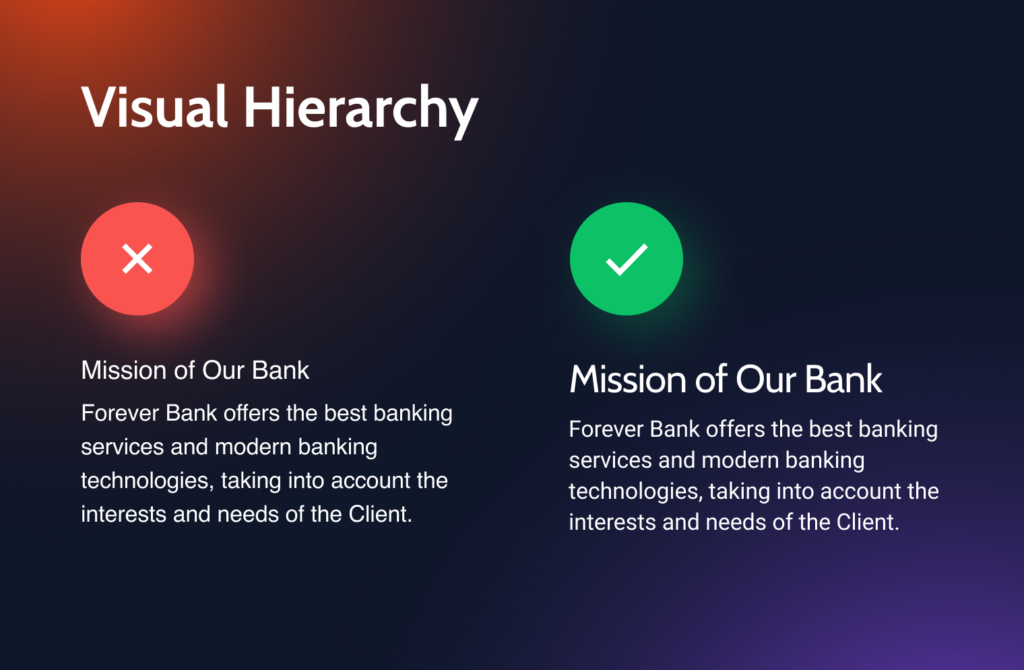
Font combinations can create contrast in your design and highlight different brand elements to your audience. Contrast can be particularly effective when you use a classic, timeless font for your headlines and a more modern font for your body text.
By combining two fonts, you can create an interesting visual hierarchy that can help you draw attention to the essential elements of the brand.
And not just that – combining fonts can help you tell a story, evoke emotion, and differentiate your brand from your competition.
Using visually appealing and well-suited fonts to your brand’s message can create a memorable and cohesive brand identity. Ensuring this consistency across different touchpoints, from website headers and social media graphics to media kits, strengthens brand recognition.

Not all marketers are good designers, especially if you have just started in this field, and many initially choose the wrong font combinations for their brand. This can negatively affect your branding strategy and make your designs look odd or out of place.
To enhance your branding strategy work well, you need to know which fonts will complement each other. If you’re unsure which fonts to choose, using the Serif and Sans Serif typefaces together is always a winning combination.
Many people argue that the Serif font is easier to read in print. And because of that, it helps the readers read the text more quickly. Sans Serif, on the other hand, looks fantastic online. Because of its simplified letterforms, the text appears more clearly on different screen resolutions. However, these fonts look great both in print and online, especially in contrasting sizes.
While Serif and Sans Serif fonts may appear similar at first glance, they have unique, differentiating characteristics. Serif typefaces feature strokes or flourishes at the ends of the letterforms.
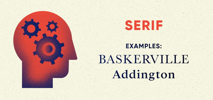
They are more traditional and often used for printed documents, bringing a classic, timeless feel to the design and often perceived as more formal and structured. Examples of Serif typefaces include Times New Roman, Garamond, and Georgia.

On the other hand, Sans Serif typefaces don’t have these flourishes. These fonts are more modern, minimal, and commonly used for digital media like websites.
Unlike Serif fonts, Sans Serif fonts can appear more casual and less serious. Examples of Sans Serif typefaces include Arial, Helvetica, and Futura.
Combining Serif and Sans Serif fonts creates dynamic and visually exciting designs. These two fonts work great together because they contrast, providing balance and creating a more striking look.
While combining fonts can be a fantastic design strategy, there’s a method to the madness. Here are some best practices for combining typefaces in your branding.
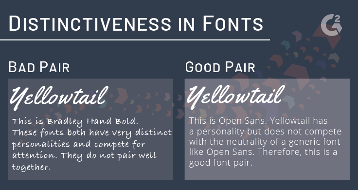
As mentioned, the Serif and Sans Serif fonts look brilliant, especially when their sizes contrast. The font combination may not look as good if the fonts are too similar in style or weight.
Always consider the size and weight of the fonts you’re combining, and ensure there is some form of contrast – this will help them stand out and create a more cohesive design. For example, you could pair a bold Sans Serif font with a light Serif font, or a narrow Serif font with a wide Sans Serif font.
Doing this lets you easily highlight multiple concepts and attract your reader’s attention. It also removes any confusion about where the reader should direct their attention and effectively guides your reader’s eye.
When using two different fonts together, you need to clearly understand how you want your design to appear. Ensure that the fonts you choose balance each other out to avoid your design becoming confusing and messy. A lack of balance will take away from the essence of your design and defeat the purpose of using the fonts to convey your unique message.
So, how do you achieve balance? One way is to choose a primary font, supported by another for small accents and minor elements. Assigning specific roles to your chosen fonts can give your design a cleaner, crisper look while creating visual variation.
Another way is to ensure that the sizes of your fonts are well-proportioned. Keep the larger sizes for headers and the smaller sizes for body text. Consistent spacing between letters and lines can also make things more polished.

Fonts that look too similar should never be combined. The whole idea behind combining fonts is to create a visual hierarchy. When your fonts are too similar, this purpose gets defeated. So, opt for fonts that are slightly or distinctly different from each other.
Always try to avoid mixing moods. It’s important to note that all typefaces have a distinct mood that reflects their personality. These moods might vary to a certain extent, but they generally don’t change significantly.
Understanding which typeface personality fits your brand before selecting your fonts is critical. If the mood of the typeface is misaligned with your brand, it can create confusion.
So, before selecting a font, part of your branding strategy should be to define your brand’s characteristics. Understand whether it’s sleek, elegant, casual, humorous, etc. Once your brand’s personality is determined, you can choose a font to match it.
Sans Serif fonts with clean lines create a contemporary and edgy feel, while a more traditional and upscale brand might benefit from Serif fonts.
The next important point to consider when combining fonts is to limit your font selection – too many fonts can be distracting and make your brand look cluttered and disorganized. Stick to two or three fonts (one Serif and one Sans Serif) and use them consistently throughout your design.
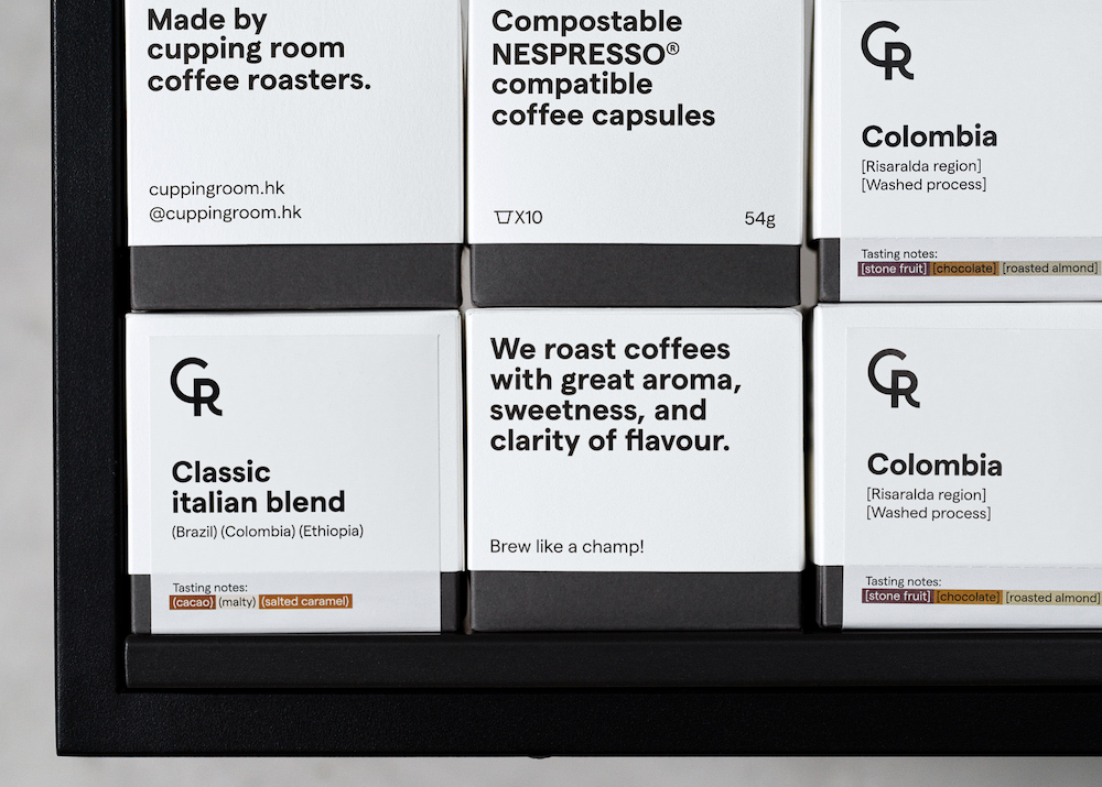
When using two different fonts together, assign them distinct roles. Ideally, all content, whether a blog post, a document, case studies, eBooks, or anything else, has a headline, subheadings, and a body.
Choose the appropriate font for each section to make it visually attractive and readable. For example, Serif fonts add a professional look to your design, and the strokes at the end of the letters make them perfect for headlines.

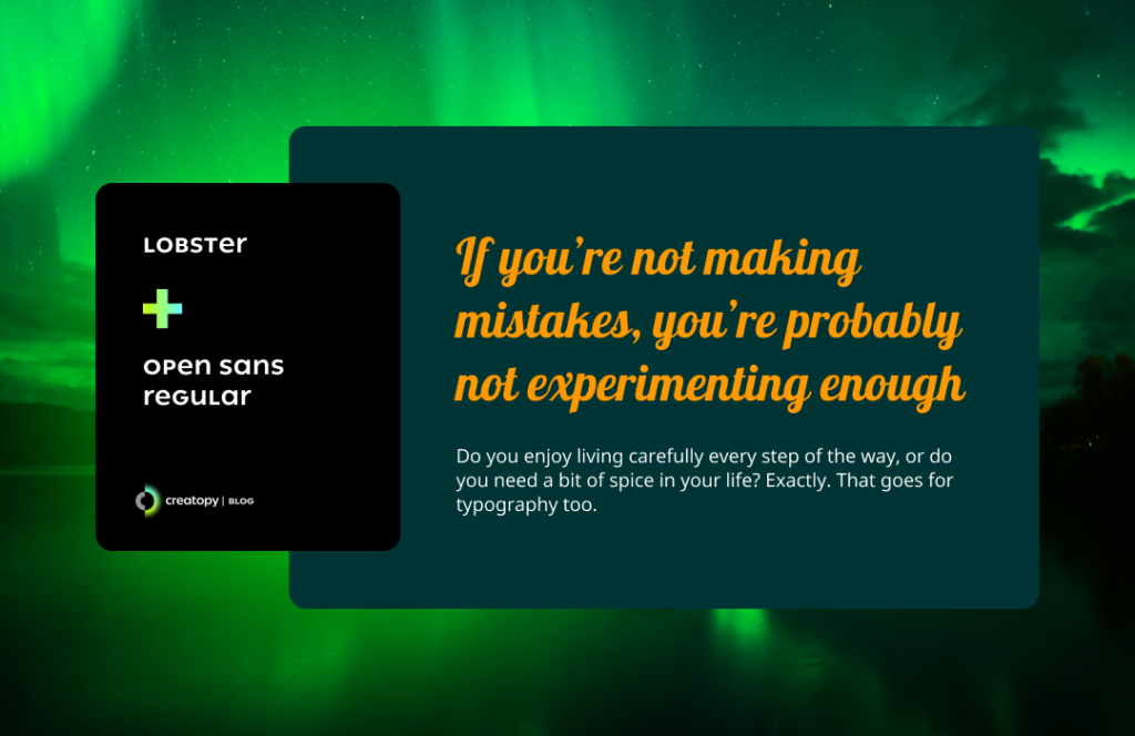
Meanwhile, the Sans Serif typeface is easier to read and lends a modern feel to your design, making more sense for body text. Here’s an example of combining two fonts on a landing page.
Combining two different fonts for your brand can be a wonderful way to make your design more distinctive. However, selecting fonts that complement each other can be a real challenge.
It’s important to note that there is no hard and fast rule when choosing fonts to combine. However, the above tips should stand you in good stead and help you understand what will work for your designs.
While you’re here, check out the top font trends rocking the design world right now. Or, head to Envato Elements to browse its huge library of fonts for your next project.
Explore PowerPoint templates with professionally designed layouts to create polished, modern, and visually cohesive presentations.
Learn what font Nike uses, explore its typography evolution, and discover Nike font alternatives to create bold, minimal, high-impact designs for branding and campaigns.

Discover bold music video fonts for 2026, with top picks and bonus styles that help creators match sound, genre, and mood with striking visual identity.

Learn how to create an AI infographic design using GraphicsGen and Illustrator, from idea to reusable systems, with a step-by-step workflow for consistent, scalable visuals.