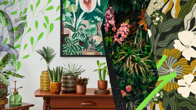
The grunge design trend: Why raw, messy aesthetics are back (and how to use them in 2026)
Discover why grunge design is trending again in 2026 and how to use textures, distressed type, and controlled chaos without sacrificing clarity or hierarchy.
Envato: Get every type of asset for any type of project, and access to AI tools. Start now
Not sure which logo style to choose? We break down the differences between flat and 3D logos so you can make the right choice for your brand.
3D logos and flat logos are two of the most popular logo design types. Both styles have unique characteristics and advantages that make them loved by designers and brands alike.
But how do you know which one is right for your brand?
In this article, we’ll dive into the differences between 3D logos and flat logos — plus we’ll show you notable examples and design techniques to help you create one yourself.
As the name suggests, a 3D logo mimics three-dimensional space in its design. The result is a logo that seems to have physical volume and can even look as if it’s popping off the screen.
Some other characteristics of a 3D design are:
Let’s look at some of the most popular logos that use a 3D style.

Chevrolet’s logo may be remembered for its unique bowtie design, but the 3D element elevates it from good to great.
The logo features a metallic texture and subtle reflective lighting to give it a chrome-like appearance. The beveled edges and strategic use of shadows make it look lifted and embossed on a page. All of these features help the logo communicate strength and solidity, which is fitting for an automobile brand known for its long-term reliability.

The Sony PlayStation logo is another great example of creative illusion.
The P is made to look like it’s “standing” upright, while the S looks like a shadow underneath it. This clever play on lighting, shadows, and perspective gives this logo a dynamic feel — perfect for a brand that focuses on providing immersive gaming experiences.

The Xbox logo may have gone through various design updates recently, but this 2010 version still remains iconic.
The strategic use of lighting and shadows makes the sphere look as if it’s floating. Meanwhile, the X seems to be carved deep into the sphere, thanks to the use of shadows and highlights. The color palette, metallic tones, and 3D elements make this logo look futuristic and dynamic, which works well for a gaming brand.
Flat logos are two-dimensional — they don’t use shadows, perspective, or textures. If 3D logos are all about depth, then the main draw of flat logos is their minimalist and simple designs.
You’ll know it’s a flat logo if it shows:
Here are some examples of household name brands that use flat logos:

Google’s logo is a simple wordmark that uses clean sans-serif fonts. The company removed the previous version’s 3D elements, like beveling and shadows, and instead focused on highlighting the logo’s vibrant color scheme. The result is a simple, scalable design but still full of life.

Apple’s logo is powerful because of its simplicity. The brand name is Apple, and the logo is an apple. There’s no way you won’t remember or recognize it, right? This straightforward approach is exactly what makes the logo so memorable.
The simple design and stark black color make it look extra sleek and timeless. It’s also easy to adapt across devices, packaging, or social media platforms.

The iconic Nike “swoosh” has no embellishments — no outlines, gradients, color, or texture. It’s just the one icon, the icon that perfectly encapsulates the feeling of motion and speed.
Just like Apple, the simplicity is what makes it distinct and versatile.
Let’s now answer the biggest question of all. Which one is better: a 3D logo or a flat logo?
To be honest, no one logo style is universally better than the other. Both have strengths and weaknesses.
A 3D logo, with its visually impactful look, can help you make a bold statement. It’s perfect for brands and businesses that are all about innovation, creativity, or expression.
However, the complexity of your 3D design might not scale down well to small sizes. All that texture and detail can also lead to heavier image files, which can slow down your website if not properly optimized.
On the other hand, flat logos are more straightforward and more minimalist. They scale beautifully across various platforms, which is why digital-first brands favor them. Flat logos also appeal to the minimalist aesthetic that most younger audiences like, which is why more and more brands are changing their logos into a flat version.
That switch to flat designs can also be a con in some ways. Since everyone is jumping into the flat logo trend, it’s easy for yours to get lost in the mix. Flat logos, if not done well, can lack personality or emotion since there are not a lot of elements to help you convey your message.
Ultimately, the right logo style for you will depend on your audience, brand identity, and goals.
Thinking of using a 3D logo? Here are a few tips to help you make an effective one:
Going for a flat logo design? Try the following:
And there you have it! We hope you learned much from our breakdown of the differences between these two popular logo styles.
As we said above, there is no “better” logo style between the two. The right logo to use between them will still depend on your brand identity, target audience, and business goals.
If you’re now thinking about creating your own 3D or flat logo, why don’t you take a look at our logo templates from Envato? Our article on how to design a logo might also help.
Good luck, and happy designing!
Discover why grunge design is trending again in 2026 and how to use textures, distressed type, and controlled chaos without sacrificing clarity or hierarchy.
Learn how to upscale images with AI using ImageEdit. Enlarge photos 2x or 4x while preserving sharpness, texture, and detail for print, design, and marketing.
Swash fonts add a touch of drama and elegance to any design. Explore our curated selection of fonts with swashes and flowing tails to give your typography that extra flourish your projects deserve.
Explore 27 Norse fonts for standout branding in 2026, from rune-inspired and Viking display styles to modern Scandinavian typefaces with bold character.