


Envato: Get every type of asset for any type of project, and access to AI tools. Start now

Introducing the Pantone Color of the Year 2025: ‘Mocha Mousse’

Why does the Pantone Color of the Year matter? Learn about the significance of this annual announcement and how it influences design trends.

Torey Butner 9min read
Pantone Color of the Year 2025

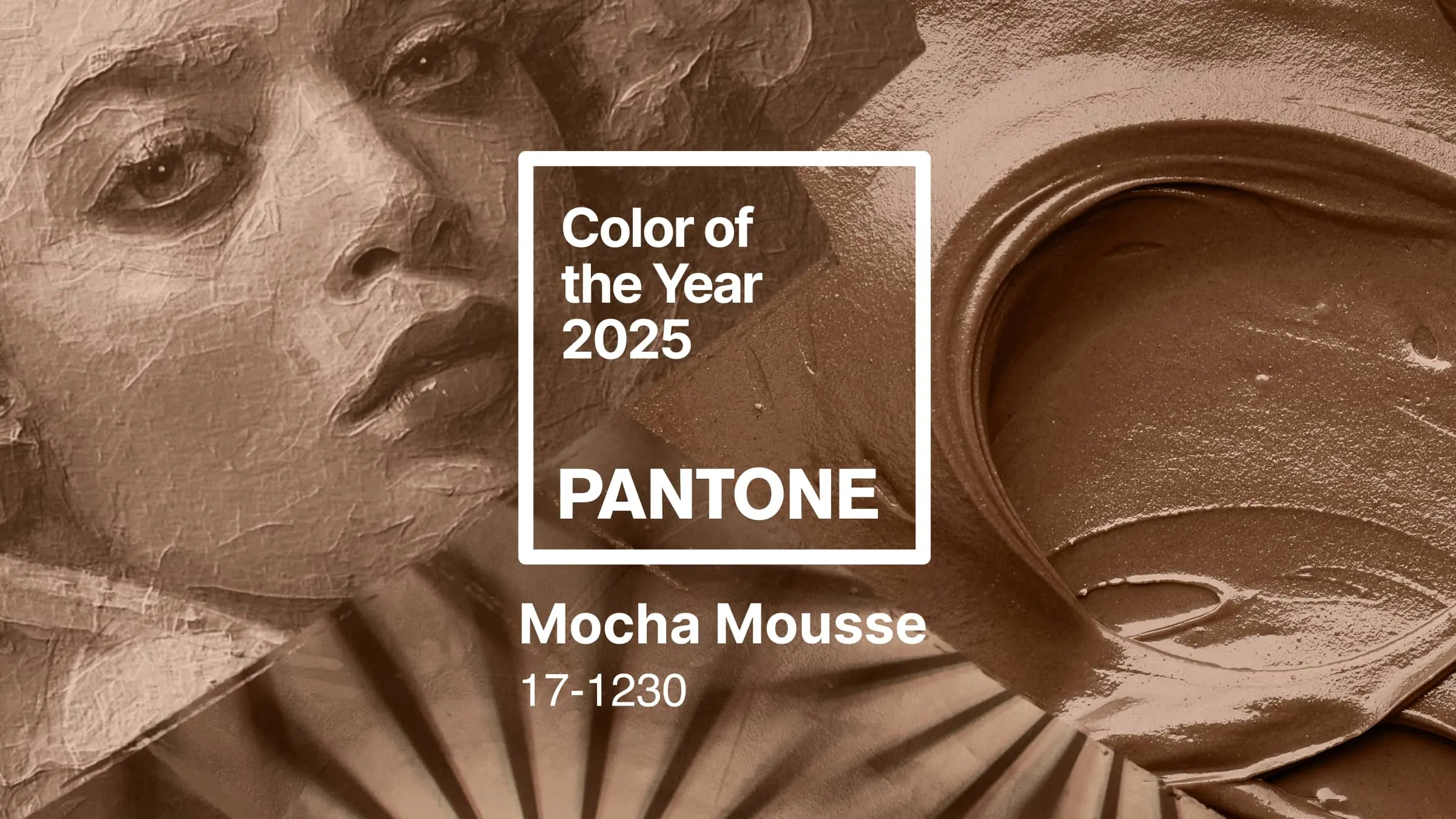
The Pantone 2025 Color of the Year is Mocha Mousse. Pantone’s Color of the Year sets the tone for color inspiration, trending palettes, and design influences for the next 365 days — and often well beyond. Every year since 1999, the Pantone Color Institute has picked a new shade to spotlight emerging trends and draw attention to the role color plays in design and culture.

Let’s look at what Mocha Mousse brings to 2025, then revisit the Colors of the Year from recent seasons and the design thinking behind each one.

TL;DR: Pantone named PANTONE 17-1230 Mocha Mousse its 2025 Color of the Year — a warm, grounded brown that leans into comfort, everyday indulgence, and natural tones. It works as a versatile neutral across interior design, branding, fashion, and packaging, pairing well with creams, greens, and deeper earth tones. Below, you’ll find how Pantone chooses the color, how to use Mocha Mousse, and a look back at the picks from 2020 to 2024.

2025: PANTONE 17-1230 Mocha Mousse

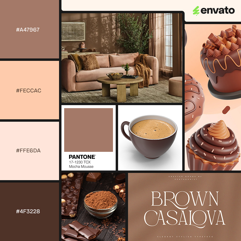
Brown color palette with various photos, patterns, fonts and 3D designs.
Images courtesy of Joybird, PANTONE, and Envato.

Welcome Mocha Mousse as Pantone’s 2025 Color of the Year! Joining the exclusive, carefully curated group of colors, the color Mocha Mousse is a harmonious, rich brown that sets the tone of sharing simple pleasures, comfort, and indulgence. 

Grounding and neutral, color Mocha Mousse has plenty of potential for versatile design uses playing off the earthy tone and simple sophistication. 

What color is Mocha Mousse?

Mocha Mousse is a rich, mid-brown hue that evokes the comfort and warmth of chocolate and coffee. It reads as sophisticated, earthy, and calming — a color that speaks to a desire for everyday pleasures and a connection to natural tones.

It also arrives with commercial backing. Pantone’s launch collaborations included longtime partners such as Motorola, Joybird, and Spoonflower. Motorola leaned into the mood with a “timeless vegan leather finish” that plays up the earthy feel, while Joybird used Mocha Mousse as a warm base color across an interior collection, a natural fit for a shade this easy to live with.

If you’re building a palette, Mocha Mousse behaves like a dependable neutral. It sits comfortably next to soft creams and off-whites, warms up alongside sage and olive greens, and gains contrast against deep navy or charcoal. Use it as a grounding base rather than the loudest element, and it earns its place across print, web, and product design.

How does the Pantone Color of the Year get chosen? 

A team of Pantone color experts meets each year to determine the new shade, drawing on a wide range of influences: pop culture, notable films, scientific discoveries, travel, technology, and anything else feeding the ever-shifting zeitgeist of color culture.

Designers and artists across many disciplines regularly use Pantone colors in their projects. These color combinations, font picks, and key elements can skyrocket your projects, and they are one of the core building blocks of innovative branding, trend-setting marketing campaigns, and culture-changing projects.

It’s worth keeping perspective, though: the Color of the Year is a trend signal, not a mandate. It’s a useful prompt for palettes and campaigns, but the right color for a project is still the one that serves the brand and the audience in front of you.

2024: PANTONE 13-1023 Peach Fuzz 

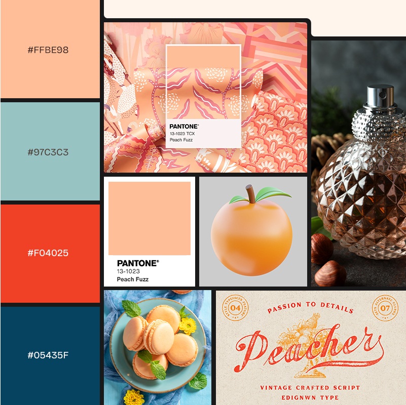
Pink, blue and red color palette with various photos, patterns, fonts and 3D designs.
Images courtesy of PANTONE, Spoonflower, and Envato

2024’s Peach Fuzz color of the year was a soft hue that opened up the desire to nurture and enrich ourselves, others, and our relationships. A kind color that reminded us of vintage nostalgia, warm tones, and modern elegance, peach fuzz was designed to bring us together.

In Pantone collaborations, togetherness and connections were apparent in Spoonflower’s comforting designs, Ruggable’s calming home décor, and Motorola’s sensual technology and color connection combination. In each, steady relationship building was placed at the forefront through color, product, and day-to-day product use.

2023: PANTONE 18-1750 Viva Magenta

2023: PANTONE 18-1750 Viva Magenta
Images courtesy of PANTONE, Motorola, and Envato

In the year of Viva Magenta, a new vivacity took root in the overarching color scheme of 2023. Viva Magenta overflowed with spirit, stamina, and strength in Pantone’s “Magentaverse.” A transformational color, magenta, sits between blue and red, creating a harmony between the two colors.

Drawing from nature and reality, Pantone aimed to remind us of the vivid authenticity of reality in a world ever more reliant on technology.

As part of Pantone and Motorola’s ongoing color and technology collaboration, Motorola released the Motorola Edge 30 Fusion in Pantone’s magenta as part of the #Magentaverse. This space connects Viva Magenta in art, design, science, and technology.

Artechouse became the home of the #Magentaverse, an immersive, multisensory exhibition that explored the color of magenta through captivating digital projections and interactive displays. The eco-conscious skater shoe brand Cariuma launched six shoe styles in Viva Magenta. When used for personal identity or design strategies, this color strongly expresses power and enthusiasm. 

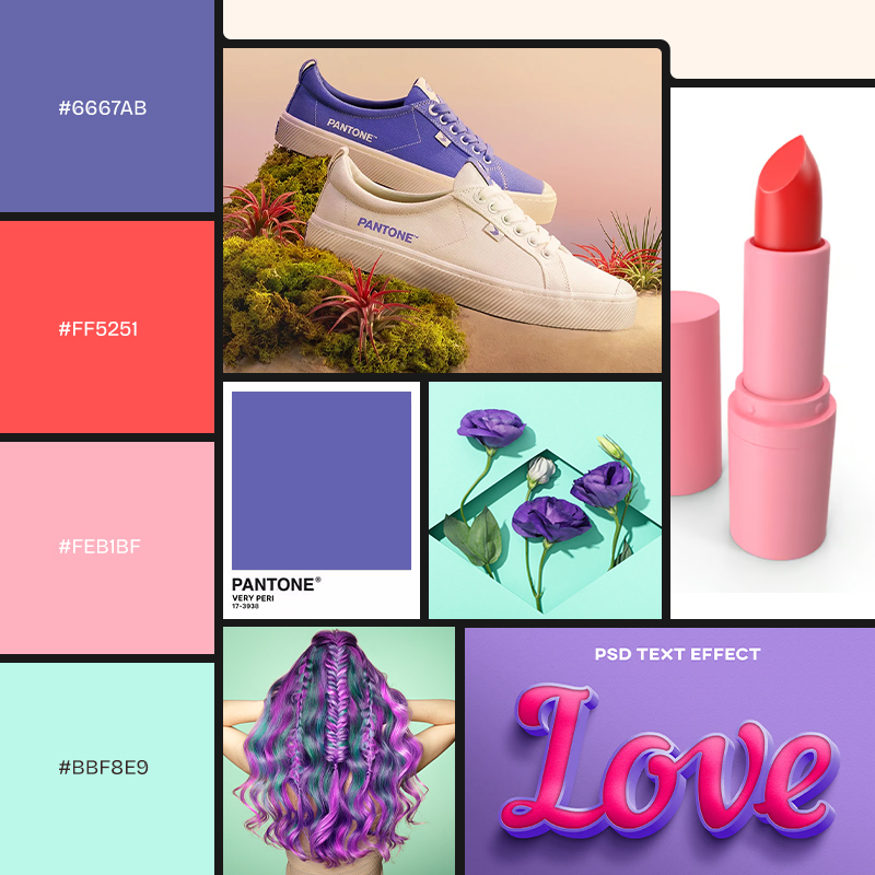
2022: PANTONE 17-3938 Very Peri

Turquoise, pink and periwinkle color palette with various turquoise, pink and periwinkle photos, patterns, fonts and 3D designs.
Images courtesy of PANTONE, CARIUMA, and Envato

A blend of serene blue and emotional red, Veri Peri shared society’s desire to continue moving towards creativity and innovation. In color psychology, the purple spectrum creates a harmonious union of the reliability of blue and the vibrancy of red, lending itself to dynamic, creative, and joyful projects.

As a bright yet grounding color, periwinkle acts as a playful base for brilliant color palettes that can be used in product development, fashion, and other industries. 

A long-time Pantone collaborator, Brazilian ethics-driven sneaker brand CARIUMA launched a limited-edition, sustainable line of Veri Peri shoes. Pantone’s and CARIUMA’s inventive spirits were clear in their team-up.

Pantone also solidified its future-centric aim by collaborating with other people-forward, eco-conscious brands, including Copenhagen Design, Priority Bicycles, and Kafrit Group.

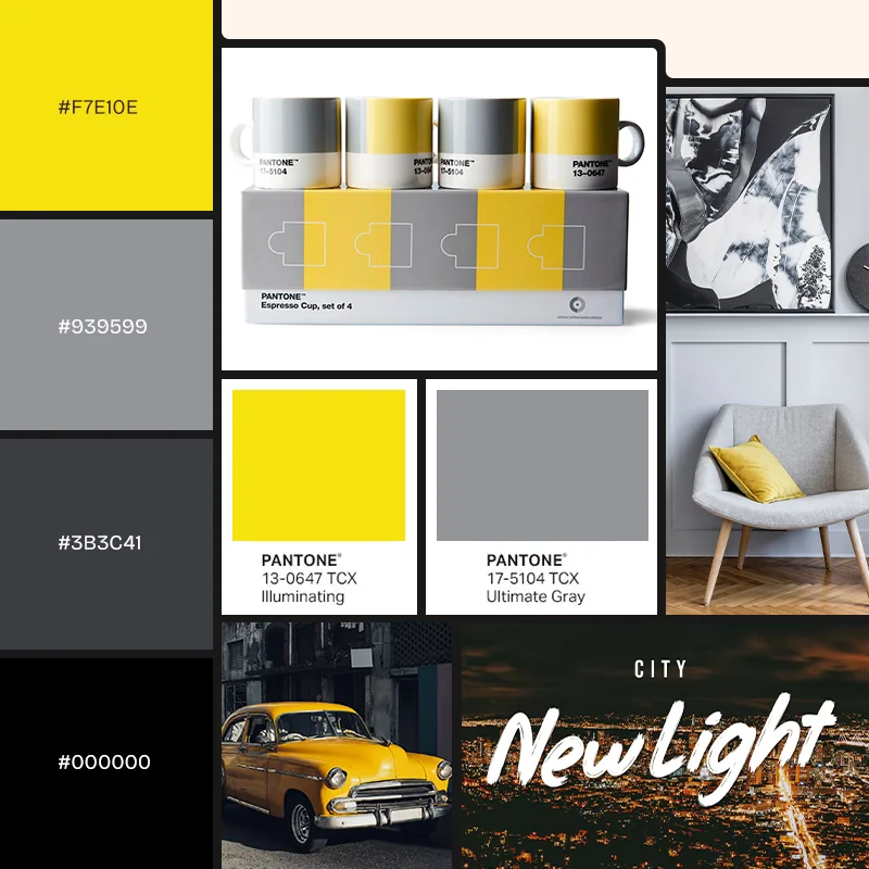
2021: PANTONE 17-5105 Ultimate Gray + PANTONE 13-0647 Illuminating

Yellow and gray color palette with various yellow and gray photos, patterns, fonts and 3D designs.
Images courtesy of PANTONE, Copenhagen Design, and Envato

Uplifting and hopeful, this color combination of Ultimate Gray & Illuminating Yellow was perfect for reflecting on 2020 and an optimistic look toward the future. Soft gray emanated feelings of solidity and steady connection, while sunshine yellow projected hope and energetic confidence.

Commonly used in interior design, this color combination spoke to the enduring human spirit seen in the countless ways people found to connect in the early months of the COVID-19 pandemic. 

In keeping with interior design, the Copenhagen Design and Pantone Living collaboration offered dual-hued classic mugs and keychains that people could incorporate into their daily lives.

Ever cutting-edge, Pantone also collaborated with TIPTOE, a sustainable furniture design studio, to produce yellow and grey table legs meant to create unique furniture pieces.

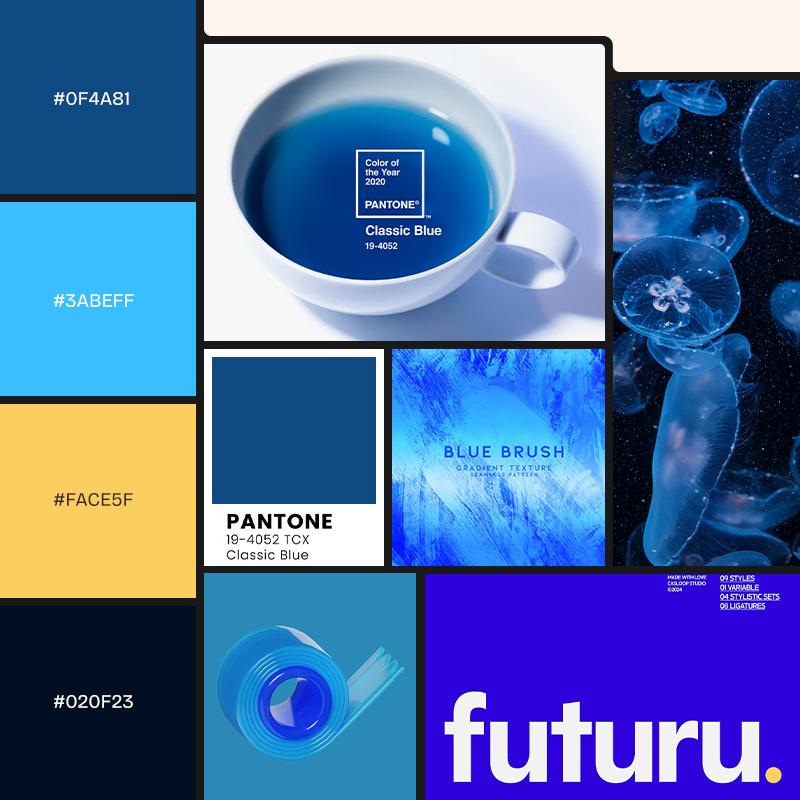
2020: PANTONE 19-4052 Classic Blue

Blue and yellow color palette with various blue photos, patterns, fonts and 3D designs.
Images courtesy of PANTONE, TeaLeaves, and Envato

As the new decade began, Pantone determined the year’s new color to be a stately, calming blue called Classic Blue. Harking back to the first-ever color of the year, Cerulean, 2020’s blue color was a natural progression towards a more mature blue for our growing society.

Hoping for a year of peace, stability, and dependability ahead, the classic blue projected connection and relatability. In a way, a return to the classic prepared us for the unexpected community distancing of 2020.

Pantone chose to pair with companies like Adobe Stock, Artechouse, FedEx, and TeaLeaves, focusing on collaborators who shared a calming sensibility and steadfast staying power. TeaLeaves’ blue botanical tea blended a berry medley and sharp citrus to match the classic blue.

Classic blue has been widely used in corporate design materials for its trustworthy feeling, so a collaboration with FedEx touting dependable color printing made sense. Using this classic blue can bring a royal, sophisticated, and reliable feel to your projects.

Create trend-setting projects with the Pantone 2025 Color of the Year!

Mocha Mousse is a useful marker for the year’s trending colors, but the real value is in what you build with it. Fold it into your palettes as a grounding neutral, test it against warm creams and deeper greens, and pair it with Envato’s library of artist-made photos, fonts, and templates to move from mood board to finished design without breaking your flow.

If you want more Pantone color inspiration, read Pantone Color of the Year 2019: Living Coral and How to Create Pantone Colors in Your Designs.

FAQ

What is the Pantone Color of the Year for 2025?

The 2025 Pantone Color of the Year is PANTONE 17-1230 Mocha Mousse, a warm, rich brown. Pantone describes it as grounding and comforting, evoking the everyday pleasures of chocolate and coffee.

What is Mocha Mousse best used for?

Mocha Mousse works best as a versatile neutral base. It suits interior design, packaging, branding, and fashion, and it pairs naturally with creams, sage and olive greens, and deeper accents like navy or charcoal for contrast.

How does Pantone choose the Color of the Year?

A team at the Pantone Color Institute selects it by studying cultural influences across a full year — film, art, technology, travel, scientific developments, and social mood. The goal is to name a shade that reflects the current moment and points toward emerging design trends.

What were the recent Pantone Colors of the Year?

Recent picks were Peach Fuzz (2024), Viva Magenta (2023), Very Peri (2022), the pairing of Ultimate Gray and Illuminating (2021), and Classic Blue (2020). Each was chosen to capture the mood of its year, from post-pandemic optimism to a renewed push toward creativity.

Do I have to use the Color of the Year in my designs?

No. The Color of the Year is a trend signal and a source of inspiration, not a rule. The right color for any project is the one that serves the brand and audience — the Pantone pick is a useful starting point, not a requirement.

Related Posts

DesignNew

The return of the brand mascot (and how to create your own)

Football teams have them. Your local diner probably has one. Mascots are ever-present, but have rarely taken center stage in mainstream branding over the past decade. That’s all set to change as major brands launch an army of fresh mascot designs, vying to win over our hearts and wallets. In 2026, your brand isn’t really […]

Grace Fussell 12min read