How to edit with AI using Envato stock photos
Learn how to edit with AI on Envato stock photos, customizing images instantly by removing objects, changing backgrounds, and creating polished visuals without leaving the platform.
Envato: Get every type of asset for any type of project, and access to AI tools. Start now
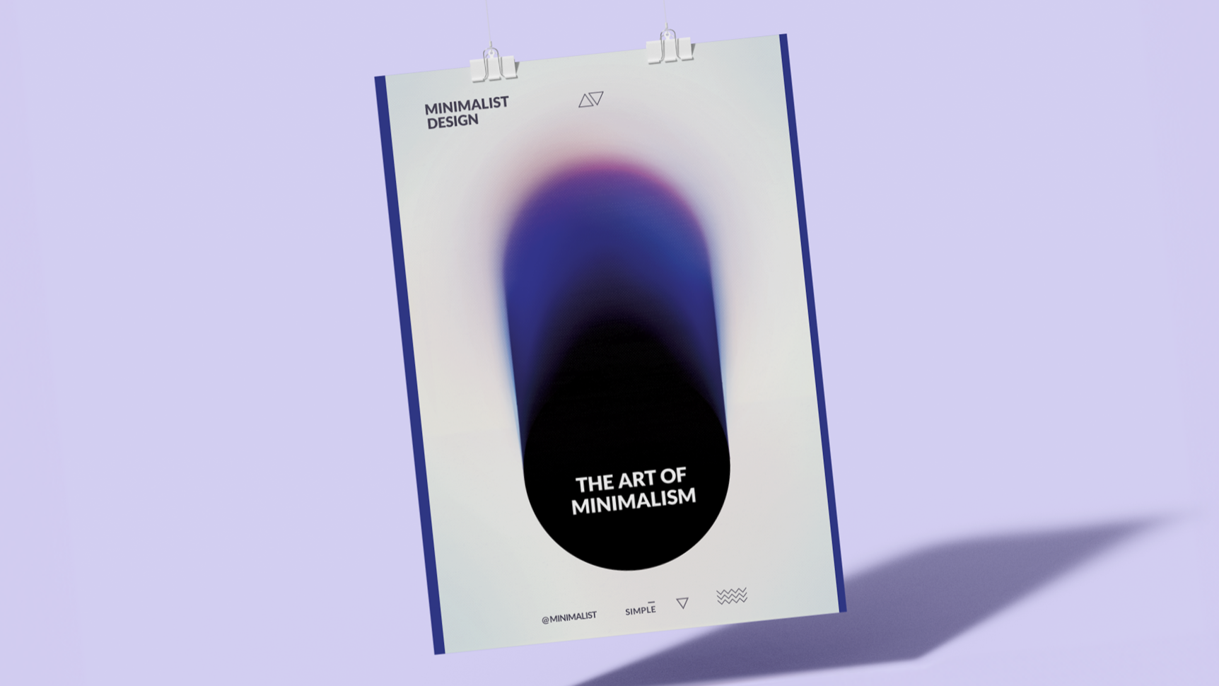
Want to make an impact with your minimalist designs? Explore minimalist design principles, discover minimalistic design trends, and learn how to use minimalism in your digital designs.
When we look at the design of everything around us, be it a website or a visiting card, it has evolved significantly over the years. In the past, complexity and fancy details were the hallmarks of great design.
As time moved on, design became more about functionality and accessibility. The Art Nouveau and Art Deco movements blended functionality with aesthetics, yet they still held onto a sense of ornamentation.
Fast forward to today, and we see the culmination of these movements in minimalism. Technology has accelerated this shift; we now live in a digital age where we commonly see information overload. In response, modern design has become all about simplicity and ease of use. It focuses on the essentials and caters to our need for clarity and calm in a hectic world.
Let’s explore the art of minimalism in design, see how simplicity can create a powerful impact, and learn why less really can be more.
The art of minimalist design is all about simplicity. It focuses on the essentials to create a strong impact. This design style uses fewer elements. It aims to reveal the true essence of an object.
Minimalism is popular today for a good reason. It offers a calm alternative in our cluttered world. Designers use clean lines and open spaces to provide a visual break from everyday chaos.
Minimalist design isn’t just about looks. It improves the user experience. It makes products easy to use and content easy to understand. This design style responds to our overstimulated lives, offering spaces that are peaceful and focused.
The philosophy of minimalism in design embraces the principle of “less is more.” This concept, rooted in the idea that simplicity and clarity lead to good design, is about stripping away the non-essential elements to reveal the true essence of a design. Let’s look at all the elements of this philosophy.
Minimalism focuses on the essentials. It removes any elements that don’t serve a specific purpose. This simplicity allows the important features to stand out and makes the design more understandable and accessible.
In minimalist design, functionality holds the most value. Every element must serve a practical purpose. This approach contrasts with designs where decorative elements might dominate. Minimalism values the efficiency and usability of design over its ornamental aspects.
A clear message is crucial in minimalist design. With fewer elements in play, each component must convey a part of the overall message. This clarity ensures that you draw the viewer’s attention to the most important aspects of the design. The focus is on delivering a concise and impactful message without distraction.
Despite its simplicity, minimalist design can evoke strong emotions. Using space, color, and form in a restrained manner can create a serene, calming atmosphere. It can also lead to a more profound appreciation of the design elements.
Minimalist design is adaptable and versatile. Its simplicity makes it easier to apply across different mediums and contexts. Whether in digital design, architecture, or product design, minimalism can be adapted to suit various needs and environments.
Minimalist designs often have a timeless quality. They avoid trends that may quickly become dated. This enduring aesthetic means that minimalist designs remain relevant and appealing over time.
Several visual characteristics define minimalism, creating a unique aesthetic that’s simple and has a strong impact. Let’s explore six key elements that we commonly see in minimalist designs.
Minimalist designs often use a restricted color palette to emphasize simplicity and coherence. Designers typically choose up to three colors. Sometimes, they even use a monochromatic scheme (color scheme based on a single color or tint). This limited use of color sets a mood and focuses on key elements. It makes designs look clean and uncluttered.
Typography in minimalist design is also about visual elements apart from the information it conveys. Bold and dramatic typography draws immediate attention. Designers often limit font choices to one or two families, helping to create a strong visual hierarchy. The right typography can make a simple design stand out.
Minimalism favors flat, two-dimensional textures and avoids graphic manipulations like shadows or gradients. Flat design elements like buttons and icons look neat across various resolutions. This simplicity enhances the minimalist aesthetic.
Also known as negative space, white space is a key element in minimalist design. It helps the design breathe and creates a sense of balance. It declutters the design and emphasizes the elements that are present.
Balance is crucial in minimalist design. It ensures that no element overpowers others without reason. Scale also plays a significant role in directing the viewer’s eye and establishing focal points. Properly scaled elements create a clear path for the viewer’s attention.
A minimalist design is often straightforward and avoids unnecessary complications in its composition. This simplicity allows for clearer communication and enhances the design’s usability. Simple compositions are more engaging and easier to navigate, making them ideal for web and digital designs.
These elements come together to define the minimalist design style. They create visually appealing designs that are both highly functional and user-friendly. Minimalist design, through its simplicity, achieves a level of sophistication and elegance that stands out.
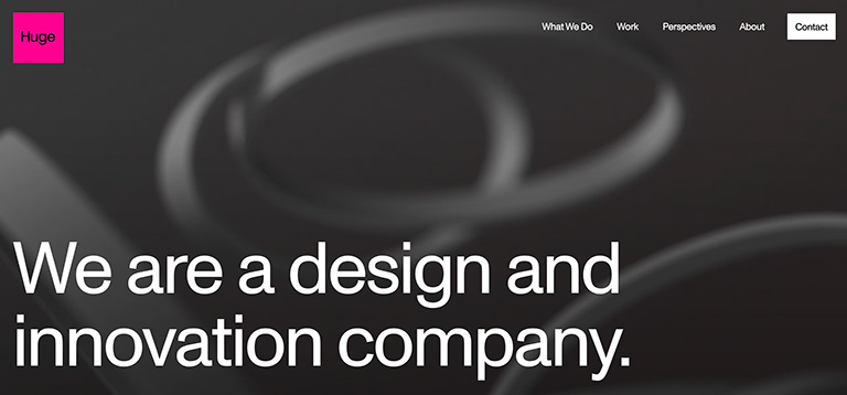
Minimalism in design shines through for its simple use of space, color, and a powerful message. Huge Inc. exemplifies this approach with a bold magenta hue that makes the logo stand out against a dynamic gray backdrop.
Geometric shapes intersect and create a sense of depth, without clutter. The text is concise, impactful, and front and center, stating exactly what the company does. There’s no excess—every element on this page has a reason to be there.
The message is clear, and the design is both striking and functional. It shows minimalism’s power to communicate effectively while maintaining visual elegance.
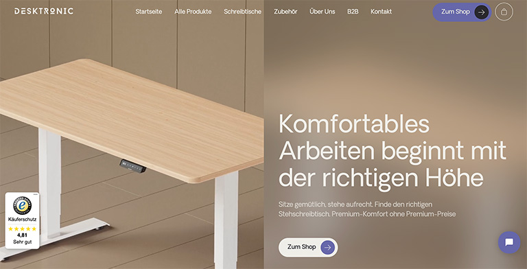
German furniture company Desktronic shows a powerful use of space and focus. The design features a sleek, modern desk as the centerpiece, set against a neutral background. This emphasizes the product without any distractions.
The text on the right explains the main benefit of the product, and adjustable-height desk: “Comfortable work begins with the right height.” Notice that the font is large and readable. Below, a subtle prompt invites visitors to explore further with a “To the shop” button.
The design communicates a clear message: this desk promises a comfortable, efficient work-from-home experience. It uses minimal elements, yet it effectively conveys the product’s value and invites action.

Zara showcases a striking example of minimalist design on a fashion retail website. As you scroll, the website presents new images of models, each embodying the style and clothing offered by the brand. However, the overall layout remains static, focusing the viewer’s attention on the fashion pieces and the models.
This design approach shows the brand’s aesthetic, where the clothes take center stage against a clean, distraction-free background. It’s a dynamic visual experience that combines interactivity with the simplicity of minimalism. It allows the product and the brand’s image to shine without unnecessary complexity.
The fourth example of minimalist design highlights Siiimple‘s approach to web layout. This CSS gallery utilizes a grid system to neatly organize and display content, creating a visual narrative of the featured work.
The interactivity comes into play when users hover over each image. It reveals a discreet menu offering more details or a direct link to the featured work’s webpage. This design choice maintains the minimalist ethos and enriches the user experience by providing quick, discreet access to additional information.
The gallery’s quick loading time ensures that the simplicity of the design matches the functionality. It offers a seamless and enjoyable browsing experience.
Creating a minimalist design is an art that requires a careful balance between functionality and visual elements. It’s not just about subtracting detail but also finding harmony in what’s left. Here are some best practices to guide you in crafting minimalist designs.
Minimalism in digital design, particularly for products, websites, and apps, is centered around the user experience. It’s an approach that seeks to enhance the usability and aesthetic appeal of a digital interface by simplifying it.
Minimalism enhances the user experience by reducing cognitive load. The fewer elements users have to process, the quicker and easier it is for them to understand and interact with the interface. A minimalist design removes unnecessary distractions and focuses on core content and functionality, which can lead to a more efficient and satisfying user experience.
Design elements serve the content in a content-driven design, not vice versa. This means that every visual aspect of the digital product should enhance the message and the usability of the content. In minimalist digital design, you present the content in a clear, direct manner, which can increase comprehension and retention.
Responsive design is about ensuring a seamless experience across all devices. Minimalism lends itself beautifully to this principle. A minimalist design scales effectively from desktop to mobile, with fewer elements to adjust. It provides a consistent experience that’s not just about looking good on a small screen but also about functioning well.
The minimalist design style supports accessibility by streamlining navigation, improving readability with high-contrast and legible fonts, and reducing cognitive load. It allows for better focus to help those with attention difficulties and ensures compatibility with assistive technologies to make digital content more inclusive.
Minimalist design continuously evolves, with current trends and innovations breathing new life into the ‘less is more’ philosophy. Here’s a brief overview of these new trends:
In contrast to traditional minimalist color palettes, designers are now integrating bold and vibrant colors to make a statement. Using a single bright color against a neutral background can capture attention while maintaining a simple aesthetic.
Designers are getting creative with typography and using large, bold fonts to create a focal point. Some even integrate interactive typography that responds to user actions, adding a layer of engagement without cluttering the design.
A new wave called ‘maximalist minimalism‘ is emerging. It combines the clean lines and decluttered spaces of minimalism with select maximalist elements. This might include a rich texture or a complex pattern used sparingly for dramatic effect.
Minimalism is aligned with eco-friendly design. The emphasis is on sustainability, using fewer resources, and creating aesthetically minimalist and environmentally conscious designs.
Minimalist design embraces immersive experiences, like full-screen video and imagery, to tell a story with minimal text. It’s about creating an environment where the user can experience a brand’s essence through visual storytelling.
AR brings minimalist designs to life. It allows users to interact with simple design elements in a more complex, real-world context. This keeps the interface clean while providing a rich user experience.
Small, simple animations or effects responding to user actions can enhance the user experience without overwhelming the design. These micro-interactions provide feedback and a sense of direct manipulation, improving usability.
Designers are finding innovative ways to use negative space beyond mere blank areas. Negative space is now a strategic tool for drawing attention and creating hidden meanings through clever composition.
Designers are reinterpreting minimalism by embracing these trends and innovations so that minimalist design remains fresh, relevant, and engaging. They continue to find the balance between simplicity and expressiveness to prove that minimalism can be as innovative as it is timeless.
As we close this exploration of minimalism in design, the enduring message is clear: simplicity is powerful. Embracing minimalism elevates the most important elements to a status where they can truly shine. The top takeaways from what we discussed include:
With the insights gained from this discussion, you can approach your next design project with a fresh perspective. Whether you’re revamping a website, creating a product, or crafting a brand identity, the principles of minimalism can guide you toward creating something that stands out in its simplicity.
Apply these principles thoughtfully to find the spot where design meets purpose and form meets function. With these tools, you can create designs that look good and deliver a superior user experience.
Learn more about minimalism in design with our post comparing minimalism vs. maximalism. And check out Envato Elements to find some high-quality creative assets to make your designs shine.
Learn how to edit with AI on Envato stock photos, customizing images instantly by removing objects, changing backgrounds, and creating polished visuals without leaving the platform.

Explore the tennis aesthetic trend for 2026, from preppy style and color palettes to branding and design ideas inspired by tennis culture, fashion, and modern creative projects.

Fourteen World Cup shirts that still matter, from Brazil 1954 to Cameroon's banned vest. The design thinking behind the kits that lasted, and what they all have in common.

Canary yellow explained: meaning, hex code, color psychology and design ideas. Learn how to use this bold yellow in branding, UI and 2026 creative projects.