Best graphic design software in 2026: 12 tools for every designer
Discover the best graphic design software for every workflow. Compare Photoshop, Illustrator, Figma, Blender, Canva, Affinity, and more to find your ideal tool.
Envato: Get every type of asset for any type of project, and access to AI tools. Start now
We all love Link, the plucky hero from The Legend of Zelda. But how has his design evolved over the years, and what can designers learn from it?

Every great adventure needs a hero, and for nearly 40 years, Link has been the one answering the call. He’s one of the most recognizable characters in gaming, going from a tiny cluster of pixels to a fully detailed warrior.
It’s incredible how Link has evolved alongside The Legend of Zelda video games. From simple 8-bit sprites to stunning open worlds, every version of Link reflects the era he was born in. That’s what makes this journey so fun to look back on! So, let’s rewind time and trace the evolution of Link from pixels to polygons (and everything in between).
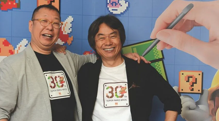
Before Link ever set foot in Hyrule, before the Master Sword, before Ganon became a name we all feared, The Legend of Zelda was just a spark of inspiration from two of Nintendo’s greatest minds.
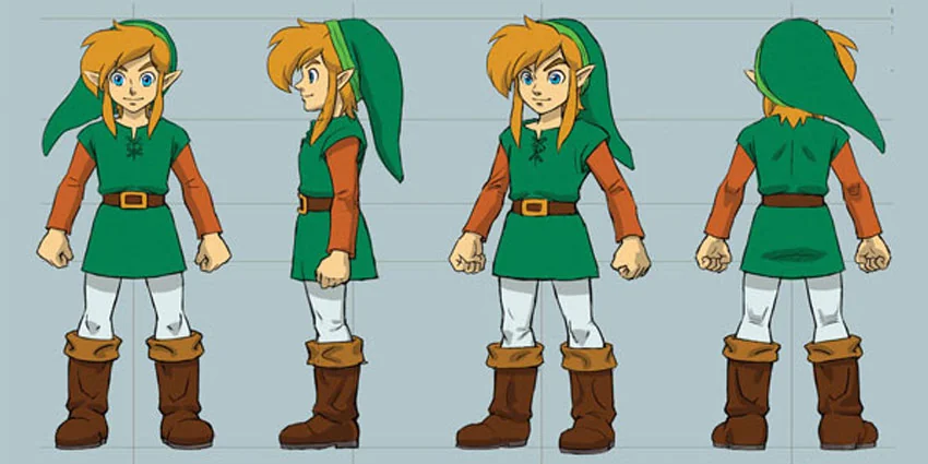
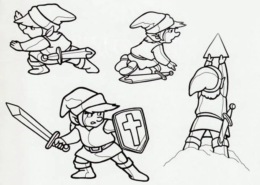
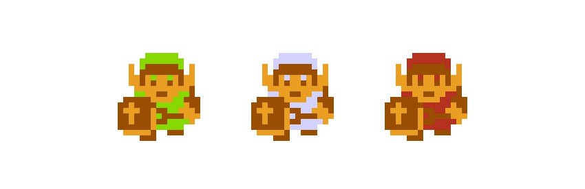
Link’s early designs were surprisingly simple: just a tunic, a hat, a sword, and a lot of courage. It didn’t matter if he was just a handful of pixels—players could tell he was a hero. In the early artwork, he always held his sword in his right hand, but when it came time to program the game, the developers changed him to be left-handed! Why? There are a couple of theories.
When The Legend of Zelda first launched in 1986, gaming was still figuring itself out. Most games were about getting from point A to point B, usually by jumping on or shooting things. But Zelda? It was something completely different. It dropped you into a vast, open world and introduced features that were revolutionary at the time:
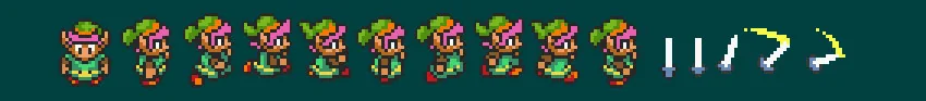
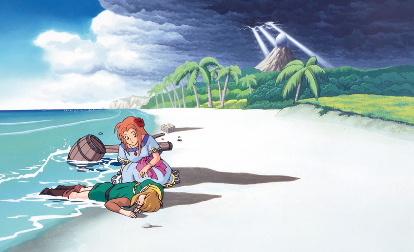
In Zelda II, Link’s design took a big step forward, shifting from a tiny top-down sprite to a full-body side-scrolling character. He had a taller, more heroic stance, with boots, a belt, and smoother animations, making him feel more like a warrior. Though divisive, this version of Link helped shape the more action-driven designs of future games.

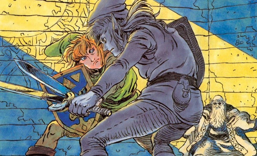
It’s often called the black sheep of the Zelda series, but I think it deserves credit for taking big risks. Some ideas stuck, and others vanished. Who can forget one of our all-time favorite villains, Dark Link (of Link’s Shadow), who made his first appearance in this game!
As technology evolved, so did The Legend of Zelda. With A Link to the Past, Nintendo’s artists could finally bring Hyrule to life with more than just blocky shapes and limited colors. The jump from NES to the SNES meant more than just better graphics. It allowed for a richer, more atmospheric world.
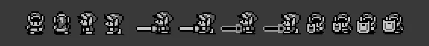
Shrinking Zelda down to an 8-bit, monochrome experience on the Game Boy could have been a huge step back, but Nintendo’s artists turned limitations into strengths. Link’s Awakening used clean, simple pixel art that prioritized clarity while maintaining the whimsical, dreamlike atmosphere that made the game unique.
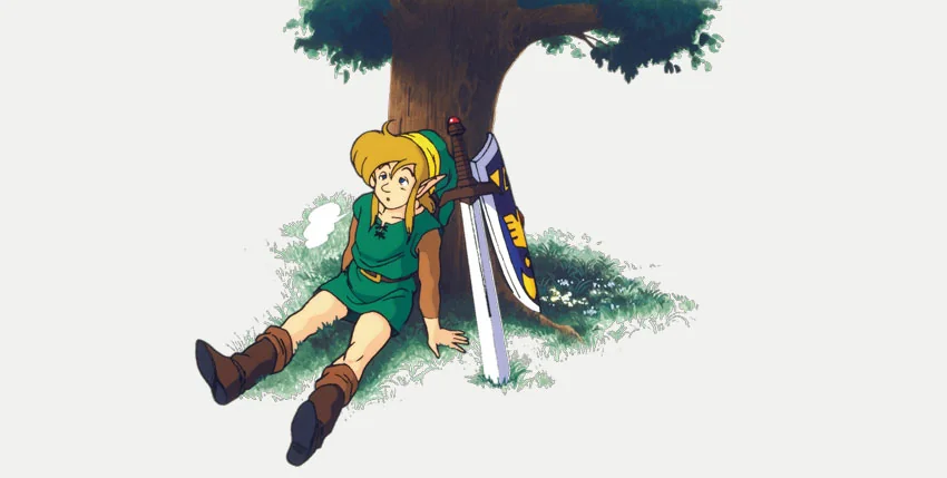
The SNES and Game Boy era wasn’t just about making Zelda bigger but also refining its artistic language. From the painterly, high-detail promo art of A Link to the Past to the minimalist, emotion-driven design of Link’s Awakening, these games showed that Zelda wasn’t just about gameplay. It was about crafting a world that players could feel, even when it was just pixels on a screen.
But as the series moved forward, Nintendo would soon face the challenge of bringing Link into 3D, and not every experiment would go as smoothly…
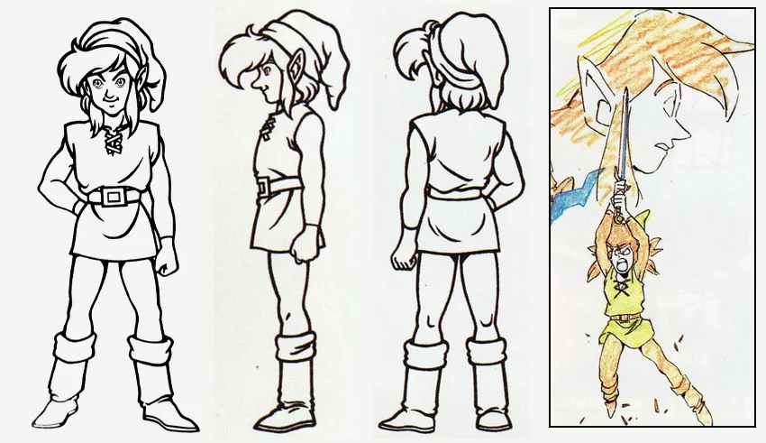
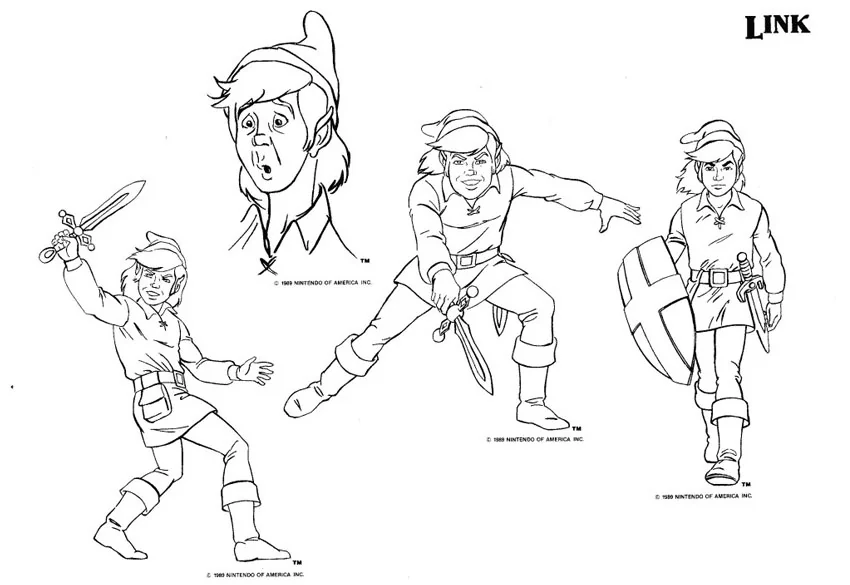
Every long-running series has weird moments; for Zelda, the late ‘80s and early ‘90s were… rough. Let’s start with the Legend of Zelda cartoon, which aired in 1989 as part of The Super Mario Bros. Super Show!. Unlike the silent, noble hero from the games, this version of Link was cocky, whiny, and always trying (and failing) to impress Zelda.

If the cartoon was awkward, the Philips CD-i Zelda games were downright painful. These games are infamous for their terrible animation, clunky gameplay, and bizarre cutscenes that look like low-budget cartoons. Awkward facial animations, weird voice acting, and stiff controls made them some of the worst Zelda games ever.
Looking back, the Zelda cartoon and the CD-i games are hilarious pieces of history. They’re also a reminder that even the greatest franchises can stumble. Nintendo learned from these mistakes because they never let third parties handle Zelda again. But as awkward as these years were, Zelda was about to enter a new era that would change gaming forever.
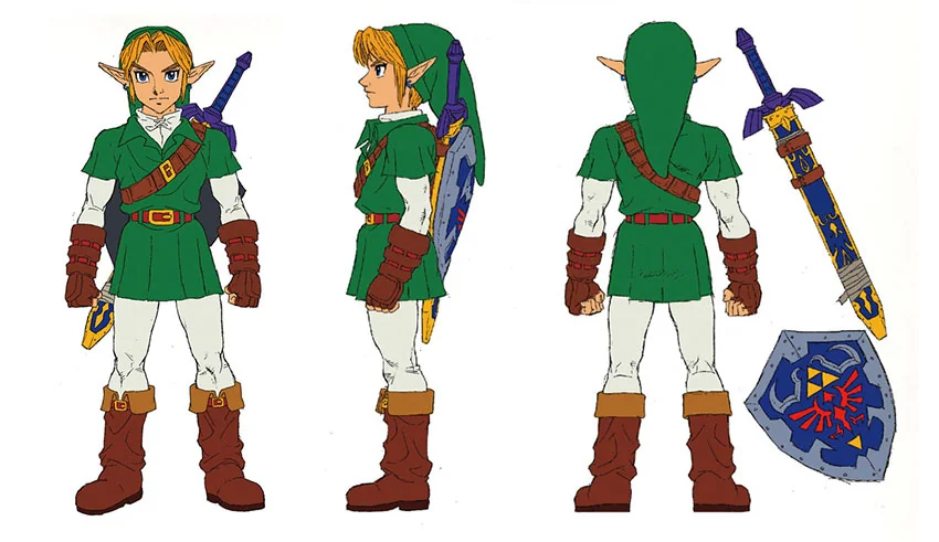
Nintendo knew that bringing Zelda to 3D meant more than upgrading the graphics. It meant reimagining everything from the ground up, completely rethinking movement, combat, and world design. Because of this, Ocarina of Time became the blueprint for 3D action adventure games!
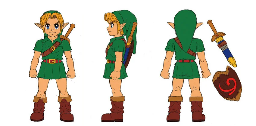
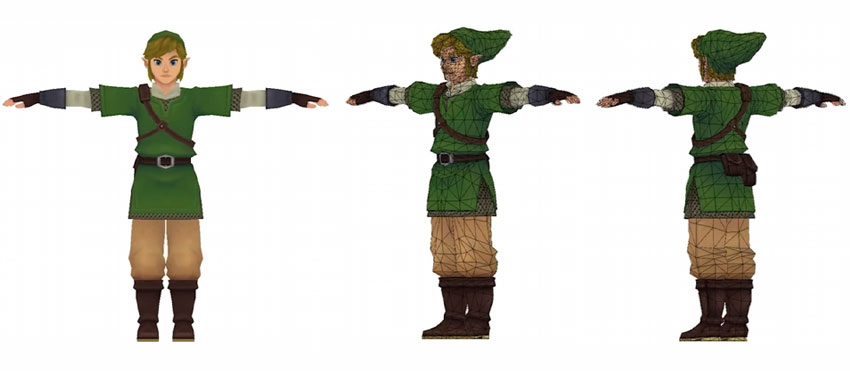
For the first time in the evolution of Link, he had to exist as a fully 3D character, seen from every angle. The artists had to balance recognizability with realism, adapting his classic green tunic and elf-like silhouette into a blocky but expressive model that would work on the limited hardware of the Nintendo 64.
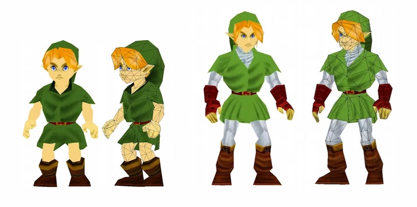
Since Majora’s Mask reused Ocarina of Time’s character model, Link’s overall design stayed the same. His most significant change came from the transformation masks, which completely altered his shape, movement, and abilities. Whether as a Deku Scrub, Goron, or Zora, each form had its own distinct posture and animations, making Link feel more versatile and visually unique than ever before.
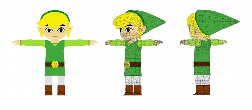
At a time when gaming was moving toward more realism, Nintendo took The Legend of Zelda in the opposite direction. Instead of detailed, textured realism, the team introduced bold, cel-shaded visuals, making The Wind Waker look more like a hand-drawn animation than a video game.
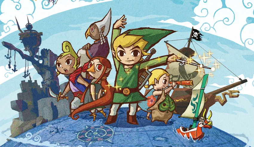
When The Wind Waker was first revealed, the reaction was… divisive. Many dismissed it as “kiddie,” but it became one of the most beloved art styles in gaming history over time. Ultimately, the game’s visuals aged far better than most early 3D games, showing that good art direction is timeless.
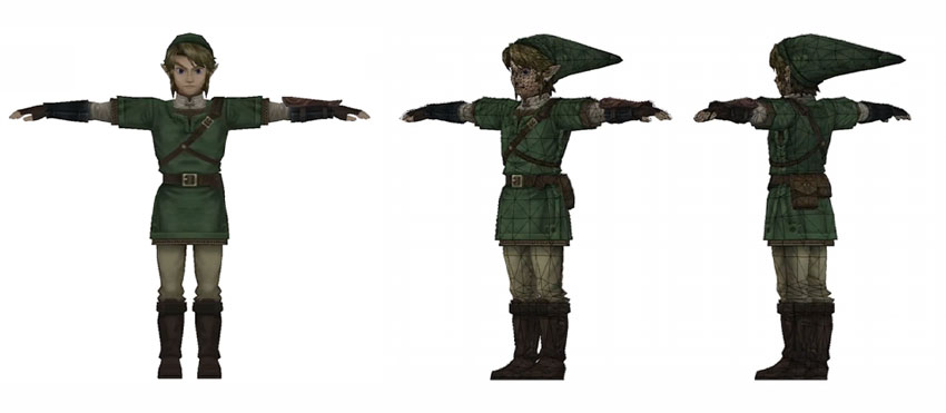
If The Wind Waker was a bold experiment in stylization, Twilight Princess was Nintendo’s answer to fans who had wanted a darker, more realistic Zelda. The game introduced the most detailed version of Link yet, with a taller, more proportionate build and intricate clothing textures that made him feel even more real.

Before fully embracing open-world design, Nintendo tested new ideas with Skyward Sword. It wasn’t an open world yet, but it played with more open-ended exploration, and its art style took a bold, impressionistic approach. This gave the world a dreamy, fantasy-inspired look, but it also greatly impacted Link’s character design and animation.
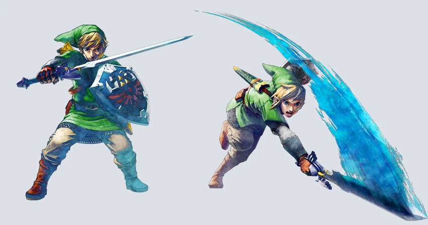
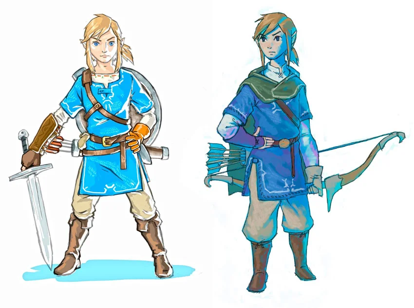
This is the game that changed everything. With Breath of the Wild, Link’s design became a reflection of the player. Instead of a fixed, iconic look, he was now a blank slate for customization, and that meant some huge changes to how he was designed, animated, and even dressed.

If Breath of the Wild was about exploration, Tears of the Kingdom was about creation—and Link’s design and animation had to evolve again to reflect that.
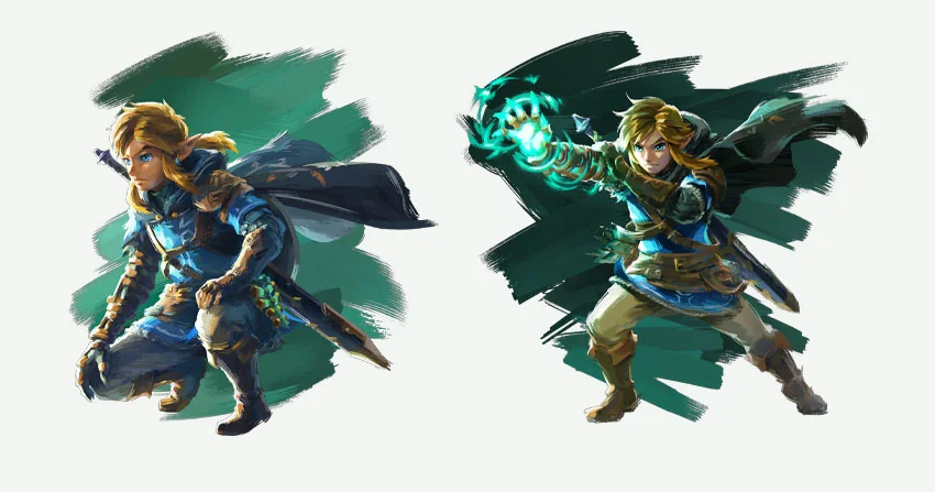
This era completely transformed Link’s role as a character and player avatar. His silhouette, movement, and outfit choices now feel less like a preset design and more like an extension of the player’s choices. Customization, armor changes, and even small details like weathered clothing and worn gear mean Link visually reflects the player’s journey.
What we love about Link is how he keeps changing but never loses what makes him iconic. From tiny pixelated beginnings to a fully animated adventurer, he’s always adapted to whatever wild new ideas Nintendo throws at him. Whether it’s bold art styles like The Wind Waker or the physics-driven freedom of Breath of the Wild, Link isn’t just a character—he’s a symbol of how games evolve over time.
That’s what makes the evolution of Link through all the Legend of Zelda games so special. No matter how much his look, movement, or world changes, he always feels like Link: courageous, determined, and ready for adventure! We can’t wait to see where Nintendo takes him next, but one thing’s for sure—whenever there’s a new Zelda game, we’ll all be there, ready to explore.
Discover the best graphic design software for every workflow. Compare Photoshop, Illustrator, Figma, Blender, Canva, Affinity, and more to find your ideal tool.

Learn how to add LUTs in Final Cut Pro, from importing .CUBE files to adjusting intensity and combining with colour correction for better video grading results.

Learn how to use LUTs with RAW footage for accurate colour grading. A step-by-step guide to applying LUTs, preserving dynamic range, and achieving cinematic video results.

Every month, we're rounding up our favourite TikTok trends: the sounds, hooks, and concepts that are going viral right now. We'll break down the formats, show you examples, and give you practical ways to adapt them to your niche.