
Envato LUTs category: preview LUTs on your own footage before you download
Explore the Envato LUTs category and discover 66,000+ searchable LUTs with previews, frame testing, commercial licensing, and compatibility across major editing software.
Envato: Get every type of asset for any type of project, and access to AI tools. Start now
Fonts do more than just spell out the title—they set the tone! Let’s take a look at how typographic choices in opening titles can help create an unforgettable first impression.

Title sequences are the opening credits of a film, series, or video. They usually involve a blending of visuals and text, but they’re not just functional—they can be a form of art on their own! Title sequences give us the vibe of what’s to come, and if they’re done right, they should reflect the visual and narrative theme of the video.
Some great examples are Stranger Things and Mad Men, very different styles of show that demonstrate how title sequences can be mood-setters.
It’s no surprise that typography in title sequences has changed a lot, given the advancements in technology over the life of film, but they’ve also moved from purely giving information to being a storytelling device in their own right.
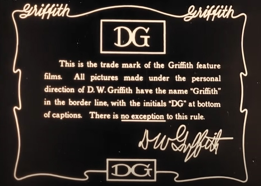
In the early days of silent films, title sequences were pretty functional—usually just the title of the film, a copyright or legal notice, and sometimes key actors and crew members. Occasionally, a director would include a personal note about the film about to be shown. Letter artists would be hired to hand-paint these title cards, and they would generally go for one-stroke letters with small or no (sans) serifs.

Films of the 1920s had title cards inspired by Art Deco trends that were popular at the time, a sort of elegant and futuristic look.
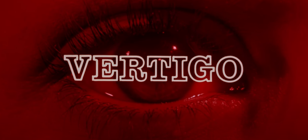
In the mid-20th century, Saul Bass entered the scene. A graphic designer, he made titles for films like Psycho, Vertigo, and Anatomy of a Murder. He introduced typography as an active part of telling the story, using a minimal but still bold serif font, paired with imagery that communicated the themes and emotions of the upcoming film.
In the ‘70s and ‘80s there was a lot of experimentation, including some quite psychedelic typefaces. Fear and Loathing in Las Vegas featured a psychedelic typeface as a nod to the 1971 novel it was based on. Sci-fi films would have a retro-futuristic style, while there would often be brush scripts in romantic comedies and grungier fonts in horror and action.
After the introduction of digital technologies, typography in title sequences became more fluid. It was often animated and usually well integrated into the narrative. Designers were merging type and visual effects to create dynamic fonts. The James Bond films are great examples of this. Here’s Casino Royale from 2006:
Quite a lot of filmmakers are into clean, crisp, and modern fonts. In a “less is more” world, sans-serif fonts are dominating, with clean lines and sharp edges for a sleek, contemporary aesthetic.
Retro typography is really having a moment, particularly those 80s and 90s influences, probably kicked off by the likes of Stranger Things. Neon styles and bold, blocky fonts are tapping into our love of nostalgia and familiarity. They usually have a serif or scripted style, with rounded edges and bright color schemes.
This is where text is animated so that it moves on the screen, which adds some dynamism. Think Zombieland, where text is physically being interacted with as part of the environment.
This is a really engaging movie opener because it’s keeping us hooked, plus we read the text as it’s part of the action!
Ahhh yeah a bit of a cop-out, but making something bespoke for a project rather than following trends is kind of in itself… a trend. In 2019, Joker had a typeface designed specifically to look as if it was drawn by hand in a gritty, raw way that reinforces the tone of the film.
We’ve mentioned already that typography in title sequences isn’t just about aesthetics but about communication; every font choice sends a message, whether you mean it to or not—and you should mean it!
The text is sharp, blocky, and italicized, and it sort of collapses in on itself, which foreshadows the mental unraveling of the main character.
What the typography looks like and how it’s interacting with the other visuals shapes our expectations for the movie. In Fight Club, the titles show us the camera zooming through a brain, with firing neurons and connecting synapses.
Designed by Saul Bass, the split lines and blocky sans-serif fonts mimic the fractured, unstable psychology of the film (a bit like Fight Club!), setting an uncomfortable tone from the start. It’s quite a simple opener, but very effective.
The scratched, jittery fonts in Se7en’s title sequence perfectly reflect the film’s gritty, disturbing atmosphere.
This has a mid-century modern aesthetic with playful, animated fonts that look as if they’re chasing each other across the screen… which obviously fits the film well!
So, how can you make the most of typography in your own film projects? Here are a few tips:
Typography is very much psychological, not just visual. The fonts we see and choose impact how audiences feel about the thing they’re watching, even before the story gets going! Serif fonts like Times New Roman can get across things like tradition, trust, and seriousness, whereas a sans-serif font like Helvetica can feel simple and modern. Here’s a quick guide:
Thanks to the constant advances in motion design and animation, typography in title sequences has become more versatile and interactive, and that will continue. In future, we can expect things like:
Using typography in title sequences is a great blend of graphic design and storytelling. Whether it’s a retro resurgence like we’re seeing at the moment or the clean, modern lines of more minimalist fonts, the choices are more plentiful than ever before!
If you’d like to learn more about motion design trends, take a look at our summary of what’s happening for 2025—and for more typographic inspiration, check out all our movie-based fonts.
Explore the Envato LUTs category and discover 66,000+ searchable LUTs with previews, frame testing, commercial licensing, and compatibility across major editing software.

Found a template that's almost perfect? This guide walks you through editing Envato video templates in any software, with a repeatable process for swapping media, text, colors, and music, then exporting a finished video.

Download a video template and you get the design system, not the finished video. Here's what to expect — and what to source separately.
Video templates aren't universal files — here's what to check before downloading to avoid compatibility issues in your editing software.