Movie typography in 2026: why does it suddenly look so good?
Explore movie typography trends shaping 2026, from bold film fonts to cinematic branding, with inspiring examples and practical tips for creating impactful, screen-ready typography.
Envato: Get every type of asset for any type of project, and access to AI tools. Start now

Nobody’s watching yet. You’ve got about a second and a half to fix that.
Let’s focus on motion graphics for short form video like Reels, Shorts, and TikTok with a practical workflow — the decisions, assets, and checks that matter most before publishing. If you’re shipping three to five short videos a week, you already know where the pain lives. It’s not the animation itself only, it’s the quality, consistency, and deadlines.
Short-form video consistently delivers the strongest returns of any content format — marketers rank it above long-form and live video for ROI, which means the concept you commit to matters far more than how much you publish. Producing more of the wrong thing is just faster failure.
Most guides cover short-form strategy or animation styles in isolation, but we’ll walk you through the full pipeline: concepting, vertical composition, hook animation, typography, batch production, and export. This will be a repeatable production workflow for motion graphics for short form video that you can run every week, whether you’re building a client series or your own channel.
Let’s create a pipeline you can trust: creative direction locked before you open a timeline, a 9:16 composition built for each platform’s UI, hooks engineered for the first 1.5 seconds, and exports that survive compression. Not a list of tips, but a process.
Motion graphics for short form video are animated graphic design elements like kinetic typography, animated shapes, transitions, data visualizations, and logo animations, built specifically for the 9:16 vertical frame and the viewing behavior of short-form platforms: sound-off playback, UI overlays covering parts of the frame, and watch times measured in seconds.
Short-form video is the top-performing content format for creatives, with an optimal length of 31–60 seconds. Motion graphics are how creative professionals differentiate inside that window: when everyone has access to the same trending audio and the same phone camera, deliberate motion design is what separates a produced piece from a casual post.
The vertical frame changes the design job. This is not resized 16:9 work. Safe zones, composition, and pacing are all specific to how each platform stacks its UI on top of your frame — caption text, the engagement rail, and bottom-bar elements all claim territory you don’t control. And because a large share of viewers watch with sound off, animated text and captions are structural elements of the design, not decoration you add at the end.
Three things, and none of them are optional if you’re producing at volume:
To keep this practical, the rest of this guide follows one worked example: a three-video launch series for a client’s compact home espresso machine. Video one is the teaser, video two is the feature demo, and video three carries the offer. Same series, same brand kit, three platforms.
Refining the first idea that works is no longer good enough. The deciding factor is choosing the strongest concept before you invest production hours, because the platform will give your video a few seconds to prove itself, and no amount of polish rescues a weak direction.
This is where Envato earns its place in the pipeline. Start from a prompt or a reference image — no perfect brief required — and use Envato’s AI image generator to rough out multiple creative territories fast. When you need licensable, production-ready references rather than AI concepts, switch to real stock assets from Envato’s broader catalog, all covered under the same unlimited subscription.
If you’re deciding between territories, the current motion design trends for 2026 are a useful gut-check on where each direction sits.
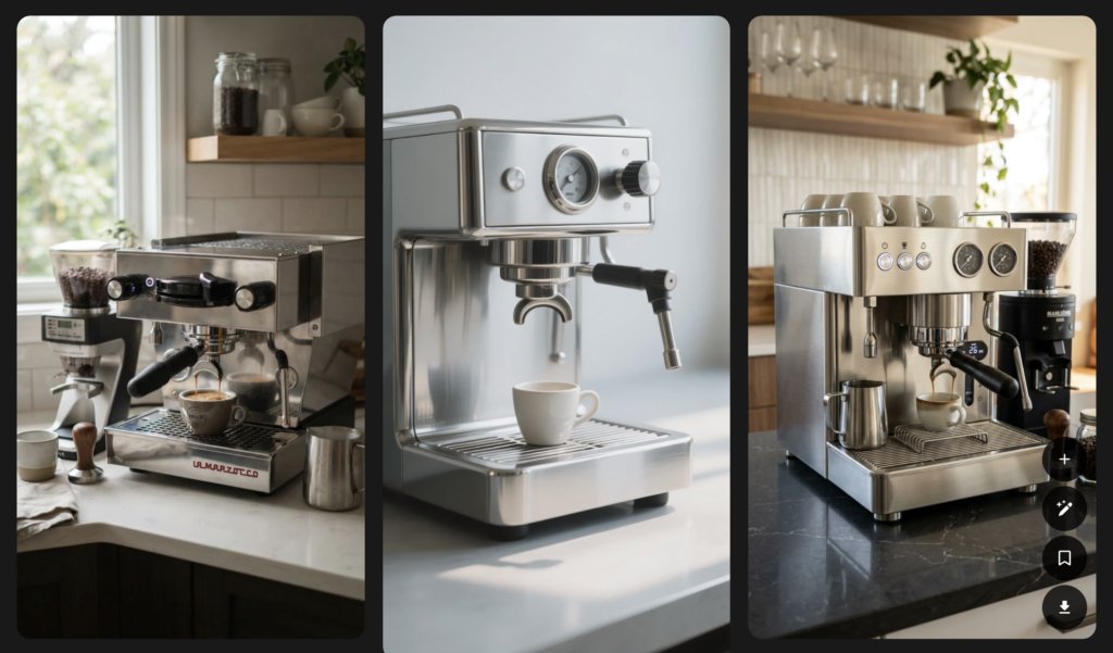
Once your client signs off, save the direction to a workspace and reference it through production. Now the composition work in Step 2 has a clear target instead of guesswork.
Vertical is its own discipline. Vertical HD uploads saw roughly a 51% jump year over year, reflecting how firmly mobile-first consumption has taken hold, and every platform overlays its own UI on your 1080×1920 frame: caption text near the bottom, the engagement rail down the right side, and bottom-bar elements that eat your lower margin.
The rule that survives all three platforms is center-weighted composition. Keep critical text and animation inside the zone no platform UI touches — roughly the middle of the frame horizontally and clear of the bottom quarter. Treat the top and bottom margins as expendable: background texture, ambient motion, nothing you’d mourn if a caption covered it.
In practice, set your comp to 1080×1920 at your working frame rate, then load safe-zone guides or an overlay template into your NLE so you’re designing against the actual usable area from frame one. Check legibility at phone scale as you go. A title that reads beautifully on a 27-inch monitor can vanish at 6 inches.
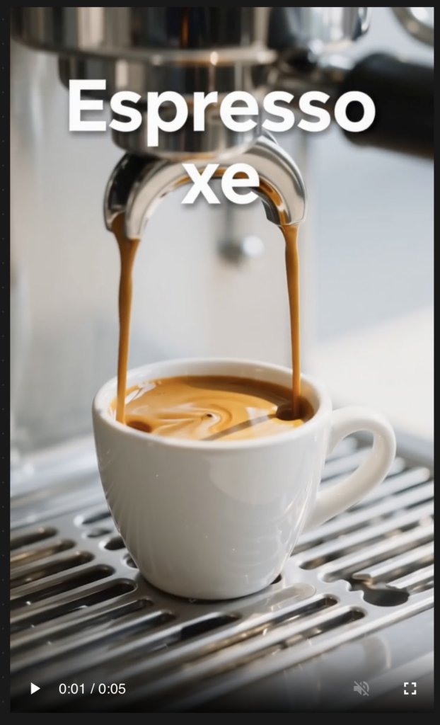
For the espresso series, block the frame once: title zone in the upper-middle third, product hero in the center, caption zone above the bottom UI band. Define it in video one, reuse it across all three. That single decision is what makes the series read as a series.
With watch time measured in seconds, the hook is an engineering problem, not a creative afterthought. You have deliberate options: movement already happening in frame one, a text overlay stating the payoff up front, a pattern interrupt, or a visual reveal in progress when the video starts. Choose one on purpose.
The structure underneath is hook, payoff, CTA. Motion graphics carry the hook better than raw footage for a simple reason: you control every pixel of frame one. Footage opens on whatever the camera saw. A motion graphic opens on exactly the composition, color, and movement you designed.
Concrete techniques that work in the first 1.5 seconds:
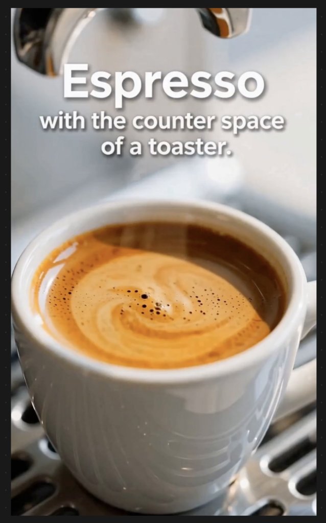
Tie this back to Step 1: the strongest hook usually comes from the creative territory you validated earlier, not one invented at 11pm. And if two hooks tested well in exploration, produce both. Two versions of a 1.5-second open cost almost nothing at this stage, and the platform will tell you which one wins.
Kinetic typography is the workhorse of vertical motion design. In practice that means word-by-word reveals timed to the voiceover, emphasis animation on the words that carry the message (“counter space,” “18 bar,” “$50 off”), and caption styles that read at phone size in under a second.
Readability craft is where amateur short-form falls apart. Set a font weight and size floor for mobile and never dip below it. Keep contrast high against moving backgrounds, using a subtle backing shape or drop shadow if the footage fights the text. Give each line enough on-screen duration to be read twice. And keep every animated word inside the safe zone you defined in Step 2, because a caption clipped by the engagement rail reads as carelessness.
Captions serve sound-off viewers and accessibility at the same time, so animate them without sacrificing legibility. No rapid flicker, no low-contrast styling, no motion so busy the words become texture. The animation should pull attention to the words, then get out of the way.
Font selection is a brand decision, not a per-video decision. Choose a display face for hooks and titles and a workhorse face for captions, lock both into the brand kit, and stop relitigating typography every Tuesday. Browsing font assets on Envato with your locked creative direction next to you makes this a one-hour decision instead of a recurring one.
For the espresso series, that means one bold geometric sans for the “Golden Hour” titles and a high-legibility companion for captions — set once, used across all three videos.
Producing a weekly series from scratch doesn’t scale, and pretending it does is how deadlines get missed. The production backbone for volume work is templates: After Effects templates for original-feeling animation, and Premiere Pro MOGRTs for editors who want motion graphics speed without leaving the edit. With the brand kit locked — fonts, colors, caption styles, logo sting — every video in the series stays recognizably consistent no matter who touches it or how tight the turnaround gets.
The key move is modular production. Build one master project with swappable text, footage, and color layers, then version it per video. For the espresso series, that’s one master comp: the teaser swaps in mood footage and the hook line, the feature demo swaps in product close-ups and spec callouts, the offer video swaps in the discount and CTA. Shoot or generate once, extract three platform-ready assets.
The objection you’ll hear is “templates look templated.” They do when they’re used out of the box. Pros customize timing so the rhythm matches their voiceover, swap the type for the brand kit faces, and restyle the color to the locked creative direction. The template supplies structure and animation craft; the brand kit supplies identity. Viewers see your brand, not the template. If you work in After Effects, it’s also worth watching the new VFX asset categories coming into the library: overlays, transitions, and effects elements slot straight into a modular master project.
If you have a library of horizontal work, the conversion rule is recompose, don’t crop. Restack horizontal layouts vertically: a title-left, product-right layout becomes title-top, product-center. Re-time animations for the shorter attention window — a leisurely 2-second reveal in a 16:9 explainer needs to land in under a second in vertical. Rebuild the layout, not the animation logic.
Know what survives and what doesn’t. Typography systems, transitions, and logo animations carry over almost untouched. Wide establishing moves and edge-anchored elements don’t — anything designed to sweep across a wide frame either gets cropped into meaninglessness or leaves the vertical frame empty. Cut those and rebuild the moment vertically instead of forcing the conversion.
This is the step most guides gloss over, and it’s where polished work quietly dies. A beautiful animation delivered at the wrong spec gets compressed into mush, cropped by the platform, or clipped by UI. Verify specs against current platform documentation before delivery (they change) but the working baseline looks like this:
| Spec | TikTok | Instagram Reels | YouTube Shorts |
|---|---|---|---|
| Resolution | 1080×1920 | 1080×1920 | 1080×1920 |
| Aspect ratio | 9:16 | 9:16 | 9:16 |
| Max duration | Long-form supported; verify current limit | Up to 180 seconds | Verify current limit |
| Recommended duration | 31–60 seconds | 31–60 seconds | 31–60 seconds |
| Safe zone considerations | Right-side engagement rail, bottom caption band | Right-side rail, bottom UI, username overlay | Right-side rail, title and subscribe elements at bottom |
| File format | MP4 or MOV, H.264 | MP4 or MOV, H.264 | MP4 or MOV, H.264 |
Note the gap between spec ceiling and creative sweet spot. Reels now support up to 180 seconds, but optimal short-form performance still clusters at 31–60 seconds. The ceiling is what the platform allows; the sweet spot is what viewers finish. Design for the second number.
Two pieces of export craft finish the job. First, bitrate: export higher than you think you need, because every platform re-compresses on upload, and a lean export compressed twice looks soft and blocky. Second, run a final safe-zone QC pass on an actual phone before publishing.
Post as a draft or private upload, and confirm nothing critical sits under the caption band or the engagement rail. It takes two minutes and catches the failures viewers judge hardest.
This is workflow fit, not a tool ranking; but most professionals run a hybrid pipeline.
The hybrid version for the espresso series: concept with Envato’s AI image generator, animate the master comp in After Effects, assemble and version in Premiere with MOGRT caption styles, QC on a phone. Each tool does the job it’s best at.
Nearly half of companies produce videos on budgets under $5,000, so the production approach you choose is the budget decision. For a weekly series, four realistic approaches exist:
| Approach | Speed | Consistency at volume | Skill required | Best for |
|---|---|---|---|---|
| From scratch | Slowest | Depends entirely on discipline | High (motion design craft) | Signature brand moments, hero content |
| Templates + brand kit | Fast | High — the kit enforces it | Moderate (customization, not creation) | Weekly series, client volume work |
| AI-assisted hybrid | Fast | High when layered into templates | Moderate | Backgrounds, elements, and variation at volume |
| Outsourced | Varies with the editor | Varies — requires a tight brief | Low (but high brief-writing skill) | Teams with budget and no in-house editor |
Fully custom work gives you the most control and the least speed: right for a hero launch film, wrong for video four of a weekly series. Template-based production provides the structure and animation craft, so your hours go only to customization. The AI-assisted hybrid layers generated backgrounds, elements, or footage from Envato’s AI video generator into that template workflow: the latest AI video models make generated elements viable for production, not just previsualization. Outsourcing trades money for time and can live or die on the quality of your brief and brand kit.
Here’s the stance: for most working creatives, the template + brand kit workflow with AI-assisted elements wins on the volume-to-quality ratio. From-scratch production is a luxury you spend deliberately; the template-plus-kit pipeline is what keeps a weekly series shipping without the quality sliding.
Each platform overlays UI in different frame areas — TikTok and Reels stack captions and engagement elements along the bottom and right side, while Shorts adds title and subscribe elements near the bottom. Center-weighted composition keeps critical content safe on all three.
Explore multiple visual territories from a rough idea or reference image first. Envato’s Explore Mode returns distinct, named directions you can steer with reactions and plain-language tweaks, so production time goes only to the winning concept.
Yes, with a recompose-not-crop approach. Typography systems, transitions, and animation logic carry over; horizontal layouts get restacked vertically and re-timed for the shorter attention window.
Match your source footage — typically 30 fps for standard content — and check each platform’s current documentation before export, since supported settings change over time.
Modular production: build one master project with swappable text, footage, and color layers, then version it per video and export to each platform’s spec.
Lock a brand kit — fonts, colors, caption styles, and a logo animation — and apply it through a reusable template system. Consistency comes from the kit, not from memory.
The template + brand kit workflow, with AI-generated elements layered in where they fit. The template supplies structure and animation craft; your time goes to customization only.
Explore movie typography trends shaping 2026, from bold film fonts to cinematic branding, with inspiring examples and practical tips for creating impactful, screen-ready typography.

Cavalry joins Canva’s professional ecosystem. Discover what this means for motion designers, After Effects users, and the future of scalable, real-time motion workflows.
Three new categories, cinema-quality effects, and zero extra costs. Your video projects are about to get a serious upgrade.
Here's how professional motion designers are using AI in their workflows.